
elementUi el-steps步骤条封装成能多行展示
不是原创,是看个某个例子然后自己改了下,那个例子链接忘记保存了。如图,一行只能放七个进度,多了会换行展示,上组件代码。rem是做了我自己项目的适配,可根据自己需求改动。
·
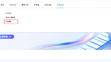
效果图

如图,一行只能放七个进度,多了会换行展示,上组件代码
<template>
	<div>
		<div class="custom_steps" v-for="(item, index) in allSteps" :key="index">
			<div class="mid_steps">
				<el-steps align-center space="9.375rem">
					<el-step
						v-for="(d, i) in item.topSteps"
						icon="el-icon-success"
						:key="i"
						:status="d.state == 1 ? 'finish' : ''"
					>
						<div class="step_title" slot="title" :title="d.title">{{ d.title }}</div>
						<div class="step_description" slot="description">{{ d.description }}</div>
					</el-step>
				</el-steps>
				<el-steps
					align-center
					space="9.375rem"
					v-if="item.bottomSteps.length"
					style="justify-content: flex-end;"
				>
					<el-step
						v-for="(d, i) in item.bottomSteps"
						icon="el-icon-success"
						:title="d.title"
						:description="d.description"
						:key="i"
						:status="d.state == 1 ? 'finish' : ''"
					>
						<div class="step_title" slot="title" :title="d.title">{{ d.title }}</div>
						<div class="step_description" slot="description">{{ d.description }}</div>
					</el-step>
				</el-steps>
			</div>
			<div class="left_steps">
				<div
					class="circle"
					:class="[item.topSteps[0].state == 1 ? 'finish' : '']"
					v-if="index >= 1"
				></div>
			</div>
			<div class="right_steps">
				<div
					class="circle"
					:class="[item.bottomSteps[item.bottomSteps.length - 1].state == 1 ? 'finish' : '']"
					v-if="item.bottomSteps.length"
				></div>
			</div>
		</div>
	</div>
</template>

<script>
export default {
	name: "CustomStep",
	props: {
		stepsData: {
			type: Array,
			default() {
				return [];
			},
		},
	},
	data() {
		return {
			allSteps: [],
		};
	},
	watch: {
		stepsData() {
			this._initStepsData();
		},
	},
	methods: {
		// 初始化数据
		_initStepsData() {
			const stepsData = this.stepsData;
			this.allSteps = [];
			if (stepsData && stepsData.length > 0) {
				let num = Math.ceil(stepsData.length / 14);
				let flagNum = 0;
				for (let index = 0; index < num; index++) {
					flagNum = index * 14;
					this.allSteps.push({
						topSteps: stepsData.slice(index * 14, index * 14 + 7),
						bottomSteps: stepsData.slice(flagNum + 7, flagNum + 14).reverse(),
					});
				}
			}
		},
	},
};
</script>

<style lang="less" scoped>
.custom_steps {
	position: relative;
	display: flex;
	justify-content: center;

	.step_title {
		width: 9.375rem;
		height: 0.8333rem;
		font-size: 0.8333rem;
		white-space: nowrap;
		overflow: hidden;
		text-overflow: ellipsis;
		// overflow: hidden;
		// display: -webkit-box;
		// -webkit-line-clamp: 2;
		// -webkit-box-orient: vertical;
	}

	.step_description {
		height: 40px;
		font-size: 12px;
	}
	.mid_steps {
		width: calc(~"100% - 160px");
		position: relative;
		z-index: 2;
	}
	.left_steps {
		position: absolute;
		top: -5.1042rem;
		left: 1.5625rem;
		width: 6.7708rem;
		margin-right: -2.6042rem;
		z-index: 1;
		.circle {
			width: 6.7708rem;
			height: 5.9375rem;
			// margin-top: 1.1458rem;
			border: 5px solid #c0c4cc;
			border-radius: 30% 0 0 30%;
			border-right: none;
			&.finish {
				border-color: #409eff;
			}
		}
	}

	.right_steps {
		position: absolute;
		top: 1.1458rem;
		right: 1.5625rem;
		width: 6.7708rem;
		margin-left: -2.6042rem;
		z-index: 1;
		.circle {
			width: 6.7708rem;
			height: 5.9375rem;
			// margin-top: 1.1458rem;
			border: 5px solid #c0c4cc;
			border-radius: 0 30% 30% 0;
			border-left: none;
			&.finish {
				border-color: #409eff;
			}
		}
	}
	// /deep/.el-step__icon {
	//   background: #f6f6f6;
	// }
	/deep/.el-step__icon-inner {
		font-size: 1.875rem;
	}
	/deep/.el-step__line {
		background: transparent;
		border-top: 5px solid;
		.el-step__line-inner {
			border-width: 0 !important;
		}
	}

	.el-steps {
		height: 6.25rem;
	}

	/deep/.el-step {
		position: relative;
		margin: 10px 0;
		.el-step__head.is-process {
			color: #c0c4cc;
			border-color: #c0c4cc;
		}
		.el-step__title.is-process {
			color: #c0c4cc;
			font-weight: unset;
		}
	}
}
</style>
rem是做了我自己项目的适配,可根据自己需求改动
不是原创,是看个某个例子然后自己改了下,那个例子链接忘记保存了

欢迎加入北京社区
更多推荐


 7
7 0
0- 0


 已为社区贡献1条内容

所有评论(0)