机器学习实战一:泰坦尼克号生存预测 Titantic
这是我在kaggle上找到的一个泰坦尼克号的生存的预测案例希望能用它来进行我的学习与实践,从这里开始入门Machine Learning也希望在这里,开始我的kaggle之旅文章目录活动背景活动背景The ChallengeThe sinking of the Titanic is one of the most infamous shipwrecks in history.On April 15
泰坦尼克号生存预测 Titantic
这是我在kaggle上找到的一个泰坦尼克号的生存的预测案例
希望能用它来进行我的学习与实践,从这里开始入门Machine Learning
也希望在这里,开始我的kaggle之旅
如果想了解更多的知识,可以去我的机器学习之路 The Road To Machine Learning通道
1.活动背景
The Challenge The sinking of the Titanic is one of the most infamous shipwrecks in history.
On April 15, 1912, during her maiden voyage, the widely considered “unsinkable” RMS Titanic sank after colliding with an iceberg. Unfortunately, there weren’t enough lifeboats for everyone onboard, resulting in the death of 1502 out of 2224 passengers and crew.
While there was some element of luck involved in surviving, it seems some groups of people were more likely to survive than others.
In this challenge, we ask you to build a predictive model that answers the question: “what sorts of people were more likely to survive?” using passenger data (ie name, age, gender, socio-economic class, etc).
泰坦尼克号(RMS Titanic),又译作铁达尼号,是英国白星航运公司下辖的一艘奥林匹克级游轮,排水量46000吨,是当时世界上体积最庞大、内部设施最豪华的客运轮船,有“永不沉没”的美誉 。在它的处女航行中,泰坦尼克号与一座冰山相撞,造成右舷船艏至船中部破裂,五间水密舱进水。1912年4月15日凌晨2时20分左右,泰坦尼克船体断裂成两截后沉入大西洋底3700米处。2224名船员及乘客中,1517人丧生,其中仅333具罹难者遗体被寻回。泰坦尼克号沉没事故为和平时期死伤人数最为惨重的一次海难,其残骸直至1985年才被再度发现,目前受到联合国教育、科学及文化组织的保护。
在英剧《Downton Abbey》中,Robert伯爵在听到Titanic沉没的消息时候说:“Every mountain is unclimbable until someone clime it, so every ship is unsinkable until it sinks.”(没有高不可攀的高峰,也没有永不翻沉的船)

2.详细代码解释
导入Python Packages
首先导入需要的python包
import numpy as np
import pandas as pd
import matplotlib.pyplot as plt
from sklearn import metrics
from sklearn.linear_model import LogisticRegression
import seaborn as sns
import warnings
warnings.filterwarnings("ignore")
读入数据 Read-In Data
将train.csv和test.csv读入,读入数据进行建模
train = pd.read_csv('../data_files/1.Titantic_data/train.csv')
test = pd.read_csv('../data_files/1.Titantic_data/test.csv')

train.info() # 查看train.csv的总体
test.info() # 查看test.csv的总体
会出现以下结果,train有891条数据,test有418条数据,并且我们可以从数据中看出,在train和test中,有一些数据是有缺失值的,所以需要进行数据预处理


在这里也介绍一下数据的含义吧
数据介绍:
- Survived 是否存活(label)
- PassengerId (乘客ID)
- Pclass(用户阶级):1 - 1st class,高等用户;2 - 2nd class,中等用户;3 - 3rd class,低等用户;
- Name(名字)
- Sex(性别)
- Age(年龄)
- SibSp:描述了泰坦尼克号上与乘客同行的兄弟姐妹(Siblings)和配偶(Spouse)数目;
- Parch:描述了泰坦尼克号上与乘客同行的家长(Parents)和孩子(Children)数目;
- Ticket(船票号)
- Fare(乘客费用)
- Cabin(船舱)
- Embarked(港口):用户上船时的港口
缺失数据处理
从刚刚的总体情况可以看出,有一些数据是具有缺失值的,所以我们需要对缺失值进行一些处理
首先看看有哪些数据是缺失的
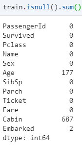
从数据可以看出来,缺失的比较多的是Age和Cabin,Embarked有少部分是缺失的
通常遇到缺值的情况,我们会有几种常见的处理方式
如果缺值的样本占总数比例极高,我们可能就直接舍弃了,作为特征加入的话,可能反倒带入noise,影响最后的结果了
如果缺值的样本适中,而该属性非连续值特征属性(比如说类目属性),那就把NaN作为一个新类别,加到类别特征中
如果缺值的样本适中,而该属性为连续值特征属性,有时候我们会考虑给定一个step(比如这里的age,我们可以考虑每隔2/3岁为一个步长),然后把它离散化,之后把NaN作为一个type加到属性类目中。
有些情况下,缺失的值个数并不是特别多,那我们也可以试着根据已有的值,拟合一下数据,补充上。
对缺失字段’Age’处理
我们可以看看Age的缺失率大概是多少
print('Percent of missing "Cabin" records is %.2f%%' %((train['Age'].isnull().sum()/train.shape[0])*100))
# Percent of missing "Cabin" records is 19.87%
从结果可以看出,大约是19.87%
sns.set()
sns.set_style('ticks')

# 缺失值处理:年龄Age字段
train_age=train[train['Age'].notnull()]

# 年龄数据的分布情况
plt.figure(figsize=(12,8))

plt.subplot(121)
train_age['Age'].hist(bins=80)
plt.xlabel('Age')
plt.ylabel('Num')

plt.subplot(122)
train_age.boxplot(column='Age',showfliers=True,showmeans=True)

train_age['Age'].describe()
我们可以画出关于notnull的Age字段的直方图和箱线图

接着要对’Age‘字段的缺失值,这里我用的是将其他Age数据的平均值来填补缺失值
# 要对缺失值处理
train['Age']=train['Age'].fillna(train['Age'].mean())
train.info()
处理完以后,可以再看一眼train的数据

这时候Age字段的缺失值被填补完毕了
对缺失字段’Cabin’处理
我们可以看看’Cabin‘字段的缺失率
print('Percent of missing "Cabin" records is %.2f%%' %((train['Cabin'].isnull().sum()/train.shape[0])*100))
# Percent of missing "Cabin" records is 77.10%
它的缺失率居然高达77.1%,所以对于这样的字段,我打算在建模的时候,直接将其舍去,不以它作为变量
train.drop(['Cabin'],axis=1,inplace=True) # 删去Cabin的那一列数据
对缺失字段’Embarked’处理
继续看一看它的缺失率
print('Percent of missing "Embarked" records is %.2f%%' %((train_df['Embarked'].isnull().sum()/train_df.shape[0])*100))
# Percent of missing "Embarked" records is 0.22%
整个训练集,也只有2个数据是缺失的,然后我们再来看一看Embarked的分布
sns.countplot(x='Embarked',data=train,palette='Set1')
plt.show()
train['Embarked'].value_counts()

从数据可以看出来,Embarked只有三个值,其中S的值最多,所以我直接将S填充那缺失的两个值。
train.Embarked = train.Embarked.fillna('S')
缺失值处理
经过分析以后,进行缺失值处理,再看看处理后的数据
train['Age']=train['Age'].fillna(train['Age'].mean()) # 用平均值填充
train.drop(['Cabin'],axis=1,inplace=True) # 删去Cabin的那一列数据
train.Embarked = train.Embarked.fillna('S') # 用’S'填补缺失值
trian.info()

这时候就没有缺失值了,处理完毕
数据分析
对数据的认识是十分重要的,所以我们在这里进行对各个字段的分析,看看每个属性与最后的Survived有什么关系
首先可以总体粗略的看一下
train_survived=train[train['Survived'].notnull()]

# 用seaborn绘制饼图,分析已知存活数据中的存活比例
sns.set_style('ticks') # 十字叉
plt.axis('equal')       #行宽相同
train_survived['Survived'].value_counts().plot.pie(autopct='%1.2f%%')

在这次中,大约有38.38的人存活了下来
分析Sex
# 男性和女性存活情况
train[['Sex','Survived']].groupby('Sex').mean().plot.bar()

survive_sex=train.groupby(['Sex','Survived'])['Survived'].count()

print('女性存活率%.2f%%,男性存活率%.2f%%' %
     (survive_sex.loc['female',1]/survive_sex.loc['female'].sum()*100,
      survive_sex.loc['male',1]/survive_sex.loc['male'].sum()*100)
     )

# 查看survived 与 Sex的关系
Survived_Sex = train['Sex'].groupby(train['Survived'])
print(Survived_Sex.value_counts().unstack())

Survived_Sex.value_counts().unstack().plot(kind = 'bar', stacked = True)
plt.show()

从数据结果可以得出,女性比男性的存活率是更高的
分析Age
plt.figure(figsize=(18,4))
train_age['Age']=train_age['Age'].astype(np.int)
average_age=train_age[['Age','Survived']].groupby('Age',as_index=False).mean()

sns.barplot(x='Age',y='Survived',data=average_age,palette='BuPu')

这里粗略的得出了Age与Survived的关系
分析Sibsp和Parch
# 筛选出有无兄弟姐妹
sibsp_df = train[train['SibSp']!=0] # 有兄弟姐妹
no_sibsp_df = train[train['SibSp']==0] # 没有兄弟姐妹

# 筛选处有无父母子女
parch_df = train[train['Parch']!=0] # 有父母子女
no_parch_df = train[train['Parch']==0] # 没有父母

plt.figure(figsize=(12,3))
plt.subplot(141)
plt.axis('equal')
sibsp_df['Survived'].value_counts().plot.pie(labels=['No Survived','Survived'],autopct='%1.1f%%',colormap='Blues')

plt.subplot(142)
plt.axis('equal')
no_sibsp_df['Survived'].value_counts().plot.pie(labels=['No Survived','Survived'],autopct='%1.1f%%',colormap='Blues')


plt.subplot(143)
plt.axis('equal')
parch_df['Survived'].value_counts().plot.pie(labels=['No Survived','Survived'],autopct='%1.1f%%',colormap='Reds')

plt.subplot(144)
plt.axis('equal')
no_parch_df['Survived'].value_counts().plot.pie(labels=['No Survived','Survived'],autopct='%1.1f%%',colormap='Reds')


# 亲戚多少与是否存活有关吗?
fig,ax=plt.subplots(1,2,figsize=(15,4))
train[['Parch','Survived']].groupby('Parch').mean().plot.bar(ax=ax[0])
train[['SibSp','Survived']].groupby('SibSp').mean().plot.bar(ax=ax[1])

train['family_size']=train['Parch']+train['SibSp']+1
train[['family_size','Survived']].groupby('family_size').mean().plot.bar(figsize=(15,4))

从以上数据可以较为清楚的去分析兄弟姐妹还有父母与最后的survived的关系,由于兄弟姐妹和父母我认为可以看为家庭成员,所以后来我将这些加起来,然后画出了一个直方图较为好的显示出数据
分析Pclass
train[['Pclass','Survived']].groupby('Pclass').mean().plot.bar(

# 查看Survived 与 Pclass的关系
Survived_Pclass = train['Pclass'].groupby(train['Survived'])
print(Survived_Pclass.value_counts().unstack())

Survived_Pclass.value_counts().unstack().plot(kind = 'bar', stacked = True)
plt.show()

从数据分析可以看出来,等级越高的,存活率就越高,所以我们可以推测,舱的等级与结果有关
分析Fare
fig,ax=plt.subplots(1,2,figsize=(15,4))
train['Fare'].hist(bins=70,ax=ax[0])
train.boxplot(column='Fare',by='Pclass',showfliers=False,ax=ax[1])

fare_not_survived=train['Fare'][train['Survived']==0]
fare_survived=train['Fare'][train['Survived']==1]
# 筛选数据

average_fare=pd.DataFrame([fare_not_survived.mean(),fare_survived.mean()])
std_fare=pd.DataFrame([fare_not_survived.std(),fare_survived.std()])

average_fare.plot(yerr=std_fare,kind='bar',figsize=(15,4),grid=True)

然后我们再看了看乘客费用与Pclass以及Survived的关系,可以看出来Pclass的等级是与Fare有关的,Pclass为1的Fare会比其他的高,最后survived也是有关的
分析Embared
sns.barplot('Embarked', 'Survived', data=train, color="teal")
plt.show()

可以看出C入口的存活率是更高的
总体结合分析
fig,ax=plt.subplots(1,2,figsize=(18,8))

sns.violinplot('Pclass','Age',hue='Survived',data=train_age,split=True,ax=ax[0])
ax[0].set_title('Pclass and Age vs Survived')

sns.violinplot('Sex','Age',hue='Survived',data=train_age,split=True,ax=ax[1])
ax[1].set_title('Sex and Age vs Survived')

这里是希望比较一下Sex和Age还有Pclass和Age的关系
fig=plt.figure()
fig.set(alpha=0.2)

plt.subplot2grid((2,3),(0,0))
train.Survived.value_counts().plot(kind='bar')
plt.title('Survived')
plt.ylabel('num')

plt.subplot2grid((2,3),(0,1))
train.Pclass.value_counts().plot(kind='bar')
plt.title('Pclass')
plt.ylabel('num')

plt.subplot2grid((2,3),(0,2))
plt.scatter(train.Survived,train.Age)
plt.ylabel('Age')
plt.grid(b=True,which='major',axis='y')
plt.title('Age')

plt.subplot2grid((2,3),(1,0),colspan=2)
train.Age[train.Pclass == 1].plot(kind='kde')
train.Age[train.Pclass == 2].plot(kind='kde')
train.Age[train.Pclass == 3].plot(kind='kde')
plt.xlabel('Age')
plt.ylabel('Density')
plt.title('Distribution of passenger ages by Pclass')
plt.legend(('first','second','third'),loc='best')

plt.subplot2grid((2,3),(1,2))
train.Embarked.value_counts().plot(kind='bar')
plt.title('Embaked')
plt.ylabel('num')
plt.show()

这里较为好的表示出来各个关系,有个更直观的感受
从上面的各个数据可以总结一下,最后的survived的值
我们推测可能与Sex是密切相关的,可能在救援过程中,人们会对女性有所照顾。
和Fare和Pclass应该也是密切相关的,这是一个重要的特征,有钱人的存活率会更高,头等舱的存活率也会更高,而票价低的乘客存活率会低很多
同时,观察Embarked,我们可以看到C出口的存活率更高,这可能是因为C出口更加靠近舱门,所以救援速度就会更快
3.建立模型
为逻辑回归建模时,需要输入的特征都是数值型特征,所以在建立模型之前,我们要进行一些操作
为了方便模型的建立,我首先是将train和test拼接在一起
dataset = train.append(test,sort=False)#合并后的数据,方便一起清洗
编码数据处理
对Sex编码
对Sex数据进行编码,男的1女的0
sexdict = {'male':1, 'female':0}
dataset.Sex = dataset.Sex.map(sexdict)
将Embarked, Cabin, Pclass进行one_hot编码
embarked2 = pd.get_dummies(dataset.Embarked, prefix = 'Embarked')

dataset = pd.concat([dataset,embarked2], axis = 1) ## 将编码好的数据添加到原数据上
dataset.drop(['Embarked'], axis = 1, inplace=True) ## 过河拆桥

dataset.head(1)

建立family_size特征
SibSp和Parch分别代表了兄弟姐妹和配偶数量,以及父母与子女数量。通过这两个数字,我们可以计算出该乘客的随行人数,作为一列新的特征
dataset['family']=dataset.SibSp+dataset.Parch+1

dataset.head(1)
去掉无关的
最后把(我觉得)没有帮助的列删除
dataset.drop(['Ticket'], axis = 1, inplace=True)

dataset.info()
接着我用seaborn的库画出维度间的相关性热度图
plt.figure(figsize=(14,12))
sns.heatmap(dataset.corr(),annot = True)
plt.show()

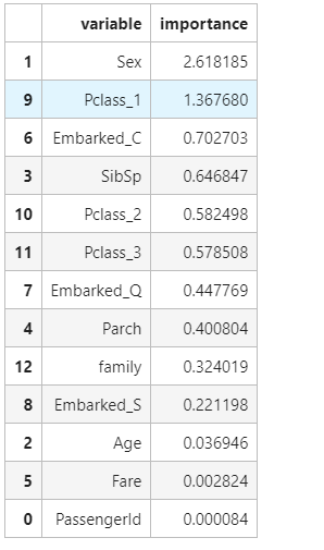
热力图显示,生存与否,与Sex, Fare, Pclass_1相关度都比较高,使用这些维度进行预测
训练集与测试集
x_train = dataset.iloc[0:891, :]
y_train = x_train.Survived
x_train.drop(['Survived'], axis=1, inplace =True)

x_test = dataset.iloc[891:, :]
x_test.drop(['Survived'], axis=1, inplace =True)

y_test = pd.read_csv('../data_files/1.Titantic_data/gender_submission.csv')#测试集
y_test=np.squeeze(y_test)

x_train.shape,y_train.shape,x_test.shape, y_test.shape
Logistic Regression模型
首先建立Logistic Regression模型,这里导入了sklearn中的Logistic Regression模型,进行一个预测。
首先我们利用训练集去拟合模型,这里我先用x_train中的一百个数据去拟合我所建立的model模型,拟合后,我用这拟合出来的模型去预测训练集中剩下的数据,计算它的准确率
from sklearn.linear_model import LogisticRegression
from sklearn.metrics import accuracy_score
model = LogisticRegression()

model.fit(x_train.iloc[0:-100,:],y_train.iloc[0:-100])
accuracy_score(model.predict(x_train.iloc[-100:,:]),y_train.iloc[-100:].values.reshape(-1,1))
# 0.82
后来的准确率大约是0.82
然后我们再用这个模型去预测我们的测试集,去看看我们的测试集的预测结果
prediction1 = model.predict(x_test)
result = pd.DataFrame({'PassengerId':y_test['PassengerId'].values, 'Survived':prediction1.astype(np.int32)})
result.to_csv("../results/predictions1.csv", index=False)
result.head()
后来会生成一个predictions1.csv文件,将这个文件提交到kaggle上,我们可以得到我们的分数大约是0.76315,不过没事,这只是我们的base模型,我们接下来继续进行优化

在刚刚训练模型的时候,我只是拿了100个数据进行一个训练,所以我尝试将所有的数据进行训练看看结果,然后再用模型去预测测试集,然后再提交到keggle
model2 = LogisticRegression()
model2.fit(x_train,y_train)
prediction2 = model2.predict(x_test)
accuracy_score(y_test['Survived'], prediction2)

result = pd.DataFrame({'PassengerId':y_test['PassengerId'].values, 'Survived':prediction2.astype(np.int32)})
result.to_csv("../results/predictions2.csv", index=False)
result.head()
结果还是比刚刚更高了,但是提高的不多,说明训练集的数据对模型的建立也是占有很重要的因素的,准确率大于0.76794

然后使用交叉验证
先简单看看cross validation情况下的打分
from sklearn.model_selection import cross_val_score, train_test_split
cross_val_score(model2, x_train, y_train, cv=5,scoring='accuracy')
# array([0.81005587, 0.79775281, 0.78651685, 0.76966292, 0.8258427 ])
可以看到出来,数据还是很不错的
接着我们还输出了相关性比较高的那几个模型
pd.concat((pd.DataFrame(x_train.columns, columns = ['variable']),
           pd.DataFrame(abs(model2.coef_[0]), columns = ['importance'])),
           axis = 1).sort_values(by='importance', ascending = False)[:15]
随机森林Random Forest模型
# 随机森林
from sklearn.ensemble import RandomForestClassifier
model3 = RandomForestClassifier(n_estimators=500, criterion='entropy', max_depth=5, min_samples_split=1.0,
                                min_samples_leaf=1, max_features='auto',    bootstrap=False, oob_score=False, n_jobs=1, random_state=0,
                                verbose=0)
model3.fit(x_train, y_train)
prediction3 =  model3.predict(x_test)

result = pd.DataFrame({'PassengerId':y_test['PassengerId'].values, 'Survived':prediction3.astype(np.int32)})
result.to_csv("../results/predictions3.csv", index=False)
accuracy_score(y_test['Survived'], prediction3)
用随机森林模型进行建立的,最后得到的结果还是差强任意,还没有单纯的logisticRegression好,还需要继续优化

决策树模型
from sklearn.tree import DecisionTreeClassifier
model4 = DecisionTreeClassifier(criterion='entropy', max_depth=7, min_impurity_decrease=0.0)
model4.fit(x_train, y_train)
prediction4 = model4.predict(x_test)

result = pd.DataFrame({'PassengerId':y_test['PassengerId'].values, 'Survived':prediction4.astype(np.int32)})
result.to_csv("../results/predictions4.csv", index=False)
accuracy_score(y_test['Survived'], prediction4)
投票法
prediciton_vote = pd.DataFrame({'PassengerId': y_test['PassengerId'],
                                 'Vote': prediction1.astype(int)+prediction2.astype(int)+prediction3.astype(int)})

vote = { 0:False,1:False,2:True,3:True}

prediciton_vote['Survived']=prediciton_vote['Vote'].map(vote)

prediciton_vote.head()

result = pd.DataFrame({'PassengerId':y_test['PassengerId'].values, 'Survived':prediciton_vote.Survived.astype(np.int32)})
result.to_csv("../results/predictions5.csv", index=False)

最后的结果是最好的,大约得到的分数达到了0.77272

Do one thing at a time, and do well.
一次只做一件事,做到最好!
4.完整代码
import numpy as np
import pandas as pd
import matplotlib.pyplot as plt
from sklearn import metrics
from sklearn.linear_model import LogisticRegression
import seaborn as sns
import warnings
warnings.filterwarnings("ignore")

train = pd.read_csv('../data_files/1.Titantic_data/train.csv')
test = pd.read_csv('../data_files/1.Titantic_data/test.csv')

train['Age']=train['Age'].fillna(train['Age'].mean()) # 用平均值填充
train.drop(['Cabin'],axis=1,inplace=True) # 删去Cabin的那一列数据
train.Embarked = train.Embarked.fillna('S') # 用’S'填补缺失值

test['Age']=test['Age'].fillna(test['Age'].mean())
test['Fare']=test['Fare'].fillna(test['Fare'].mean())
test.drop('Cabin',axis=1,inplace=True)

dataset = train.append(test,sort=False)#合并后的数据,方便一起清洗

sexdict = {'male':1, 'female':0}
dataset.Sex = dataset.Sex.map(sexdict)

embarked2 = pd.get_dummies(dataset.Embarked, prefix = 'Embarked')

dataset = pd.concat([dataset,embarked2], axis = 1) ## 将编码好的数据添加到原数据上
dataset.drop(['Embarked'], axis = 1, inplace=True) ## 过河拆桥

pclass = pd.get_dummies(dataset.Pclass, prefix = 'Pclass')

dataset = pd.concat([dataset,pclass], axis = 1)
dataset.drop(['Pclass'], axis = 1, inplace=True)

dataset['family']=dataset.SibSp+dataset.Parch+1

dataset.drop(['Ticket','Name'], axis = 1, inplace=True)
x_train = dataset.iloc[0:891, :]
y_train = x_train.Survived
x_train.drop(['Survived'], axis=1, inplace =True)

x_test = dataset.iloc[891:, :]
x_test.drop(['Survived'], axis=1, inplace =True)

y_test = pd.read_csv('../data_files/1.Titantic_data/gender_submission.csv')#测试集
y_test=np.squeeze(y_test)

x_train.shape,y_train.shape,x_test.shape, y_test.shape

from sklearn.linear_model import LogisticRegression
from sklearn.metrics import accuracy_score
model = LogisticRegression()

model.fit(x_train.iloc[0:-100,:],y_train.iloc[0:-100])
accuracy_score(model.predict(x_train.iloc[-100:,:]),y_train.iloc[-100:].values.reshape(-1,1))

prediction1 = model.predict(x_test)
result = pd.DataFrame({'PassengerId':y_test['PassengerId'].values, 'Survived':prediction1.astype(np.int32)})
result.to_csv("../results/predictions1.csv", index=False)

model2 = LogisticRegression()
model2.fit(x_train,y_train)

prediction2 = model2.predict(x_test)

result = pd.DataFrame({'PassengerId':y_test['PassengerId'].values, 'Survived':prediction2.astype(np.int32)})
result.to_csv("../results/predictions2.csv", index=False)

# 随机森林
from sklearn.ensemble import RandomForestClassifier
model3 = RandomForestClassifier(n_estimators=500, criterion='entropy', max_depth=5, min_samples_split=1.0,
                                min_samples_leaf=1, max_features='auto',    bootstrap=False, oob_score=False, n_jobs=1, random_state=0,
                                verbose=0)
model3.fit(x_train, y_train)
prediction3 =  model3.predict(x_test)

result = pd.DataFrame({'PassengerId':y_test['PassengerId'].values, 'Survived':prediction3.astype(np.int32)})
result.to_csv("../results/predictions3.csv", index=False)

from sklearn.tree import DecisionTreeClassifier
model4 = DecisionTreeClassifier(criterion='entropy', max_depth=7, min_impurity_decrease=0.0)
model4.fit(x_train, y_train)
prediction4 = model4.predict(x_test)

result = pd.DataFrame({'PassengerId':y_test['PassengerId'].values, 'Survived':prediction4.astype(np.int32)})
result.to_csv("../results/predictions4.csv", index=False)

prediciton_vote = pd.DataFrame({'PassengerId': y_test['PassengerId'],
                                 'Vote': prediction1.astype(int)+prediction2.astype(int)+prediction3.astype(int)})
vote = { 0:False,1:False,2:True,3:True}

prediciton_vote['Survived']=prediciton_vote['Vote'].map(vote)

prediciton_vote.head()

result = pd.DataFrame({'PassengerId':y_test['PassengerId'].values, 'Survived':prediciton_vote.Survived.astype(np.int32)})
result.to_csv("../results/predictions5.csv", index=False)
补充优化
不定时会进行更新优化
每日一句
Don’t let the past steal your present.(别让过去悄然偷走了你的当下)
如果需要数据和代码,可以自提
- 路径1:我的gitee
- 路径2:百度网盘
链接:https://pan.baidu.com/s/1uA5YU06FEW7pW8g9KaHaaw
提取码:5605

讨论HarmonyOS开发技术,专注于API与组件、DevEco Studio、测试、元服务和应用上架分发等。
更多推荐


 63
63 0
0- 0


 已为社区贡献1条内容

所有评论(0)