

I want to have bold labels on my axis, so I can use the plot for publication. I also need to have the label of the lines in the legend plotted in bold. So far I can set the axis labels and the legend to the size and weight I want. I can also set the size of the axis labels to the size I want, however I am failing with the weight.
Here is an example code:
# plotting libs
from pylab import *
from matplotlib import rc


if __name__=='__main__':

  tmpData = np.random.random( 100 )


  # activate latex text rendering
  rc('text', usetex=True)
  rc('axes', linewidth=2)
  rc('font', weight='bold')

  #create figure
  f = figure(figsize=(10,10))

  ax = gca()

  plot(np.arange(100), tmpData, label=r'\textbf{Line 1}', linewidth=2)

  ylabel(r'\textbf{Y-AXIS}', fontsize=20)
  xlabel(r'\textbf{X-AXIS}', fontsize=20)

  fontsize = 20
  fontweight = 'bold'
  fontproperties = {'family':'sans-serif','sans-serif':['Helvetica'],'weight' : fontweight, 'size' : fontsize}
  ax.set_xticklabels(ax.get_xticks(), fontproperties)
  ax.set_yticklabels(ax.get_yticks(), fontproperties)

  for tick in ax.xaxis.get_major_ticks():
      tick.label1.set_fontsize(fontsize)

  for tick in ax.yaxis.get_major_ticks():
      tick.label1.set_fontsize(fontsize)


  legend()
  show()

  sys.exit()
And this is what I get:
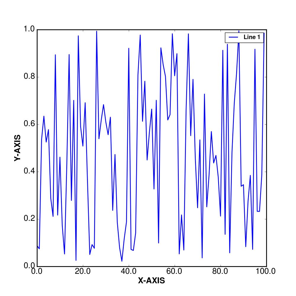
Any idea what I am missing or doing wrong in order to get the axis ticks label in bold?
EDIT
I have updated my code using toms response. However I now have another problem, as I need to use datetime on the x-axis, this has not the same effect as on the normal y-axis (sorry for not putting this in in the original question, but I did not think it would change things):
# plotting libs
from pylab import *
from matplotlib import rc, rcParams
import matplotlib.dates as dates

# datetime
import datetime

if __name__=='__main__':

  tmpData = np.random.random( 100 )
  base = datetime.datetime(2000, 1, 1)
  arr = np.array([base + datetime.timedelta(days=i) for i in xrange(100)])


  # activate latex text rendering
  rc('text', usetex=True)
  rc('axes', linewidth=2)
  rc('font', weight='bold')

  rcParams['text.latex.preamble'] = [r'\usepackage{sfmath} \boldmath']

  #create figure
  f = figure(figsize=(10,10))

  ax = gca()

  plot(np.arange(100), tmpData, label=r'\textbf{Line 1}', linewidth=2)

  ylabel(r'\textbf{Y-AXIS}', fontsize=20)
  xlabel(r'\textbf{X-AXIS}', fontsize=20)

  ax.xaxis.set_tick_params(labelsize=20)
  ax.yaxis.set_tick_params(labelsize=20)

  ax.xaxis.set_major_formatter(dates.DateFormatter('%m/%Y'))
  ax.xaxis.set_major_locator(dates.MonthLocator(interval=1))


  legend()
Now my result looks like this:
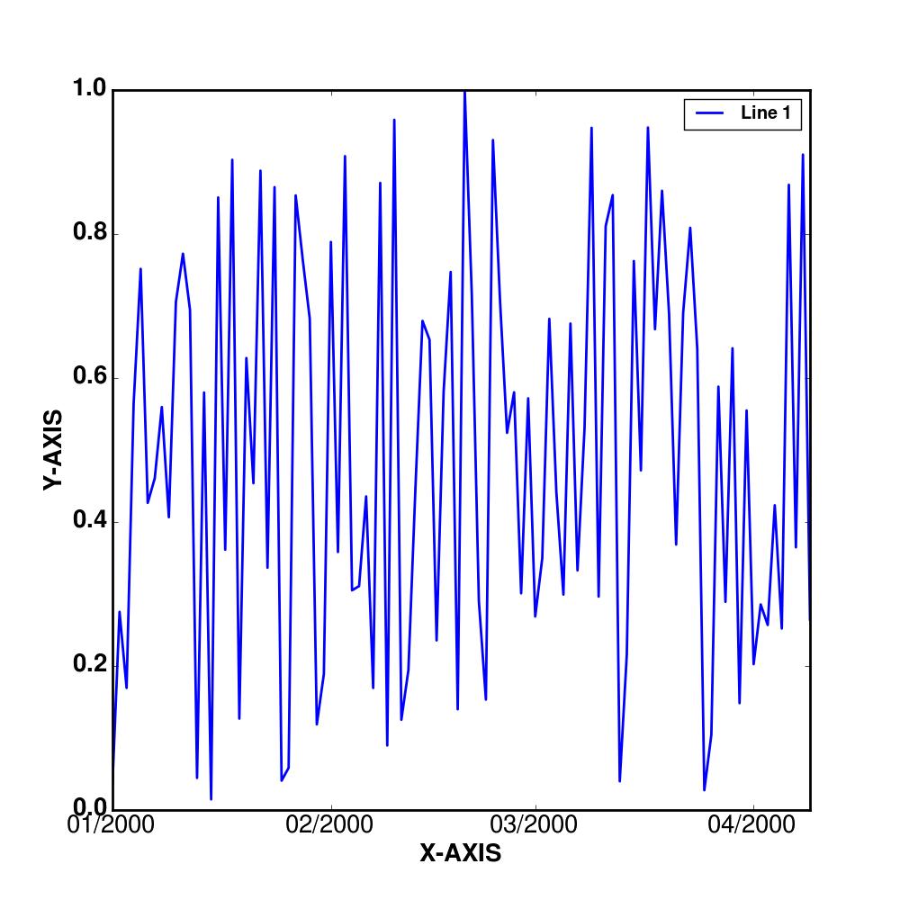
It seems to be that the changes doe not affect the display or rather the weight of the x-axis ticks labels.


 已为社区贡献126440条内容

所有评论(0)