I would like to make a graph with a multi-level x axis like in the following picture: 
import plotly.graph_objects as go
fig = go.Figure()
fig.add_trace(
  go.Scatter(
    x = [df['x'], df['x1']],
    y = df['y'],
    mode='markers'
  )
)
But also I would like to put jitter on the x-axis like in the next picture: 
So far I can make each graph independently using the next code:
import plotly.express as px
fig = px.strip(df,
               x=[df["x"], df['x1']],
               y="y",
               stripmode='overlay')
Is it possible to combine the jitter and the multi-level axis in one plot?
Here is a code to reproduce the dataset:
import numpy as np
import pandas as pd
import random

'''Create DataFrame'''
price = np.append(
  np.random.normal(20, 5, size=(1, 50)), np.random.normal(40, 2, size=(1, 10))
)
quantity = np.append(
  np.random.randint(1, 5, size=(50)), np.random.randint(8, 12, size=(10))
)

firstLayerList = ['15 in', '16 in']
secondLayerList = ['1/2', '3/8']
vendorList = ['Vendor1','Vendor2','Vendor3']

data = {
  'Width':  [random.choice(firstLayerList) for i in range(len(price))],
  'Length': [random.choice(secondLayerList) for i in range(len(price))],
  'Vendor': [random.choice(vendorList) for i in range(len(price))],
  'Quantity': quantity,
  'Price':  price
}
df = pd.DataFrame.from_dict(data)
Firstly - thanks for the challenge! There aren't many challenging Plotly questions these days.
The key elements to creating a scatter graph with jitter are:
- Using
mode: 'box' - to create a box-plot, not a scatter plot.
- Setting
'boxpoints': 'all' - so all points are plotted.
- Using
'pointpos': 0 - to center the points on the x-axis.
- Removing (hiding!) the whisker boxes using:
'fillcolor': 'rgba(255,255,255,0)''line': {'color': 'rgba(255,255,255,0)'}
DataFrame preparation:
This code simply splits the main DataFrame into a frame for each vendor, thus allowing a trace to be created for each, with their own colour.
df1 = df[df['Vendor'] == 'Vendor1']
df2 = df[df['Vendor'] == 'Vendor2']
df3 = df[df['Vendor'] == 'Vendor3']
Plotting code:
The plotting code could use a for-loop if you like. However, I've intentionally kept it more verbose, so as to increase clarity.
import plotly.io as pio

layout = {'title': 'Categorical X-Axis, with Jitter'}
traces = []

traces.append({'x': [df1['Width'], df1['Length']], 'y': df1['Price'], 'name': 'Vendor1', 'marker': {'color': 'green'}})
traces.append({'x': [df2['Width'], df2['Length']], 'y': df2['Price'], 'name': 'Vendor2', 'marker': {'color': 'blue'}})
traces.append({'x': [df3['Width'], df3['Length']], 'y': df3['Price'], 'name': 'Vendor3', 'marker': {'color': 'orange'}})

# Update (add) trace elements common to all traces.
for t in traces:
    t.update({'type': 'box',
              'boxpoints': 'all',
              'fillcolor': 'rgba(255,255,255,0)',
              'hoveron': 'points',
              'hovertemplate': 'value=%{x}<br>Price=%{y}<extra></extra>',
              'line': {'color': 'rgba(255,255,255,0)'},
              'pointpos': 0,
              'showlegend': True})

pio.show({'data': traces, 'layout': layout})
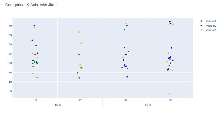
Graph:
The data behind this graph was generated using np.random.seed(73), against the dataset creation code posted in the question.

Comments (TL;DR):
The example code shown here uses the lower-level Plotly API, rather than a convenience wrapper such as graph_objects or express. The reason is that I (personally) feel it's helpful to users to show what is occurring 'under the hood', rather than masking the underlying code logic with a convenience wrapper.
This way, when the user needs to modify a finer detail of the graph, they will have a better understanding of the lists and dicts which Plotly is constructing for the underlying graphing engine (orca).
And this use-case is a prime example of this reasoning, as it’s edging Plotly past its (current) design point.


 已为社区贡献126442条内容

所有评论(0)