
python轻量绘图库toyplot初步教程
·
安装与示例
Toyplot是Python可视化库,专注于生成适合出版的、交互式的科学图表,输出格式以 SVG 为主,支持 HTML 嵌入和 PNG/PDF 导出。安装没什么好说的,支持conda和pip
pip install toyplot -i https://pypi.tuna.tsinghua.edu.cn/simple
简单示例
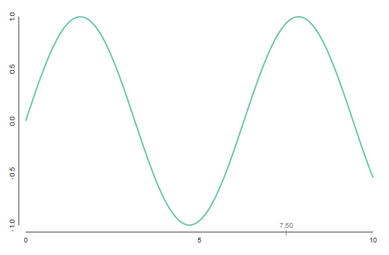
绘图代码如下,分三步走,先定义画布,再定义坐标,最后在坐标系上绘制数据。如想保存绘图结果,需额外导入toyplot.html。
import toyplot
import numpy as np

x = np.linspace(0, 10, 100)
y = np.sin(x)

canvas = toyplot.Canvas(width=600, height=400)
axes = canvas.cartesian()
axes.plot(x, y)

from toyplot import html
html.render(canvas, "output.html")

from toyplot import pdf
pdf.render(canvas, "output.pdf")
子图绘制
toyplot支持子图绘制,但控制逻辑更加原始,通过指定坐标系在画布上的位置和尺寸来进行布局,效果如下
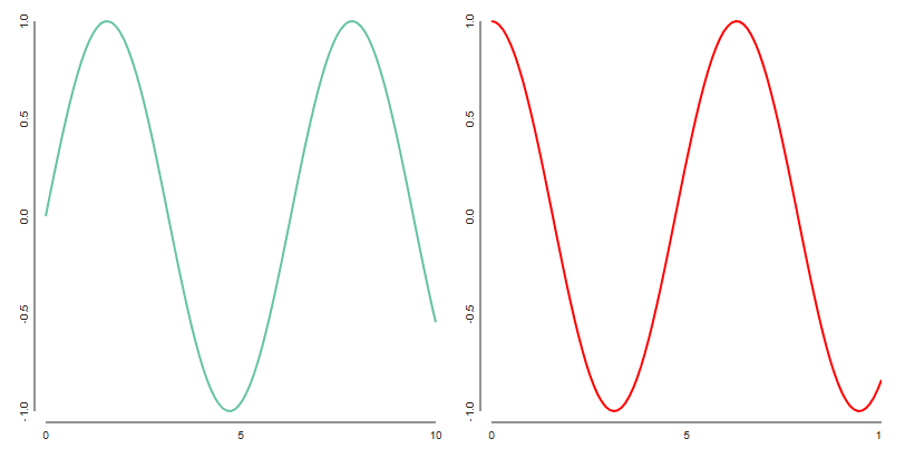
绘图代码如下,其中rect可指定坐标轴所在区域,输入参数分别是 x , y , w , h x,y,w,h x,y,w,h,即坐标和宽高。
import toyplot
import numpy as np

x = np.linspace(0, 10, 100)
y1 = np.sin(x)
y2 = np.cos(x)

canvas = toyplot.Canvas(width=800, height=400)
ax1 = canvas.cartesian(rect=(50, 20, 350, 350))
ax1.plot(x, y1)

ax2 = canvas.cartesian(rect=(450, 20, 350, 350))
ax2.plot(x, y2, color="red")

html.render(canvas, "output.html")
双坐标轴
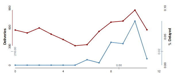
下面用toyplot绘制一个稍微复杂一点的图,其特点是,两组数据采用了不同的纵坐标,其中红图的数据范围是300到900,蓝图则是0到0.1,二者显然无法使用同样的坐标刻度
代码如下
import toyplot.data
data = toyplot.data.deliveries()

data["Delayed"] = 1.0 - data["On Time"].astype("float64")

canvas = toyplot.Canvas(width=600, height=300)
axes = canvas.cartesian(xlabel="Date", ylabel="Deliveries", ymin=0)
axes.plot(data["Delivered"], color="darkred", marker="o")
axes.y.spine.style = {"stroke":"darkred"}

axes = axes.share("x", ylabel="% Delayed", ymax=0.1)
axes.plot(data["Delayed"].astype("float64"), color="steelblue", marker="o")
axes.y.spine.style = {"stroke":"steelblue"}
html.render(canvas, "output.html")
代码中关键使用了axes.share这个方法,从而在红色坐标系的基础之上,创建了一个y轴最大值为0.1的蓝色坐标系。此外,代码中通过为spine.style成员赋值,以改数据点处的的颜色。
更多推荐

 12
12 0
0- 0


 已为社区贡献13条内容

所有评论(0)