
Vue3+TS 实战:打印、自动滚动、ECharts 可视化、自定义指令全攻略
·
在 Vue3 + TypeScript 项目开发中,DOM 打印、列表自动滚动、ECharts 数据可视化、TSX 自定义指令是高频刚需场景。本文整合企业级实战代码,封装通用方案,支持直接复制使用,完美适配后台管理系统、数据大屏、报表打印等业务场景。
一、Vue3+TS 实现 DOM 精准打印(带自定义页眉页脚 / 分页)
基于 print-js 实现 DOM 元素打印,支持自定义页眉页脚、A4 纸张、强制分页、样式隔离,完美解决 Vue 项目打印样式错乱、页眉页脚不生效问题。
核心代码
// 安装依赖:npm install print-js
import print from 'print-js'

// 调用打印方法
const handlePrint = () => {
  print({
    printable: 'print-section', // 目标打印DOM的id
    type: 'html',
    // 自定义打印样式:页眉、页脚、分页、边距
    style: `
      body {
        counter-reset: page 0;
      }
      /* 打印页面配置 */
      @page {
        size: A4;
        margin: 60px 80px 55px; /* 上下边距预留页眉页脚空间 */

        /* 左上角页眉 */
        @top-left {
          margin-bottom: 20px;
          margin-top: 22px;
          content: "学生健康体质监测";
          font-size: 11px;
          color: #46474c;
          border-bottom: 1px solid #b8becc;
          padding-bottom: 8px;
          font-weight: 400;
          font-family: Microsoft YaHei UI;
          letter-spacing: 0.02px;
          box-sizing: border-box;
        }

        /* 右下角页脚(自动页码) */
        @bottom-right {
          margin-bottom: 25px;
          content: "第 " counter(page) " 页";
          font-size: 9px;
          color: #5d6067;
          border-top: 1px solid #b8becc;
          padding-top: 6px;
          font-family: Microsoft YaHei UI;
          box-sizing: border-box;
        }
      }
      /* 打印容器样式 */
      #print-section {
        width: 100%;
        padding: 0;
      }
      /* 强制分页类(给需要分页的元素添加) */
      .page-break-always {
        page-break-after: always !important;
        break-after: page !important;
      }
      /* 禁止分页类(避免内容被截断) */
      .page-break-avoid {
        page-break-after: avoid !important;
        break-after: avoid !important;
      }
    `,
    scanStyles: false, // 关闭全局样式扫描,避免样式冲突
  })
}
使用说明
- 给需要打印的 DOM 设置
id="print-section"; - 需要强制分页的元素添加类名
page-break-always; - 表格 / 模块避免被分页截断添加类名
page-break-avoid; - 支持自定义页眉文字、页脚页码、边距、字体样式
二、Vue3+TS 手动实现表格无限自动滚动(悬浮暂停 / 底部回顶)
纯原生 JS 实现列表 / 表格自动滚动、鼠标悬浮暂停、滚动到底部暂停回顶,无第三方依赖,性能优异,适配数据大屏、排名列表等场景。
1. 定义响应式变量
import { ref, onMounted, onUnmounted } from 'vue'

// 滚动定时器
const scrollInterval = ref<number | null>(null)
// 鼠标悬浮状态
const isHovered = ref(false)
// 初始化延迟定时器
const initTimer = ref<number | null>(null)
// 底部暂停定时器
const bottomPauseTimer = ref<number | null>(null)
// 是否滚动到底部
const isAtBottom = ref(false)
// 是否正在滚动
const isScrolling = ref(false)
// 滚动容器DOM引用
const contentBoxRef = ref<HTMLDivElement | null>(null)
2. 模板结构
<template>
  <div
    class="content-box"
    ref="contentBoxRef"
    @mouseenter="isHovered = true"
    @mouseleave="isHovered = false"
  >
    <div
      v-for="(item, index) in props.dataList"
      :key="index"
      class="content-item"
    >
      <template v-for="(row, number) in props.headerList" :key="row.key">
        <div class="row-item" :style="getRowItemStyle(row)">
          <img
            v-if="!number"
            class="ranking-item"
            :src="getImg(index)"
            alt="排位"
          />
          <span class="ellipsis-text">{{ item[row.key] }}</span>
        </div>
      </template>
    </div>
  </div>
</template>
3. 滚动核心逻辑
/**
 * 启动自动滚动(初始延迟3秒)
 */
const startAutoScroll = () => {
  if (scrollInterval.value || isScrolling.value) return
  isScrolling.value = false
  // 初始延迟3秒后开始滚动
  initTimer.value = window.setTimeout(() => {
    isScrolling.value = true
    doScroll()
  }, 3000)
}

/**
 * 执行滚动逻辑
 */
const doScroll = () => {
  if (scrollInterval.value) return
  scrollInterval.value = window.setInterval(() => {
    if (!contentBoxRef.value || isHovered.value || !isScrolling.value) return
    const { scrollTop, scrollHeight, clientHeight } = contentBoxRef.value
    // 判断是否可滚动、是否触底
    const canScroll = scrollHeight > clientHeight
    const reachedBottom = scrollTop + clientHeight >= scrollHeight - 1

    if (canScroll) {
      // 触底逻辑:暂停3秒后回到顶部重新滚动
      if (reachedBottom && !isAtBottom.value) {
        isAtBottom.value = true
        isScrolling.value = false
        clearInterval(scrollInterval.value!)
        scrollInterval.value = null

        bottomPauseTimer.value = window.setTimeout(() => {
          contentBoxRef.value!.scrollTop = 0
          isAtBottom.value = false
          isScrolling.value = false
          startAutoScroll()
        }, 3000)
      }
      // 正常滚动
      else if (!reachedBottom) {
        contentBoxRef.value.scrollBy({
          top: 1,
          behavior: 'smooth',
        })
      }
    }
  }, 50) as unknown as number
}

/**
 * 停止所有滚动,清除定时器(防止内存泄漏)
 */
const stopAllScroll = () => {
  initTimer.value && clearTimeout(initTimer.value)
  bottomPauseTimer.value && clearTimeout(bottomPauseTimer.value)
  scrollInterval.value && clearInterval(scrollInterval.value)

  initTimer.value = null
  bottomPauseTimer.value = null
  scrollInterval.value = null
  isScrolling.value = false
  isAtBottom.value = false
}

// 生命周期:挂载启动、卸载销毁
onMounted(() => startAutoScroll())
onUnmounted(() => stopAllScroll())
核心特性
- 鼠标悬浮自动暂停,离开恢复滚动;
- 初始延迟 3 秒,滚动到底部暂停 3 秒后回顶;
- 平滑滚动,无卡顿,性能占用极低;
- 完整定时器销毁,避免内存泄漏。
三、Vue3+TS+ECharts 封装通用折线图(渐变 / 空状态 / 自适应)
封装高可用折线图组件,支持渐变填充、自定义样式、空数据状态、响应式渲染,统一 ECharts 初始化逻辑。
1. 通用 ECharts 初始化封装(全局复用)
// src/utils/echart.ts
import * as echarts from 'echarts'

/**
 * 统一初始化ECharts实例
 * @param echartsInstance echarts对象
 * @param id DOM节点ID
 * @param renderer 渲染方式
 * @returns ECharts实例
 */
export function getInitecharts(
  echartsInstance: typeof echarts,
  id: string,
  renderer: 'canvas' | 'svg' = 'canvas',
): echarts.ECharts {
  const dom = document.getElementById(id)
  if (!dom) throw new Error(`DOM节点 ${id} 不存在`)
  return echartsInstance.init(dom, null, {
    renderer,
    useDirtyRect: false,
  })
}
2. 折线图组件代码
<script setup lang="ts" name="RepsSingleLineChart">
import * as echarts from 'echarts'
import { ref, reactive, watch, onMounted, nextTick } from 'vue'
import { getInitecharts } from '@/utils/echart'
import type { EChartsOption } from 'echarts'
// Props类型定义
interface Props {
id: string
dataObj: Record<string, unknown> | null
}
const props = defineProps<Props>()
// ECharts实例
let myChart: echarts.ECharts | null = null
// 空数据提示
const emptyObj = reactive<Record<string, string>>({
dashboardPtglHyxxs: '暂无学校数据',
dashboardPtglRzqys: '暂无企业数据',
})
// 图表配置项
const option = ref<EChartsOption>({
grid: {
top: '30px',
left: '17px',
right: '20px',
bottom: '9px',
containLabel: true,
},
xAxis: {
type: 'category',
boundaryGap: false,
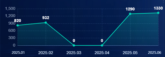
data: ['2025.01', '2025.02', '2025.03', '2025.04', '2025.05', '2025.06'],
axisTick: { show: false },
axisLine: {
lineStyle: { color: 'rgba(153,204,255,0.50)', width: 1 }
},
axisLabel: { color: '#DAECFF', fontSize: 14 },
splitLine: {
lineStyle: { color: 'rgba(153,204,255,0.20)', type: 'dashed' }
}
},
yAxis: {
type: 'value',
axisLabel: { color: 'rgba(218,236,255,0.60)', fontSize: 14 },
axisLine: { show: false },
axisTick: { show: false },
splitLine: {
lineStyle: { color: 'rgba(153,204,255,0.20)', type: 'dashed' }
}
},
series: [
{
data: [820, 932, 0, 0, 1290, 1330],
type: 'line',
symbol: 'circle',
symbolSize: 6,
label: {
show: true,
position: 'top',
color: '#ffffff',
fontSize: 14,
fontWeight: 'bold'
},
// 渐变填充
areaStyle: {
color: {
type: 'linear',
x: 0, y: 0, x2: 0, y2: 1,
colorStops: [
{ offset: 0, color: 'rgba(0,230,191,0.30)' },
{ offset: 1, color: 'rgba(0,230,191,0.10)' }
]
}
},
lineStyle: { color: '#00E5BF', width: 2 },
itemStyle: {
color: '#00e5bf',
borderColor: 'rgba(0,229,191,0.40)',
borderWidth: 3
}
}
]
})
// 渲染图表
const getRender = () => {
myChart?.dispose()
myChart = getInitecharts(echarts, props.id)
nextTick(() => {
if (!myChart) return
// 有数据渲染图表
if (props.dataObj && Object.keys(props.dataObj).length) {
myChart.setOption(option.value)
}
// 无数据显示空状态
else {
myChart.setOption({
tooltip: { show: false },
graphic: {
elements: [{
type: 'group', left: 'center', top: 'center', silent: true,
children: [
{ type: 'image', style: { image: '/src/assets/img/table-empty.png', width: 88, height: 88 } },
{ type: 'text', style: { text: emptyObj[props.id], fontSize: 14, fill: 'rgba(255,255,255,.8)' } }
]
}]
}
})
}
})
}
// 监听数据变化
watch(() => props.dataObj, () => getRender(), { deep: true })
onMounted(() => getRender())
</script>
<template>
<div :id="props.id" class="line-chart" />
</template>
<style lang="less" scoped>
.line-chart {
width: 100%;
height: 100%;
}
</style>四、Vue3+TS+ECharts 自定义柱状图(分段柱状 / 空状态)
使用 ECharts custom 自定义渲染,实现分段式柱状图(多矩形堆叠效果),支持数值显示、渐变样式、空数据占位。
完整组件代码
<script setup lang="ts" name="RepsSingleBarChart">
import * as echarts from 'echarts'
import { ref, reactive, watch, onMounted, nextTick } from 'vue'
import { getInitecharts } from '@/utils/echart'
interface Props {
id: string
dataObj: Record<string, unknown> | null
}
const props = defineProps<Props>()
// 自定义配置类型
interface SeriesOption {
type: string
data: number[]
renderItem?: (params: any, api: any) => any
encode?: { x: number; y: number }
}
let myChart: echarts.ECharts | null = null
const emptyObj = reactive<Record<string, string>>({
dashboardPtglRzxxs: '暂无入驻学校',
})
const option = ref<{
tooltip?: any; grid?: any; xAxis?: any; yAxis?: any; series?: SeriesOption[]
}>({
tooltip: { show: false },
grid: { top: '31px', left: '17px', right: '21px', bottom: '9px', containLabel: true },
xAxis: [{
type: 'category',
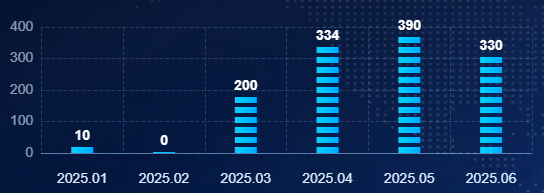
data: ['2025.01', '2025.02', '2025.03', '2025.04', '2025.05', '2025.06'],
axisTick: { show: false },
axisLine: { lineStyle: { color: 'rgba(153,204,255,0.50)' } },
axisLabel: { color: '#DAECFF', fontSize: 14 },
splitLine: { lineStyle: { color: 'rgba(153,204,255,0.20)', type: 'dashed' } }
}],
yAxis: [{
type: 'value',
axisLabel: { color: 'rgba(218,236,255,0.60)', fontSize: 14 },
axisLine: { show: false },
axisTick: { show: false },
splitLine: { lineStyle: { color: 'rgba(153,204,255,0.20)', type: 'dashed' } }
}],
// 自定义分段柱状图
series: [{
type: 'custom',
data: [10, 0, 200, 334, 390, 330],
encode: { x: 0, y: 1 },
renderItem: (_, api) => {
const gap = 4 // 分段间距
const segWidth = 22 // 分段宽度
const segHeight = 6 // 分段高度
const base = api.coord([api.value(0), 0])
const value = api.coord([api.value(0), api.value(1)])
let segCount = Math.round((base[1] - value[1]) / (segHeight + gap))
const number = api.value(1)
let children: any[] = []
segCount === 0 && number && (segCount = 1)
// 生成分段矩形
for (let i = 0; i < segCount; i++) {
const y = base[1] - segHeight - i * (segHeight + gap)
children.push({
type: 'rect',
shape: { x: value[0] - segWidth / 2, y, width: segWidth, height: segHeight },
style: {
fill: new echarts.graphic.LinearGradient(0,0,1,0, [
{ offset:0, color:'#00d4ff' },
{ offset:1, color:'#00aaff' }
])
}
})
}
// 数值为0时特殊处理
if (segCount === 0) {
children = [
{ type: 'rect', shape: { x: value[0]-11, y: base[1]-1, width:22, height:1 }, style: { fill:'#00d4ff' } },
{ type: 'text', style: { text: '0', fill:'#fff', fontSize:14, textAlign:'center' }, position: [value[0], base[1]-24] }
]
} else {
// 显示数值
children.push({
type: 'text',
style: { text: number.toString(), fill: '#fff', fontSize:14, fontWeight:700, textAlign:'center' },
position: [value[0], base[1] - (segHeight+gap)*segCount - 20],
z:10
})
}
return { type: 'group', children, silent: true }
}
}]
})
// 渲染逻辑与折线图一致
const getRender = () => {
myChart?.dispose()
myChart = getInitecharts(echarts, props.id)
nextTick(() => {
if (!myChart) return
props.dataObj && Object.keys(props.dataObj).length
? myChart.setOption(option.value)
: myChart.setOption({ /* 空状态配置 */ })
})
}
watch(() => props.dataObj, () => getRender(), { deep: true })
onMounted(() => getRender())
</script>
<template>
<div :id="props.id" class="bar-chart" />
</template>
<style lang="less" scoped>
.bar-chart { width: 100%; height: 100%; }
</style>五、Vue3 TSX/JSX 中使用自定义指令(权限指令实战)
Vue3 中TSX/JSX 不支持 v - 指令语法,需通过 withDirectives + resolveDirective 实现自定义指令(如权限控制、按钮禁用等)。
实战代码(权限指令)
import {
  createVNode, h, withDirectives, resolveDirective
} from 'vue'
import { Button, Modal, message } from 'ant-design-vue'
import { ExclamationCircleOutlined } from '@ant-design/icons-vue'

// 解析自定义指令(如权限指令 hasPermi)
const permission = resolveDirective('hasPermi')

// 表格列渲染
const columns = [
  {
    title: '操作',
    customRender: ({ record }) => {
      return h('div', [
        // 普通按钮
        h(Button, {
          type: 'link',
          onClick: () => {
            roleDetailProps.roleId = record.roleId
            roleDetailProps.visible = true
          }
        }, () => '详情'),

        // 带权限指令的按钮
        withDirectives(
          h(Button, {
            type: 'link',
            onClick: () => {
              userAssignmentProps.roleId = record.roleId
              userAssignmentProps.visible = true
            }
          }, () => '用户分配'),
          // 绑定指令:[指令实例, 指令值]
          [[permission, 'szjz_qxgl_yyjsqx_yhfp']]
        ),

        // 删除按钮(权限+二次确认)
        withDirectives(
          h(Button, {
            type: 'link',
            danger: true,
            onClick: () => {
              Modal.confirm({
                title: `是否删除${record.name}?`,
                icon: createVNode(ExclamationCircleOutlined),
                onOk: () => {
                  return axios.removePrivilegeRole(record.id).then(res => {
                    message.success('删除成功')
                    InstanceType.reload()
                  })
                }
              })
            }
          }, () => '删除'),
          [[permission, 'szjz_qxgl_yyjsqx_sc']]
        )
      ])
    }
  }
]
核心语法
// 格式:withDirectives(渲染的VNode, [[指令, 参数]])
withDirectives(h(Button, {}, () => '按钮'), [[指令实例, '指令参数']])
总结
本文覆盖 Vue3+TS 项目五大高频实战场景,所有代码均为企业级生产可用版本:
- DOM 打印:自定义页眉页脚、分页、样式隔离,解决打印痛点;
- 自动滚动:纯原生实现,悬浮暂停、触底回顶,性能拉满;
- ECharts 折线图:渐变、空状态、统一封装,开箱即用;
- 自定义柱状图:分段渲染、数值显示、视觉效果拉满;
- TSX 自定义指令:权限控制实战,解决 TSX 指令不生效问题。
代码可直接复制到项目中使用,适配 Vue3 + TypeScript + Vite 全场景,欢迎收藏、转发、交流!
更多推荐

 8
8 0
0- 0


 已为社区贡献1条内容

所有评论(0)