vue中使用 echarts 多条折线图使用及相关配置
自己在工作中经常用到echarts来实现一些统计功能和效果,在这里对自己使用较多的做简单的记录,方便自己后期查阅。同时希望帮助更多人。首先简单介绍一下,ECharts是一个纯JavaScript图表库,底层依赖于轻量级的Canvas类库ZRender,基于BSD开原协议,是一款非常优秀的可视化前端框架。1.首先在官网 选择合适的下载版本2.引入Echartsimport echarts f...
·
自己在工作中经常用到echarts来实现一些统计功能和效果,在这里对自己使用较多的做简单的记录,方便自己后期查阅。同时希望帮助更多人。
首先简单介绍一下,ECharts是一个纯JavaScript图表库,底层依赖于轻量级的Canvas类库ZRender,基于BSD开原协议,是一款非常优秀的可视化前端框架。
1.首先在官网 选择合适的下载版本
2.引入Echarts
import echarts from 'echarts'
3.准备一个DOM容器
<div id="echarts"></div>
4.绘制一个简单的折线图
所有代码如下:
<template>
  <div>
    <div id="echarts"></div>
  </div>
</template>

<script>
import echarts from 'echarts'
export default {
  data() {
    return {
      // 颜色配置
      colorConfigList: ['#1890FF', '#2FC25B','#FACC14','#B381E6','#13C2C2','#E6965C','#7564CC','#3047a8','#41D9C7','#8543E0','#5C8EE6', '#F04864', '#3436C7', '#D598D9'],
      colorbgcTop: ['rgba(24, 144, 255, 0.6)', 'rgba(47, 194, 91, 0.6)'],
      colorbgcBot: ['rgba(24, 144, 255, 0.2)', 'rgba(47, 194, 91, 0.2)']
    }
  },
  created() {
    this.$nextTick(() => {
      //  执行echarts方法
      this.initEcharts()
    })
  },
  methods: {
    initEcharts() {
      var myChart = echarts.init(document.getElementById('echarts'))
      myChart.showLoading({
        color: '#3a3c64',
        textColor: '#000',
        maskColor: 'rgba(255, 255, 255, 0.8)'
      }) //加载及样式
      let urls =
        ' .../confcenter/linkTopology/lineDetail'
      this.$axios
        .post(urls, {
          appName: 'ecs-tak-business-service',
          callType: 'entry-rocketmq',
          entryFlag: true,
          event: 'MARKET_OMS_ORDER_INFO_TO_ECS_PRODUCER',
          linkName: '推送ECS订单信息',
          normalType: 'TPS',
          type: 'entry-rocketmq'
        })
        .then(res => {
          myChart.hideLoading({
            color: '#3a3c64',
            textColor: '#000',
            maskColor: 'rgba(255, 255, 255, 0.8)'
          }) // 加载结束及样式
          const { code, data: lineData } = res
          const seriesdata = []
          const legendData = []
          lineData.map((e, i) => {
            legendData.push(e.callEvent)
            let seriesDataMap = {
              name: e.callEvent,
              type: 'line',
              data: e.list,
              smooth: true,
              lineStyle: {
                normal: {
                  width: 1
                }
              }, //线条样式。
              areaStyle: {
                normal: {
                  color: new echarts.graphic.LinearGradient( 0,0,0,1,
                    [{
                        offset: 0,
                        color: this.colorbgcTop
                      },
                      {
                        offset: 1,
                        color: this.colorbgcBot
                      }]
                    // false
                  ),
                  shadowColor: 'rgba(0, 0, 0, 0.1)',
                  shadowBlur: 10
                }
              } //折线图区域渐变色
              // itemStyle: {
              //   normal: {
              //     color: 'rgb(137,189,27)',
              //     borderColor: 'rgba(137,189,2,0.27)',
              //     borderWidth: 12
              //   }
              // } //折线拐点标志的样式。
            }
            seriesdata.push(seriesDataMap)
              const yAxisNameMap = {
              TPS: 'TPS',
              Time: 'Time'
               } // 坐标轴
            myChart.setOption({
              backgroundColor: '#fff', // 折线图背景
              title: {
                text: '中转装卸分拣流量模型',
                left: 'center'
              }, // 坐标标题 及样式
              color: this.colorConfigList, // 自定义折线颜色
              series: seriesdata,
              yAxis: {
                name: yAxisNameMap.TPS,
                splitLine: {
                  show: false
                }
                // axisLabel: {
                //   color: '#fff',
                //   fontSize: 10
                // }
                // 坐标轴颜色
                // axisLine: {
                //   lineStyle: {
                //     color: '#0045ac',
                //     width: 1
                //   }
                // }
              },
              grid: {
                left: '3%',
                right: '10%',
                bottom: '15%',
                containLabel: true
              },
              tooltip: {
                trigger: 'axis',
                axisPointer: {
                  type: 'line'
                }
              },
              legend: {
                left: 'center',
                bottom: '0%',
                // itemWidth: 13,
                // itemHeight: 13,
                icon: 'line',
                // type: 'scroll',
                data: legendData,
                textStyle: {
                  color: '#000'
                },
                pageIconColor: '#ccc'
              }, // 图例代表及样式
              xAxis: {
                name: yAxisNameMap.Time,

                // axisLabel: {
                //   color: '#fff',
                //   fontSize: 10
                // },x轴线下值
                // axisLine: {
                //   lineStyle: {
                //     color: '#0045ac',
                //     width: 1
                //   }
                // }, // x轴线条颜色
                type: 'time',
                splitLine: {
                  show: false
                }
              },
              toolbox: {
                right: '30',
                top: '10',
                orient: 'vertical',
                feature: {
                  dataZoom: {
                    yAxisIndex: 'none'
                  },
                  restore: {}
                },
                itemGap: 15
              } // 对图例使用工具
            })
          })
        })
    }
  },
  mounted() {}
}
</script>

<style lang="less" scoped>
.dialog-footer {
  text-align: center;
  margin: 10px;
}
#echarts {
  width: 100%;
  height: 300px;
}
</style>
5 . 接口返回的数据结构

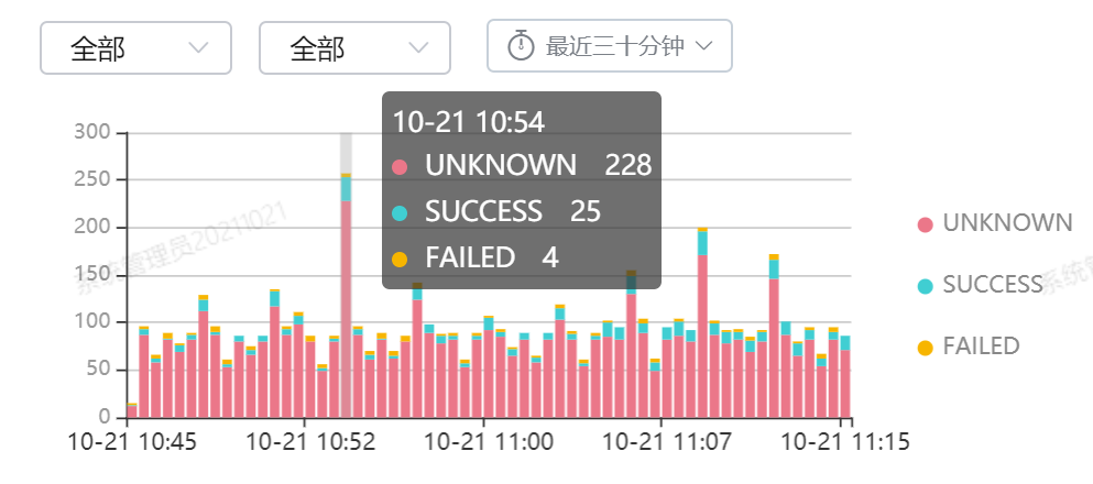
6. 最终效果图

相关API可参考echarts官网

前往低代码交流专区
更多推荐
 3
3 0
0- 0


 已为社区贡献12条内容

所有评论(0)