How to change Vuetify v-autocomplete menu border radius style?
Answer a question
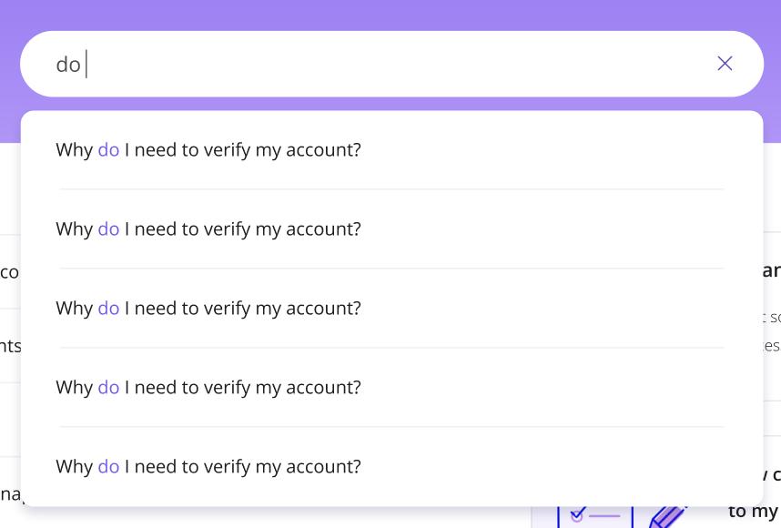
I want to change the box style of the v-autocomplete drop-down list and give a border-radius style to the drop-down list, as you can see in the image below.

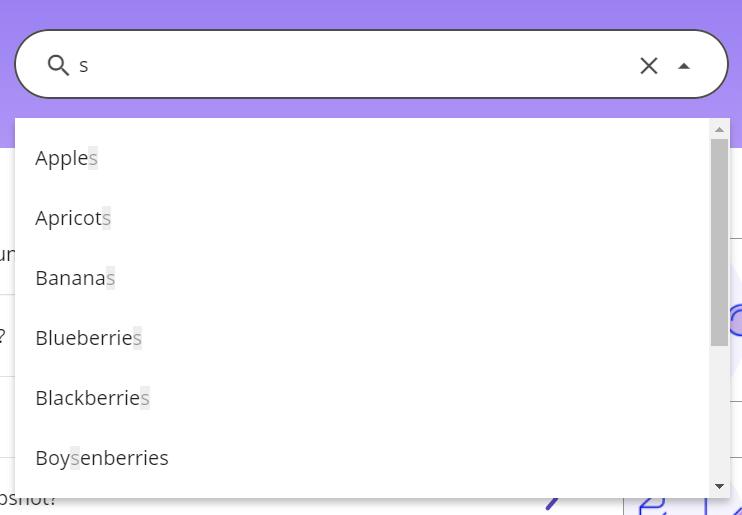
What I have designed so far is like the image below.

So far, I've given the menu-props property directly to the v-autocomplete tag:
<v-autocomplete
  :menu-props="{
    nudgeBottom: 15 + 'px',
    zIndex: 2,
    allowOverflow
  }"
  :items="searchBarInfo"
  rounded
  outlined
  filled
  clearable
  item-color="deep-purple"
  height="50"
  placeholder="Search the ..."
  color="rgba(0, 0, 0, 0.7)"
  background-color="white"
  prepend-inner-icon="mdi-magnify"
  class="my-text-style "
  :no-data-text="($vuetify.noDataText = 'Nothing found')">
</v-autocomplete>
The above code only adds the v-autocomplete tag but not the border-radius style.
Is there a way to make something like the image you see with Vuetify's v-autocomplete?
Any help would be appreciated.
Answers
Using menu-props: { rounded }
For Vuetify's rounded menu borders, you can use the menu property called rounded to avoid modifying CSS directly. Pass it along with the other menu-props:
:menu-props="{
  nudgeBottom: 15 + 'px',
  zIndex: 2,
  allowOverflow,
  rounded: 'xl'      // <-- Here ✅
}"
On the Vuetify Border radius page you can see some of the values it accepts:
- 0
- sm
- md
- lg
- xl
- pill
- circle
The xl value seems to match your image best. Here is a demo
-or- Modifying CSS
Or if you want to modify the CSS directly, use a more specific selector than the Vuetify default. For example:
.v-application .v-autocomplete__content.menuable__content__active {
  border-radius: 100px !important;
}
!important is necessary for superseding Vuetify's own !important
更多推荐
 已为社区贡献21230条内容


所有评论(0)