Vue ElementUI 修改消息提示框样式—messageBox 的大小
Vue ElementUI 修改消息提示框样式—messageBox 的大小
·
在窄屏模式下(移动端或pda),提示框的宽度太宽,会出现显示不完全的问题。 应当如何修改 ElementUI 的样式呢?

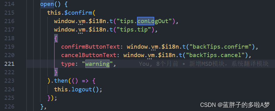
  open() {
      this.$confirm(
        window.vm.$i18n.t("tips.conLogOut"),
        window.vm.$i18n.t("tips.tip"),
        {
          confirmButtonText: window.vm.$i18n.t("backTips.confirm"),
          cancelButtonText: window.vm.$i18n.t("backTips.cancel"),
          type: "warning",
        }
      ).then(() => {
        this.logout();
      });
    },
 <style scoped>
  .el-message-box {
    width: 235px;
}
</style>

此时在scoped的style中写是无效的,因为ElementUI组件不可以给样式添加scoped,因此必须去掉scoped;但是去掉scoped后不满足单组件的CSS。
解决方案
1、附加在没有scoped的style中
<style scoped>
  ...
</style>
<style>
  ...
  .el-message-box {
    width: 235px;
  }
</style>

2、给消息提示框加类名(荐)
更加推荐这个messageBox添加一个类名,比较好用并且不会影响到其他页面的弹框样式。

this.$confirm('确认注销吗?', '提示', {
  customClass: 'elmessageWidth'
}).then(() => {
  this.$message({
    message: '已成功注销',
    type: 'success'
  })
}).catch(() => {  })
<style scoped>
  ...
</style>
<style>
 .elmessageWidth {
    width: 350px;
  }
</style>
或者直接important
@media (max-width: 730px) {
  .elmessageWidth{
    width: 350px !important;
  }
 }


前往低代码交流专区
更多推荐

 10
10 0
0- 0


 已为社区贡献36条内容

所有评论(0)