
Element Plus框架快速上手详解(一)
✍、Element Plus框架快速上手详解(一)
Element Plus框架快速上手详解
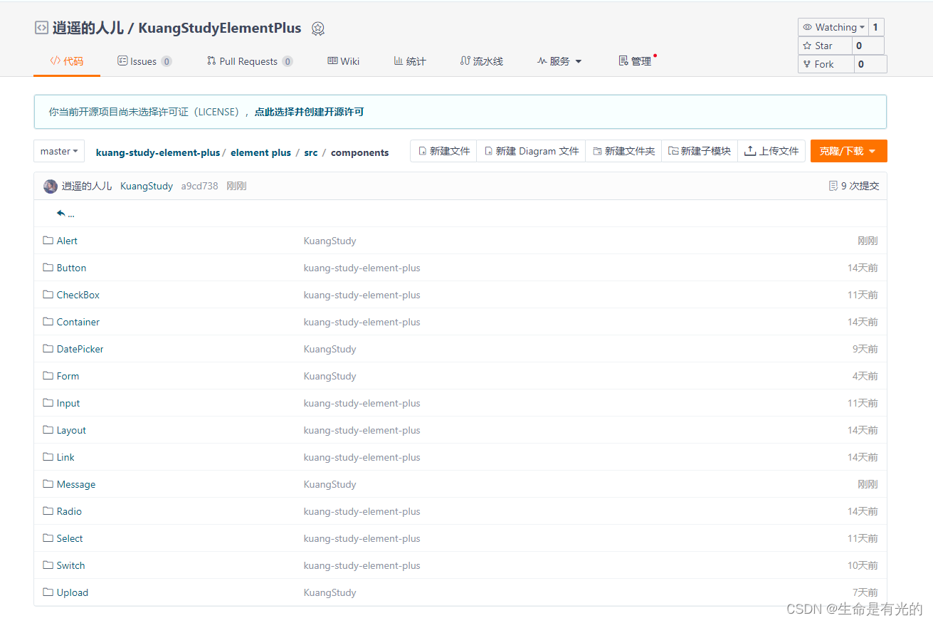
随笔记源码: 逍遥的人儿 / KuangStudyElementPlus
1、Element Plus
-
官方定义:
网站快速成型工具和桌面端组件库
Element Plus 就是基于 Vue 的一个 UI 框架,该框架基于 Vue 开发了很多相关组件,方便我们快速开发页面。是由饿了么前端团队开发并开源。
Tips:为什么 Element 组件属性前面有的需要加冒号
:,有的不需要
- 如果不加冒号或v-bind,那么赋的就是值
- 如果加了冒号或v-bind,赋的就是变量
- 参考文章:【精选】为什么 Vue3.js / Element+ 组件属性前面有的需要添加冒号,有的不需要?_vue3 冒号-CSDN博客
口诀:带了冒号,则不带双引号;不带冒号,则带双引号
<el-radio :label="1" v-model="radio">Option A</el-radio>
<el-radio label="2" v-model="radio1">Option B</el-radio>


<script setup>
	const radio = ref(1)
	const radio1 = ref("2")
</script>
在Element Plus 文档中的默认值是 boolean 的属性使用一律加冒号
:
1.1、安装
- 通过脚手架Vite创建Vue项目
npm create vite@latest
- 安装
element-plus
npm install element-plus --save
- 在
main.js完整引入依赖
import { createApp } from 'vue'
import ElementPlus from 'element-plus'
import 'element-plus/dist/index.css'
import App from './App.vue'

const app = createApp(App)

app.use(ElementPlus)
app.mount('#app')
- 在
App.vue中使用
<script setup>

</script>

<template>
    <div>
      <!--使用默认按钮-->
      <el-row class="mb-4">
        <el-button>Default</el-button>
        <el-button type="primary">Primary</el-button>
        <el-button type="success">Success</el-button>
        <el-button type="info">Info</el-button>
        <el-button type="warning">Warning</el-button>
        <el-button type="danger">Danger</el-button>
      </el-row>
    </div>
</template>

<style scoped>

</style>
- 启动项目
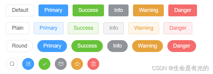
2、Button

-
基础用法:
<el-button></el-button> -
默认按钮:
type="xxx" -
简洁按钮:
plain -
圆角按钮:
round -
图标按钮:
:icon="xxx"
  <el-row class="mb-4">
    <!--1.使用默认按钮-->
    <el-button type="primary">Primary</el-button>
    <!--2.使用简洁按钮:鼠标移动上去才会显示背景颜色-->
    <el-button type="primary" plain>Primary</el-button>
    <!--3.使用圆角按钮-->
    <el-button type="primary" round>Primary</el-button>
    <!--4.使用图标按钮-->
    <el-button type="primary" :icon="Edit" circle />
  </el-row>
在
Element plus中所有组件的属性全都写在组件标签中
3、Link链接

- 基础用法:
<el-link></el-link> - 禁用状态:
disabled - 下划线:
:underline - 图标链接:
:icon
<!--1.文字链接-->
<el-link type="primary" href="https://element-plus.org" target="_blank">primary</el-link>

<!--2.文字链接禁用-->
<el-link type="primary" disabled>primary</el-link>

<!--2.文字链接下划线-->
<el-link :underline="false">没有下划线</el-link>
<el-link>有下划线</el-link>

<!--2.图标链接-->
<el-link :icon="Edit">Edit</el-link>
4、Layout布局
通过基础的 24 分栏,迅速简便地创建布局。
-
行的属性写在
<el-row>标签里面,列的属性写在<el-col>标签里面 -
基础布局:
:span="xx"<el-row> <el-col :span="24"></el-col> </el-row> -
列间距:
<el-row :gutter="20">- 行提供
gutter属性来指定列之间的间距,其默认值为0。
<el-row :gutter="20"> <el-col :span="6"><div class="col">占用四分之一6</div></el-col> <el-col :span="6"><div class="col">占用四分之一6</div></el-col> <el-col :span="6"><div class="col">占用四分之一6</div></el-col> </el-row> - 行提供
-
列偏移:
<el-col :span="6" :offset="6"></el-col>- 列提供
offset属性可以指定分栏偏移的栏数
<el-col :span="6" :offset="6"><div class="col">占用四分之一6</div></el-col>踩坑:
- 列提供
5、Container布局容器
-
<el-container>:外层容器。- 当子元素中包含
<el-header>或<el-footer>时,全部子元素会垂直上下排列, 否则会水平左右排列。
- 当子元素中包含
-
<el-header>:顶栏容器 -
<el-aside>:侧边栏容器 -
<el-main>:主要区域容器 -
<el-footer>:底栏容器 -
水平容器:
<el-container direction="horizontal"></el-container> -
垂直容器:
<el-container direction="vertical"></el-container>
<el-container direction="horizontal">
  <el-header>Header</el-header>
  <el-aside>Aside</el-aside>
  <el-main>Main</el-main>
  <el-footer>Footer</el-footer>
</el-container>
6、Radio单选框
- Radio 单选框需要
v-model和label两个属性
<template>
    <el-radio-group v-model="radio1">
      <el-radio label="男" size="large">男</el-radio>
      <el-radio label="女" size="large">女</el-radio>
    </el-radio-group>
</template>


<script setup>
import { ref } from 'vue'

const radio1 = ref('男')
</script>
6.1、单选框组
结合el-radio-group元素和子元素el-radio可以实现单选组:
- 为
el-radio-group绑定v-model - 再为 每一个
el-radio设置好label属性即可
<template>
  <el-radio-group v-model="radio">
    <el-radio :label="3">Option A</el-radio>
    <el-radio :label="6">Option B</el-radio>
    <el-radio :label="9">Option C</el-radio>
  </el-radio-group>
</template>

<script setup>
import { ref } from 'vue'

const radio = ref(3)
</script>
6.2、事件
- 事件的使用也是和属性使用一致,都是直接写在对应的组件标签上
<el-radio label="1" size="large" border @change="A">Option A</el-radio>

<script setup>
const A = ()=>{
  alert('A')
}
</script>
7、Checkbox多选框
- 基本使用:
<el-checkbox></el-checkbox>
<el-checkbox v-model="checked">北京</el-checkbox>
<el-checkbox v-model="checked">上海</el-checkbox>
<el-checkbox v-model="checked">天津</el-checkbox>
-
禁用状态:标签加
disabled -
带有边框:标签加
border -
选中状态的值:
true-label='xx'
<template>
    <!-- 当选中时的值是北京 -->
	<el-checkbox v-model="checked1" true-label="北京">北京</el-checkbox>
    <el-checkbox v-model="checked1" true-label="上海">上海</el-checkbox>
</template>

<script>
	import { ref } from 'vue'
    const checked1 = ref('北京')
</script>
7.1、多选框组
适用于多个勾选框绑定到同一个数组的情景,通过是否勾选来表示这一组选项中选中的项。
- 基本用法:
<el-checkbox-group></el-checkbox-group>
<template>
  <el-checkbox-group v-model="checkList" @change="B">
    <el-checkbox label="北京" />
    <el-checkbox label="上海" />
    <el-checkbox label="西安" />
    <el-checkbox label="禁用" disabled />
    <el-checkbox label="郑州" disabled />
  </el-checkbox-group>
</template>

<script setup>
import { ref } from 'vue'


const checkList = ref(['北京', '郑州'])
const B = ()=> {
  console.log(checkList.value)
}

</script>
- 属性
label是选中状态的值:只有在checkbox-group或者绑定对象类型为array时有效
7.2、事件
- 事件的使用也是和属性使用一致,都是直接写在对应的组件标签上
<template>
	<el-checkbox v-model="checked2" @change="A">北京</el-checkbox>
</template>

<script setup>
	import { ref } from 'vue'
    const checked2 = ref(false)

    const A = ()=> {
  		console.log(checked2.value)
	}
</script>
8、Input输入框组件
- 基本使用:
<el-input v-model="input"></el-input>
<template>
  <h1>基础用法</h1>
  <el-input v-model="input" placeholder="请输入" />
</template>

<script setup>
import { ref } from 'vue'

const input = ref('')
</script>
-
禁用状态:标签加
disabled -
输入框加入清空按钮:标签加
clearable -
密码框:标签加
type=password show-password -
文本框输入限制:标签加
type=text maxlength="10" show-word-limit -
带图标输入框:标签加:
prefix-icon="User" suffix-icon="xxx"
8.1、事件
- 事件的使用也是和属性使用一致,都是直接写在对应的组件标签上
<template>
	<el-input v-model="input" placeholder="请输入" @blur="A"/>
</template>

<script setup>
import { ref } from 'vue'

const input = ref('')

const A = ()=> {
  alert("失去焦点")
}
</script>
- 失去焦点:
@blur - 获得焦点:
@focux - 事件传值:
change(value): 当输入框市区焦点或者用户按下 Enter 时触发input(value): 在 Input 值改变时触发
<template>
  <el-input v-model="input" placeholder="请输入" @blur="A" />

  <el-input v-model="input3" placeholder="请输入" @change="B" />

  <el-input v-model="input4" placeholder="请输入" @input="C" />

</template>


<script setup>
import { ref } from 'vue'

const input = ref('')
const input3 = ref('')
const input4 = ref('')

const A = ()=> {
  console.log("失去焦点")
}

// 当失去焦点或者按下Enter时触发,只触发一次
const B = (value)=> {
  console.log("改变" + value)
}

// 当input值改变就触发,可触发多次
const C = (value)=> {
  console.log("改变" + value)
}

</script>
clear:在点击由clearable属性生成的清空按钮时触发
8.2、方法
- 给标签加
ref="xxx"组件别名绑定数据 - 通过
xxx.value.方法名调用方法
<template>
    <el-input v-model="input5" ref="inputs"></el-input>
    <el-button @click="focusInput">点击</el-button>
</template>


<script setup>
import { ref } from 'vue'

const input5 = ref('')

const inputs = ref()
const focusInput = ()=> {
  // 点击按钮则聚焦
  inputs.value.focus()
}
</script>
9、Select选择器
- 基础用法
:label="xx"要展示的下拉文字:value="xx"选择后所对应的值
<template>
  <el-select v-model="username">
    <el-option
       v-for="item in options"
       :key="item.id"
       :label="item.name"
       :value="item.id" />
  </el-select>
</template>

<script setup>
import { ref } from 'vue'

// 当选中值时会赋给 username
const username = ref()

const options = [
  {id: 1, name: "张三"},
  {id: 2, name: "李四"},
  {id: 3, name: "王五"},
  {id: 4, name: "赵六"},
  {id: 5, name: "秦七"},
  {id: 6, name: "肥八"}
]
</script>
解释:el-option 选中的值会赋值给 el-select 的 username
- 有禁用选项:
el-option标签加:disabled="item.disabled",并且 options 禁用的对象也加disabled: true
<template>
  <el-select v-model="username">
    <el-option
       v-for="item in options"
       :key="item.id"
       :label="item.name"
       :value="item.id"
       :disabled="item.disabled" />
  </el-select>
</template>

<script setup>
// 当选中值时会赋给 username
const username = ref()

const options = [
  {id: 1, name: "张三"},
  {id: 2, name: "李四"},
  {id: 3, name: "王五",disabled: true},
  {id: 4, name: "赵六"},
  {id: 5, name: "秦七"},
  {id: 6, name: "肥八"}
]
</script>
-
禁用整个选择器组件:给
el-select标签加disabled -
可清空单选:给
el-select标签加clearable属性 (注:clearable属性仅适用于单选)
9.1、基础多选
- 为
el-select设置multiple属性即可启用多选
<template>
  	<el-select  v-model="username" multiple>
      <el-option
          v-for="item in options"
          :key="item.id"
          :label="item.name"
          :value="item.id" />
    </el-select>
</template>

<script setup>
import { ref } from 'vue'

const username = ref()


const options = [
  {id: 1, name: "张三"},
  {id: 2, name: "李四"},
  {id: 3, name: "王五",disabled: true},
  {id: 4, name: "赵六"},
  {id: 5, name: "秦七"},
  {id: 6, name: "肥八"}
]
</script>
9.2、事件
- 事件的使用也是和属性使用一致,都是直接写在对应的组件标签上
<template>
    <el-select  v-model="username" multiple @change="A">
      <el-option
          v-for="item in options"
          :key="item.id"
          :label="item.name"
          :value="item.id" />
    </el-select>
</template>

<script setup>
import { ref } from 'vue'

const username = ref()

const options = [
  {id: 1, name: "张三"},
  {id: 2, name: "李四"},
  {id: 3, name: "王五",disabled: true},
  {id: 4, name: "赵六"},
  {id: 5, name: "秦七"},
  {id: 6, name: "肥八"}
]

// 选中的值
const A = (value)=> {
  console.log(value)
}
9.3、方法
- 给标签加
ref="xxx"组件别名绑定数据 - 通过
xxx.value.方法名调用方法
<template>
    <el-select  v-model="username" multiple ref="selects">
      <el-option
          v-for="item in options"
          :key="item.id"
          :label="item.name"
          :value="item.id" />
    </el-select>
    <el-button @click="selectFocus">点击聚焦</el-button>
</template>

<script setup>
import { ref } from 'vue'

const selects = ref('')
const selectFocus = ()=> {
  selects.value.focus()
}
</script>
10、Switch开关
- 基础用法
<template>
	<el-switch v-model="value1" />
</template>

<script setup>
<script setup>

import { ref } from 'vue'
const value1 = ref(true)
</script>
-
禁用状态:给标签加
disabled -
加载状态:给标签加
loading -
添加图标:给标签加
:active-action-icon="View" :inactive-action-icon="Hide" inline-prompt -
文字描述:给标签加
active-text="是" inactive-text="否" inline-prompt -
扩展的 value 类型:设置
active-value和inactive-value属性, 它们接受Boolean、String或Number类型的值。
<template>
    <!--开关打开值是100,开关关闭值是0-->
    <el-switch
        v-model="value4"
        style="--el-switch-on-color: #13ce66; --el-switch-off-color: #ff4949"
        active-value="100"
        inactive-value="0"
    />
</template>


<script setup>
import { ref } from 'vue'
const value4 = ref('100')


</script>
10.1、事件
- 事件的使用也是和属性使用一致,都是直接写在对应的组件标签上
<template>
	<el-switch v-model="value1" @change="A"/>
</template>

<script setup>


const A = (value)=> {
  console.log(value)
}
</script>
10.2、方法
- 给标签加
ref="xxx"组件别名绑定数据 - 通过
xxx.value.方法名调用方法
<template>
    <el-switch v-model="value1" ref="switchs"/>
    <el-button @click="switchFocus">点击</el-button>
</template>

<script setup>
import { ref } from 'vue'

const value1 = ref(true)

const switchs = ref()
const switchFocus = ()=> {
  console.log("switch获得焦点")
  switchs.value.focus()
}
</script>
11、DatePicker日期选择器
- 基础用法:
<template>
    <el-date-picker
          v-model="value1"
          type="date"
          placeholder="请选择日期" />

</template>

<script setup>
import { ref } from 'vue'
const value1 = ref('')

</script>
- 只读:标签加
:readonly="true" - 禁用:标签加
:disabled="true" - 显示清除按钮:标签加
:clearable="true" - 显示时间范围:标签加
type="daterange"
<template>
    <el-date-picker
      v-model="value1"
      type="daterange"
      range-separator="至"
      start-placeholder="开始日期"
      end-placeholder="结束日期" />

</template>

<script setup>
import { ref } from 'vue'
const value1 = ref('')

</script>
-
输入框的格式:标签加
format="yyyy/MM/dd" -
设置快捷选项
<template>
    <el-date-picker
      v-model="value3"
      type="date"
      placeholder="请选择日期"
      :shortcuts="shortcuts" />

</template>

<script setup>
import { ref } from 'vue'
const value3 = ref('')

// 从官网复制
const shortcuts = [
  {
    text: '今天',
    value: new Date(),
  },
  {
    text: '昨天',
    value: () => {
      const date = new Date()
      date.setTime(date.getTime() - 3600 * 1000 * 24)
      return date
    },
  },
  {
    text: '一周前',
    value: () => {
      const date = new Date()
      date.setTime(date.getTime() - 3600 * 1000 * 24 * 7)
      return date
    },
  },
]

</script>
- 设置禁用日期:标签加
:disabled-date="disabledDate"
<template>
    <el-date-picker
      v-model="value3"
      type="date"
      placeholder="请选择日期"
      :disabled-date="disabledDate" />

</template>

<script setup>
import { ref } from 'vue'
const value3 = ref('')


const disabledDate = (time) => {
  // 如果输入框选择的时间 > 当前的时间 ,则不可选,也就是只能选 当前时间之前的
  return time.getTime() > Date.now()
}
</script>

11.1、事件
- 事件的使用也是和属性使用一致,都是直接写在对应的组件标签上
<template>
    <el-date-picker
      v-model="value4"
      type="date"
      placeholder="请选择日期"
      @change="handleChange" />

</template>

<script setup>
import { ref } from 'vue'
const value4 = ref('')


const handleChange = (value) => {
  console.log(value)
}

</script>
11.2、方法
<template>
     <el-date-picker
      v-model="value5"
      type="date"
      placeholder="请选择日期"
      @blur="handleBlur"
      ref="datePickers"
  />

</template>

<script setup>
import { ref } from 'vue'
const value5 = ref('')


const datePickers = ref()
const handleBlur = ()=> {
  console.log("获得焦点")
  datePickers.value.focus()
}

</script>
12、国际化
Element Plus 组件 默认 使用英语,如果你希望使用其他语言,可以进行全局配置:
import ElementPlus from 'element-plus'
import zhCn from 'element-plus/dist/locale/zh-cn.mjs'

app.use(ElementPlus, {
  // 使用中文显示
  locale: zhCn,
})
13、Upload组件
- 基础用法:
<template>
    <el-upload action="https://run.mocky.io/v3/9d059bf9-4660-45f2-925d-ce80ad6c4d15">
        <el-button type="primary">点击上传</el-button>
    </el-upload>
</template>
action属性是必须的,表示请求 URL
- 默认显示上传的文件列表:属性加
:file-list="fileList"
<template>
    <el-upload
          :file-list="fileList"
          action="https://run.mocky.io/v3/9d059bf9-4660-45f2-925d-ce80ad6c4d15"
      >
        <el-button type="primary">点击上传</el-button>
      </el-upload>
</template>

<script setup>
import { ref } from 'vue'

const fileList = ref([
  {
    name: 'element-plus-logo.svg',
    url: 'https://element-plus.org/images/element-plus-logo.svg',
  },
  {
    name: 'element-plus-logo2.svg',
    url: 'https://element-plus.org/images/element-plus-logo.svg',
  }
])

</script>
- 显示文本提示:插槽显示
<template #tip></template>
<template>
    <el-upload
      :file-list="fileList"
      action="https://run.mocky.io/v3/9d059bf9-4660-45f2-925d-ce80ad6c4d15"
  >
    <el-button type="primary">点击上传</el-button>
    <template #tip>
      <div class="el-upload__tip">
        这里是上传文件的地方
      </div>
    </template>
  </el-upload>
</template>

<script setup>
import { ref } from 'vue'

const fileList = ref([
  {
    name: 'element-plus-logo.svg',
    url: 'https://element-plus.org/images/element-plus-logo.svg',
  },
  {
    name: 'element-plus-logo2.svg',
    url: 'https://element-plus.org/images/element-plus-logo.svg',
  }
])

</script>
-
支持多选文件上传:标签加
multiple -
采用拖拽上传:标签加
drag
<template>
    <el-upload
      action="https://run.mocky.io/v3/9d059bf9-4660-45f2-925d-ce80ad6c4d15"
      drag
  >
    <i class="el-icon-upload"></i>
    <div class="el-upload__text">将文件拖到此处,或<em>点击上传</em></div>
  </el-upload>
</template>
- 上传文件附带额外参数:标签加:
:data="xxx"
<template>
    <el-upload
      action="https://run.mocky.io/v3/9d059bf9-4660-45f2-925d-ce80ad6c4d15"
      :data="information"
  >
    <el-button type="primary">点击上传</el-button>
  </el-upload>
</template>

<script setup>
import { ref } from 'vue'

const information = {
  // 每次上传时候不光上传文件,还附带上传额外参数token
  token: '123456'
}
</script>
- 设置上传的文件名:标签加
name="xxxx" - 不展示已经上传的文件列表:标签加
:show-file-list="false" - 设置允许上传的文件类型:标签加
:accept=".txt, .png" - 钩子函数
<template>
      <el-upload
      :file-list="fileList"
      action="https://run.mocky.io/v3/9d059bf9-4660-45f2-925d-ce80ad6c4d15"
      :on-preview="handlePreview"
      :on-remove="handleRemove"
      :on-success="handleSuccess"
      :on-error="handleError"
      :on-progress="handleProgress"
  >
    <el-button type="primary">点击上传</el-button>
  </el-upload>
</template>

<script setup>
import { ref } from 'vue'

const handlePreview = (UploadFile)=> {
  console.log("点击文件列表中已上传的文件时的钩子" + UploadFile.name)
}

const handleRemove = (UploadFile,uploadFiles)=> {
  console.log("文件列表移除文件时的钩子" + UploadFile.name + ",文件数" +uploadFiles.length)
}

const handleSuccess = (UploadFile,uploadFiles)=> {
  console.log("文件上传成功时的钩子" + UploadFile.name + "文件数" +uploadFiles.length)
}
const handleError = (Error,UploadFile,uploadFiles)=> {
  console.log("文件上传失败时的钩子" + UploadFile.name)
}


const handleProgress = (UploadFile)=> {
  console.log("文件上传时的钩子" + UploadFile.name)
}
</script>

这里解释一下官方文档的意思:这个钩子函数接收两个参数,类型分别为
uploadFile和uploadFiles,返回值是 void,也就是无返回值
13.1、方法
<template>
    <el-upload
      ref="uploads"
      action="https://run.mocky.io/v3/9d059bf9-4660-45f2-925d-ce80ad6c4d15"
  >
    <el-button type="primary">点击上传</el-button>
  </el-upload>
</template>

<script setup>
import { ref } from 'vue'

const uploads = ref()
const clearFiles = ()=> {
  uploads.value.clearFiles()
}
</script>
14、Form表单
- 基本使用:
<el-form>里面包含<el-form-item>
<template>
  <el-form :model="form" label-width="120px">
    <el-form-item label="活动名称">
      <el-input v-model="form.name" />
    </el-form-item>

    <el-form-item label="活动区域">
      <el-select v-model="form.region" placeholder="选择你的区域">
        <el-option label="上海" value="shanghai" />
        <el-option label="北京" value="beijing" />
      </el-select>
    </el-form-item>

    <el-form-item label="活动时间">
      <el-col :span="11">
        <el-date-picker
            v-model="form.date1"
            type="date"
            placeholder="Pick a date"
            style="width: 100%"
        />
      </el-col>
      <el-col :span="2" class="text-center">
        <span class="text-gray-500">-</span>
      </el-col>
      <el-col :span="11">
        <el-time-picker
            v-model="form.date2"
            placeholder="Pick a time"
            style="width: 100%"
        />
      </el-col>
    </el-form-item>

    <el-form-item label="即时配送">
      <el-switch v-model="form.delivery" />
    </el-form-item>

    <el-form-item label="活动性质">
      <el-checkbox-group v-model="form.type">
        <el-checkbox label="线上活动" name="type" />
        <el-checkbox label="地摊活动" name="type" />
        <el-checkbox label="线下主题活动" name="type" />
        <el-checkbox label="单纯品牌曝光" name="type" />
      </el-checkbox-group>
    </el-form-item>

    <el-form-item label="特殊资源">
      <el-radio-group v-model="form.resource">
        <el-radio label="线上品牌商赞助" />
        <el-radio label="线下场地免费" />
      </el-radio-group>
    </el-form-item>

    <el-form-item label="活动形式">
      <el-input v-model="form.desc" type="textarea" />
    </el-form-item>

    <el-form-item>
      <el-button type="primary" @click="onSubmit">立即创建</el-button>
      <el-button>取消</el-button>
    </el-form-item>
  </el-form>
</template>

<script setup>
import { reactive } from 'vue'

// do not use same name with ref
const form = reactive({
  name: '',
  region: '',
  date1: '',
  date2: '',
  delivery: false,
  type: [],
  resource: '',
  desc: '',
})

const onSubmit = () => {
  console.log('submit!')
}


</script>

<style scoped>

</style>
-
表单项为一行:
el-form标签加:inline="true" -
对齐方式:通过
label-position属性来改变表单标签的位置,可选值为top、left、right,需要配置label-width="xxpx" 使用
<template>
	<el-form
    :label-position="left"
    label-width="100px"
    :model="form"
  >
</template>
- 表单标签后缀:标签加
label-suffix=":",比方说一般加个冒号
14.1、表单验证
Form 组件允许你验证用户的输入是否符合规范,来帮助你找到和纠正错误。
只需为 rules 属性传入约定的验证规则,并将 form-Item 的 prop 属性设置为需要验证的特殊键值即可。
- 给
el-form标签添加:rule="xxx" - 给
el-form-item标签加prop="xxx" - 这里给
el-form绑定了别名ruleForms,这样我们不光可以在用户填写表单时进行验证,还可以在提交表单时进行二次验证
<template>
   <el-form :model="form" label-width="120px" label-suffix=":" :rules="rules" ref="ruleForms">
    <el-form-item label="活动名称" prop="name">
      <el-input v-model="form.name" />
    </el-form-item>

    <el-form-item label="活动区域" prop="region">
      <el-select v-model="form.region" placeholder="选择你的区域">
        <el-option label="上海" value="shanghai" />
        <el-option label="北京" value="beijing" />
      </el-select>
    </el-form-item>

    <el-form-item label="活动时间" prop="data1">
      <el-col :span="11">
        <el-date-picker
            v-model="form.date1"
            type="date"
            placeholder="Pick a date"
            style="width: 100%"
        />
      </el-col>
      <el-col :span="2" class="text-center">
        <span class="text-gray-500">-</span>
      </el-col>
      <el-col :span="11">
        <el-time-picker
            v-model="form.date2"
            placeholder="Pick a time"
            style="width: 100%"
        />
      </el-col>
    </el-form-item>

    <el-form-item label="即时配送">
      <el-switch v-model="form.delivery" />
    </el-form-item>

    <el-form-item label="活动性质" prop="type">
      <el-checkbox-group v-model="form.type">
        <el-checkbox label="线上活动" name="type" />
        <el-checkbox label="地摊活动" name="type" />
        <el-checkbox label="线下主题活动" name="type" />
        <el-checkbox label="单纯品牌曝光" name="type" />
      </el-checkbox-group>
    </el-form-item>

    <el-form-item label="特殊资源" prop="resource">
      <el-radio-group v-model="form.resource">
        <el-radio label="线上品牌商赞助" />
        <el-radio label="线下场地免费" />
      </el-radio-group>
    </el-form-item>

    <el-form-item label="活动形式" prop="desc">
      <el-input v-model="form.desc" type="textarea" />
    </el-form-item>

    <el-form-item>
      <el-button type="primary" @click="onSubmit">立即创建</el-button>
      <el-button>取消</el-button>
    </el-form-item>
  </el-form>

</template>


<script setup>
import {reactive, ref} from 'vue'

// do not use same name with ref
const form = reactive({
  name: '',
  region: '',
  date1: '',
  date2: '',
  delivery: false,
  type: [],
  resource: '',
  desc: '',
})

const ruleForms = ref(null);

const rules = {
  name: [
    {
      required: true,
      message: '请输入活动名称',
      trigger: 'blur',
    },
    {
      min: 3,
      max: 5,
      message: '长度在 3 到 5 个字符',
      trigger: 'blur',
    }
  ],
  region: [
    {
      required: true,
      message: '请选择活动区域',
      trigger: 'change',
    }
  ],
  date1: [
    {
      type: 'date',
      required: true,
      message: '请选择一个日期',
      trigger: 'change',
    },
  ],
  type: [
    {
      type: 'array',
      required: true,
      message: '请至少选择一种活动类型',
      trigger: 'change',
    },
  ],
  resource: [
    {
      required: true,
      message: '请选择一个活动资源',
      trigger: 'change',
    },
  ],
  desc: [
    { required: true, message: '请输入活动形式', trigger: 'blur' },
  ],

}


const onSubmit = () => {
  console.log('submit!')
  //通过ref的值触发验证
  //validate 验证表单项的方法
  ruleForms.value.validate((valid) => {
    if (valid) {
      console.log("通过");
      //触发成功验证表单,则调用接口,即发送异步请求到 SpringBoot 项目;
    } else {
      console.log("未通过");
    }
  });

}


</script>
15、Alert提示
-
基本使用:
<el-alert></el-alert> -
type属性:success、info、warning、error -
主题:
effect="dark" -
自定义关闭按钮的文本:标签加
close-text="关闭" -
文字居中:标签加
center
<template>
  <el-alert title="成功提示" type="success" effect="dark" />
  <el-alert title="信息提示" type="info" effect="dark" />
  <el-alert title="警告提示" type="warning" effect="dark" />
  <el-alert title="错误提示" type="error" effect="dark" />

  <h1>描述性文本呢</h1>
  <el-alert title="成功提示" type="success" effect="dark"  description="成功的辅助性文字"/>

  <h1>不可以关闭</h1>
  <el-alert title="成功提示" type="success" effect="dark"  description="成功的辅助性文字" :closable="false"/>

  <h1>文字居中</h1>
  <el-alert title="成功提示" type="success" effect="dark"  description="成功的辅助性文字" :closable="false" :center="true"/>

  <h1>自定义关闭按钮文本</h1>
  <el-alert title="成功提示" type="success" effect="dark"  description="成功的辅助性文字"   close-text="关闭"/>

  <h1>显示图标</h1>
  <el-alert title="成功提示" type="success" effect="dark" show-icon/>
  <el-alert title="信息提示" type="info" effect="dark" show-icon/>
  <el-alert title="警告提示" type="warning" effect="dark" show-icon/>
  <el-alert title="错误提示" type="error" effect="dark" show-icon/>

</template>

<script setup>


</script>

<style scoped>

</style>
16、Message消息提示组件
注意:这个组件的创建无须在页面中写任何标签,他是一个 js 插件,在需要展示消息提示的位置直接调用提供的 js 插件方法即可
- 基本使用:
<template>
	<el-button @click="open">普通消息提示</el-button>
</template>

<script setup>
import { ElMessage } from 'element-plus'


const open = () => {
  ElMessage({
    message: '这是一条普通消息提示',
    type: 'success',
    // 可以手动关闭
    showClose: true,
    // 文字居中
    center: true
  })

}
</script>
- 如果我们要自定义消息提示文字
<template>
	<el-button @click="openVn">自定义消息提示</el-button>
</template>

<script setup>
import { h } from 'vue'
import { ElMessage } from 'element-plus'


const openVn = () => {
  // 给 p 标签加了一个 span 标签,然后让字体倾斜
  ElMessage({
    message: h('p', null, [
      h('span', null, '自定义内容: '),
      h('i', { style: 'color: teal' }, '秦晓林真帅'),
    ]),
  })
}
</script>
16.1、方法
- 关闭提示框:
ElMessage.closeAll()
<template>
  <h1>普通消息提示</h1>
  <el-button @click="open">普通消息提示</el-button>

  <h1>手动关闭</h1>
  <el-button @click="close">关闭消息提示</el-button>
</template>

<script setup>

import { h } from 'vue'
import { ElMessage } from 'element-plus'

const open = () => {
  ElMessage({
    message: '这是一条普通消息提示',
    type: 'success',
    showClose: true,
    center: true
  })

}

const close = () => {
  ElMessage.closeAll()
}

</script>

瓜分20万奖金 获得内推名额 丰厚实物奖励 易参与易上手
更多推荐

 1
1 0
0- 0


 已为社区贡献3条内容

所有评论(0)