
肿瘤生信科研:绘制突变景观图(mutation landscape)
肿瘤生信科研经常会画突变的景观图,或者叫瀑布图,用 maftools 包可以实现简单的 Landscape 图,但是当图形比较复杂时,maftools 就不能胜任了,可以用 ComplexHeatmap 包来画。实际上,Landscape 图是热图的一种:图形由许多方块组成,根据突变类型的不同,方块被渲染成不同的颜色。本文旨在抛砖引玉,更全面地学习 ComplexHeatmap 画景观图的方法,可
肿瘤生信科研经常会画突变的景观图,或者叫瀑布图,用 maftools 包可以实现简单的 Landscape 图,但是当图形比较复杂时,maftools 就不能胜任了,可以用 ComplexHeatmap 包来画。
实际上,Landscape 图是热图的一种:图形由许多方块组成,根据突变类型的不同,方块被渲染成不同的颜色。
本文旨在抛砖引玉,更全面地学习 ComplexHeatmap 画景观图的方法,可以参考官方文档:https://jokergoo.github.io/ComplexHeatmap-reference/book/oncoprint.html
安装
安装稳定版本(建议):
if (!require("BiocManager", quietly = TRUE))
    install.packages("BiocManager")

BiocManager::install("ComplexHeatmap")
或者安装开发版本:
library(devtools)
install_github("jokergoo/ComplexHeatmap")
绘图
library(ComplexHeatmap)加载包自带的数据:
mat = read.table(system.file("extdata", package = "ComplexHeatmap",
    "tcga_lung_adenocarcinoma_provisional_ras_raf_mek_jnk_signalling.txt"),
    header = TRUE, stringsAsFactors = FALSE, sep = "\t")
mat[is.na(mat)] = ""
rownames(mat) = mat[, 1]
mat = mat[, -1]
mat=  mat[, -ncol(mat)]
mat = t(as.matrix(mat))
mat[1:3, 1:3]
## TCGA-05-4384-01 TCGA-05-4390-01 TCGA-05-4425-01
## KRAS " " "MUT;" " "
## HRAS " " " " " "
## BRAF " " " " " "原数据行是样本,列是基因,需要进行转置,变成行为基因,列为样本。
数据集中有 3 种变异:HOMDEL、AMP 和 MUT,先定义每种变异在热图中的颜色,再定义一个 alter_fun 函数,用以指明突变的形状,高度等。
col = c("HOMDEL" = "blue", "AMP" = "red", "MUT" = "#008000")

# just for demonstration
alter_fun = list(
    background = alter_graphic("rect", fill = "#CCCCCC"),
    HOMDEL = alter_graphic("rect", fill = col["HOMDEL"]),
    AMP = alter_graphic("rect", fill = col["AMP"]),
    MUT = alter_graphic("rect", height = 0.33, fill = col["MUT"])
)
现在画景观图。我们将 column_title 和 heatmap_legend_param 保存为变量,因为它们在以下代码块中多次使用。
column_title = "OncoPrint for TCGA Lung Adenocarcinoma, genes in Ras Raf MEK JNK signalling"
heatmap_legend_param = list(title = "Alternations", at = c("HOMDEL", "AMP", "MUT"),
        labels = c("Deep deletion", "Amplification", "Mutation"))
oncoPrint(mat,
    alter_fun = alter_fun, col = col,
    column_title = column_title, heatmap_legend_param = heatmap_legend_param)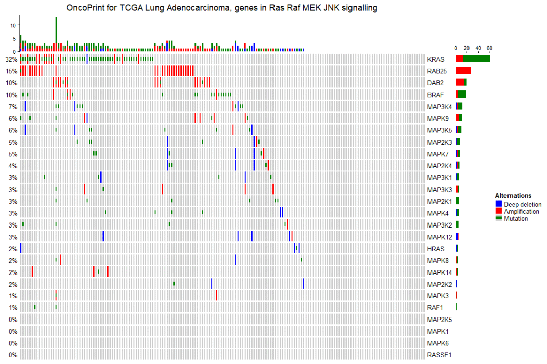
可以看到,一个基础版的景观图就生成了,横坐标是样本,纵坐标上是基因,并且基因和样本是自动重新排序的(先对基因按突变频率从高到低排序,然后对样本进行排序)。
删除空行和空列
默认情况下,如果样本或基因没有突变,它们仍将保留在热图中,但我们可以将 remove_empty_columns 和 remove_empty_rows 设置为 TRUE 来删除它们:
oncoPrint(mat,
    alter_fun = alter_fun, col = col,
    remove_empty_columns = TRUE, remove_empty_rows = TRUE,
    column_title = column_title, heatmap_legend_param = heatmap_legend_param)
重新排序行和列
可以通过两个顺序向量:row_order 和 column_order 指定行和列的顺序。
sample_order = scan(paste0(system.file("extdata", package = "ComplexHeatmap"),
    "/sample_order.txt"), what = "character")
oncoPrint(mat,
    alter_fun = alter_fun, col = col,
    row_order = 1:nrow(mat), column_order = sample_order,
    remove_empty_columns = TRUE, remove_empty_rows = TRUE,
    column_title = column_title, heatmap_legend_param = heatmap_legend_param)
景观图注释
在景观图的顶部和右侧,有显示每个基因或每个样本的不同变异数量的条形图,在景观图的左侧是显示每个基因具有变异的样本百分比的文本注释。
oncoPrint(mat,
    alter_fun = alter_fun, col = col,
    top_annotation = HeatmapAnnotation(
        column_barplot = anno_oncoprint_barplot("MUT", border = TRUE, # only MUT
            height = unit(4, "cm"))
    ),
    right_annotation = rowAnnotation(
        row_barplot = anno_oncoprint_barplot(c("AMP", "HOMDEL"),  # only AMP and HOMDEL
            border = TRUE, height = unit(4, "cm"),
            axis_param = list(side = "bottom", labels_rot = 90))
    ),
    remove_empty_columns = TRUE, remove_empty_rows = TRUE,
    column_title = column_title, heatmap_legend_param = heatmap_legend_param)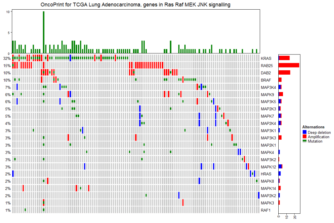
默认情况下,条形图注释显示频率。通过在 anno_oncoprint_barplot() 中设置 show_fraction = TRUE ,可将这些值更改为分数:
oncoPrint(mat,
    alter_fun = alter_fun, col = col,
    top_annotation = HeatmapAnnotation(
        column_barplot = anno_oncoprint_barplot(show_fraction = TRUE)
    ),
    right_annotation = rowAnnotation(
        row_barplot = anno_oncoprint_barplot(show_fraction = TRUE)
    ),
    remove_empty_columns = TRUE, remove_empty_rows = TRUE,
    column_title = column_title, heatmap_legend_param = heatmap_legend_param)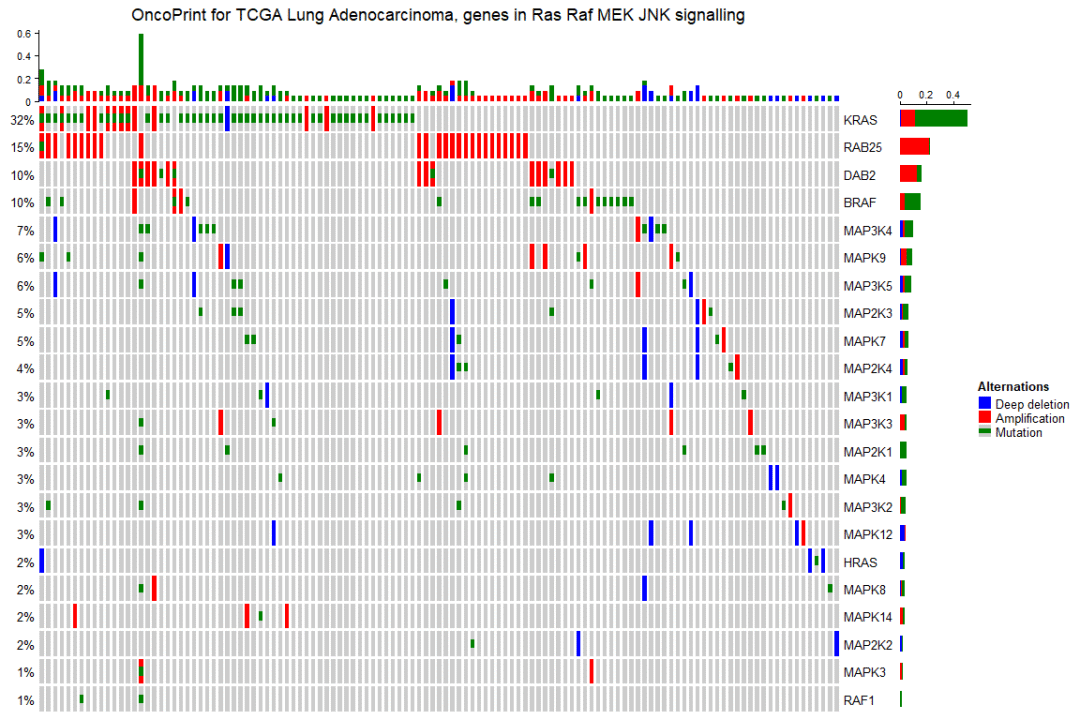
百分比值和行名称在内部构造为文本注释。可以设置 show_pct 和 show_row_names 来打开或关闭它们。pct_side 和 row_names_side 控制放置它们的边。
oncoPrint(mat,
    alter_fun = alter_fun, col = col,
    remove_empty_columns = TRUE, remove_empty_rows = TRUE,
    pct_side = "right", row_names_side = "left",
    column_title = column_title, heatmap_legend_param = heatmap_legend_param)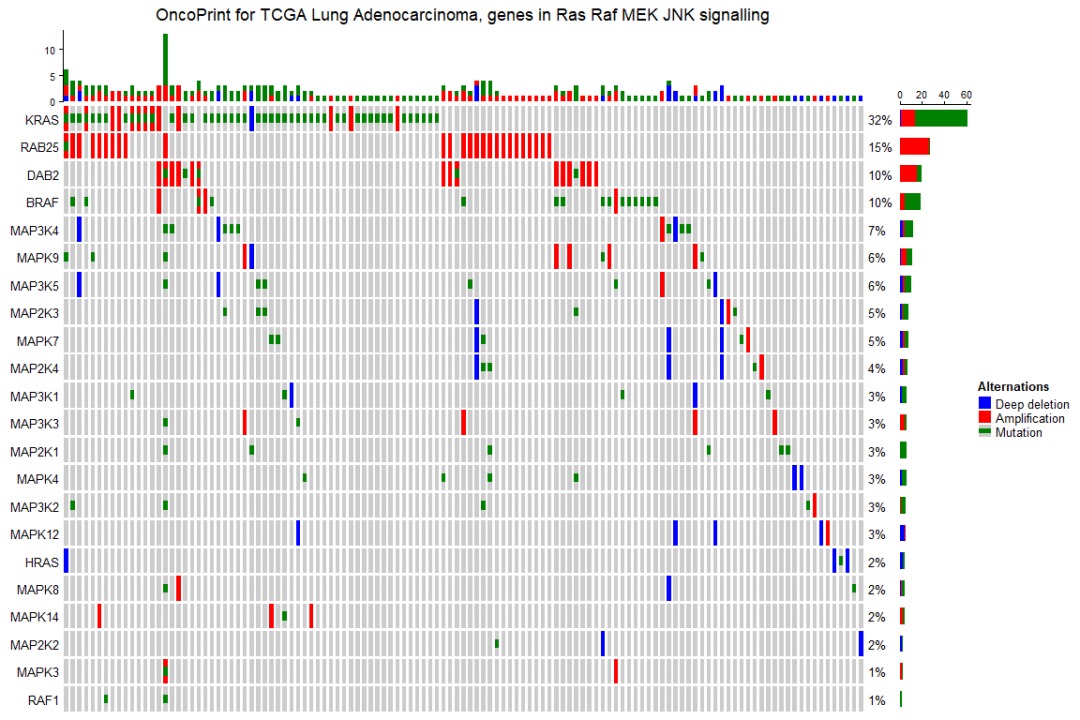
景观图的条形图注释本质上是普通注释,可以在 HeatmapAnnotation() 或 rowAnnotation() 中添加更多注释:
oncoPrint(mat,
    alter_fun = alter_fun, col = col,
    remove_empty_columns = TRUE, remove_empty_rows = TRUE,
    top_annotation = HeatmapAnnotation(cbar = anno_oncoprint_barplot(),
        foo1 = 1:172,
        bar1 = anno_points(1:172)
    ),
    left_annotation = rowAnnotation(foo2 = 1:26),
    right_annotation = rowAnnotation(bar2 = anno_barplot(1:26)),
    column_title = column_title, heatmap_legend_param = heatmap_legend_param)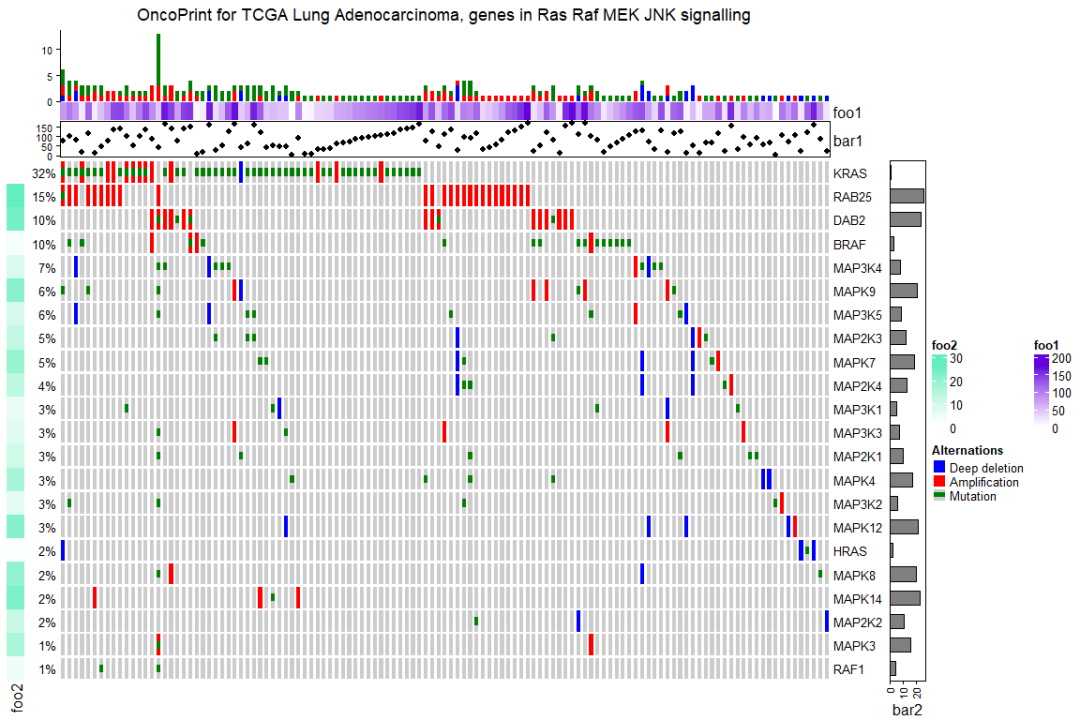
实战
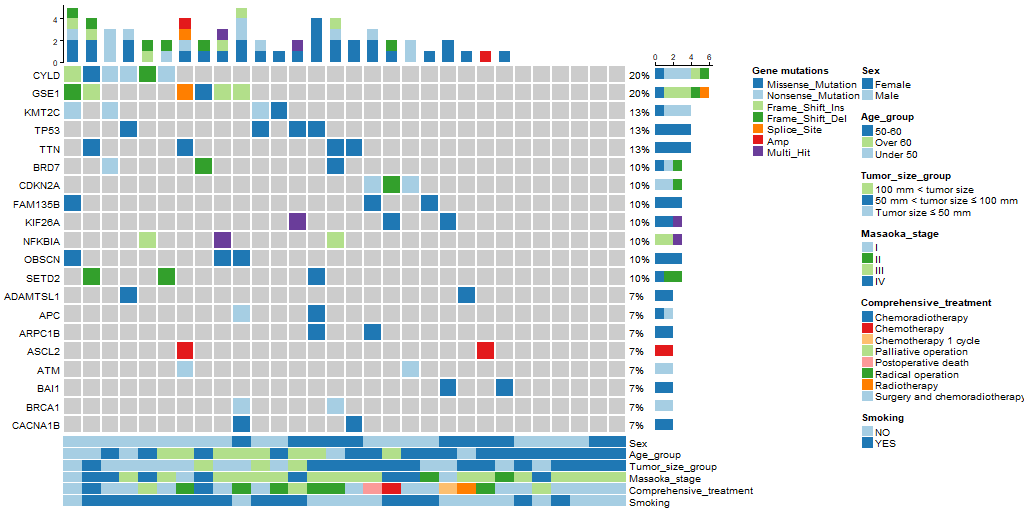
最后,用自有数据绘图,效果如下。除了颜色需要再做一些调整之外,整体效果还行吧。
生信科服
如果你有数据分析需求,欢迎与我们合作:

汇聚原天河团队并行计算工程师、中科院计算所专家以及头部AI名企HPC专家,助力解决“卡脖子”问题
更多推荐
 1
1 0
0- 0


 已为社区贡献1条内容

所有评论(0)