vue+echarts图表的基本使用
vue echarts数据可视化前端
·
文章目录
前言
在实际开发当中,我们经常需要用到一些图表来实现数据可视化,这时候 echarts 可以帮助我们实现数据的展示。这里将介绍如何使用前端框架vue+echarts来实现数据可视化。
一、echarts是什么?
长话短说,echarts就是一个帮助数据可视化的库。
二、Vue+echarts使用步骤
1.安装 echart
npm install echarts --save
2.在main.js 引入 echarts
import * as echarts from 'echarts'
Vue.prototype.$echarts = echarts //将echarts作为全局变量加入Vue
3.一个vue组件显示一个图表
代码:直接复制代码创建一个vue组件,到App中引入组件即可
<template>
<div id="myChart" :style="{width: '100%', height: '1000px'}" />
</template>
<script>
export default {
mounted() {
this.drawLine()
},
methods: {
drawLine() {
// 基于准备好的dom,初始化echarts实例
const myChart = this.$echarts.init(document.getElementById('myChart'))
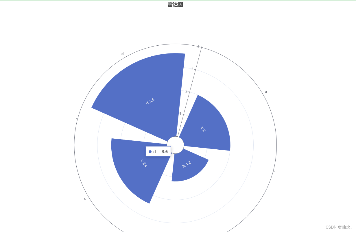
myChart.setOption({
title: [
{
text: '雷达图',
left:'center'
}
],
polar: {
radius: [30, '70%']
},
radiusAxis: {
max: 4
},
angleAxis: {
type: 'category',
data: ['a', 'b', 'c', 'd'],
startAngle: 75
},
tooltip: {},
series: {
type: 'bar',
data: [2, 1.2, 2.4, 3.6],
coordinateSystem: 'polar',
label: {
show: true,
position: 'middle',
formatter: '{b}: {c}'
}
},
backgroundColor: '#fff',
animation: false
})
}
}
}
</script>
引入
<template>
  <div id="app">
    <Pie/>
  </div>
</template>
<script>
import Pie from './components/Pie'
export default {
  name: 'App',
  components: {
    Pie
  }
 }
效果
4. 一个组件显示多个echarts图表
以下是将两个图表放在一个组件中展示的方式 使用了 props 属性 watch 深度监视
props用于父组件向子组件传递数据
创建组件1 :柱状图
<template>
  <!-- 创建承载图标的容器 -->
  <div :id=id :data=data></div>
</template>
  <script>
  export default {
    mounted() {
      this.drawLine(this.id,this.data)
    },
    data(){
      return {
        chartGrapgh:null
      }
    },
    props:["id","data"],
    watch:{
      data:{
        handler(newVal,oldVal){
          this.drawLine(this.id,newVal)
        },
        deep:true
      }
    },
    methods: {
      drawLine(id,data) {
        // 基于准备好的dom,初始化echarts实例
        let _this = this
        let myChart = document.getElementById(id)
        this.chartGrapgh = this.$echarts.init(myChart)
        this.chartGrapgh.setOption(data)
        this.$echarts.init(document.getElementById(id)).setOption(data);

        window.addEventListener("resize",function () {
            _this.chartGrapgh.resize();  //监听浏览器缩放,自适应浏览器大小
          })
      }
    },
    beforeDestroy(){
      if(this.chartGrapgh){
        this.chartGrapgh.clear() //组件销毁之前清空图表
      }
    }
  }
</script>
创建组件2:折线图
<template>
    <!-- 创建承载图标的容器 -->
	<div :id=id :data=data></div>
</template>
  <script>

  export default {
    data(){
        return{
            newPatagrapgh:null //让每个组件都有一块自己的区域显示图表,不再是一整块
        }
    },
    props:["id","data"],
    //  深度监听 父组件刚开始没有值,只有图标的配置项
    //  父组件ajax请求后改变数据的值,传递过来,图标已生成,监听传过来的值的改变
    // deep:true.深度监听,确保data中子项修改也能监听到。写法参考:https://cn.vuejs.org/v2/api/#watch
    watch:{
        data:{
            handler(newVal,oldVal){
                this.drawLine(this.id,newVal)
            },
            deep:true
        }
    },
    mounted() {
      this.drawLine(this.id,this.data)
    },
    methods: {
      drawLine(id,data) {
        // 创建属于组件本身的图形区域,不是全局 $echarts
        let _this = this
        let mychart = document.getElementById(id)
        this.newPatagrapgh = this.$echarts.init(mychart)
        this.newPatagrapgh.setOption(data)

        window.addEventListener("resize",function () { //可选,浏览器缩放监听
            _this.newPatagrapgh.resize();
          })
      }
    },
  }
  </script>
父组件App.vue
<template>
<div id="app">
<!-- <Zhe :id="'myChart'" :data="optionZhe" style="width:75%;height:350px;"/> -->
<hr/>
<!-- <Zhu :id="'myChart2'" :data="optionZhu" style="width:75%;height:350px;"/> -->
<Pie/>
</div>
</template>
<script>
import Zhe from './components/Zhe'
import Zhu from './components/Zhu'
export default {
name: 'App',
components: {
Zhe,
Zhu
},
data(){ //在App中传入子组件要渲染的数据:
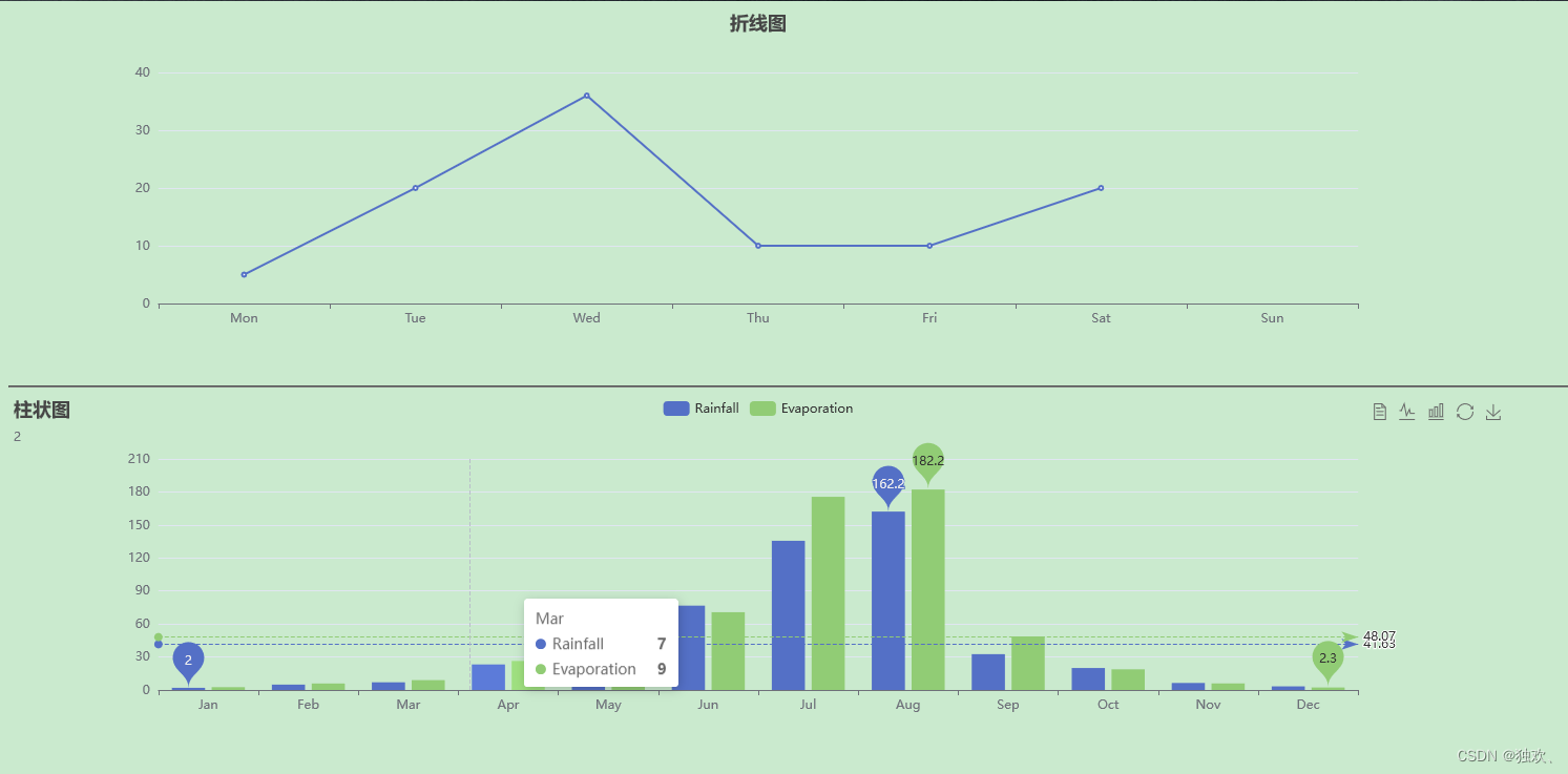
return {
optionZhe:{ //折线图的配置
title:{
text:"折线图",
left:'center'
},
xAxis:{
type: 'category',
data: ['Mon','Tue','Wed','Thu','Fri','Sat','Sun']
},
yAxis:{
type: 'value'
},
series: [
{
data:[5, 20, 36, 10, 10, 20],
type:'line'
}
]
},
optionZhu:{ //柱状图的配置
title: {
text: '柱状图',
subtext: '2',
},
tooltip: {
trigger: 'axis'
},
legend: {
data: ['Rainfall', 'Evaporation']
},
toolbox: {
show: true,
feature: {
dataView: { show: true, readOnly: false },
magicType: { show: true, type: ['line', 'bar'] },
restore: { show: true },
saveAsImage: { show: true }
}
},
calculable: true,
xAxis: [
{
type: 'category',
// prettier-ignore
data: ['Jan', 'Feb', 'Mar', 'Apr', 'May', 'Jun', 'Jul', 'Aug', 'Sep', 'Oct', 'Nov', 'Dec']
}
],
yAxis: [
{
type: 'value'
}
],
series: [
{
name: 'Rainfall',
type: 'bar',
data: [
2.0, 4.9, 7.0, 23.2, 25.6, 76.7, 135.6, 162.2, 32.6, 20.0, 6.4, 3.3
],
markPoint: {
data: [
{ type: 'max', name: 'Max' },
{ type: 'min', name: 'Min' }
]
},
markLine: {
data: [{ type: 'average', name: 'Avg' }]
}
},
{
name: 'Evaporation',
type: 'bar',
data: [
2.6, 5.9, 9.0, 26.4, 28.7, 70.7, 175.6, 182.2, 48.7, 18.8, 6.0, 2.3
],
markPoint: {
data: [
{ name: 'Max', value: 182.2, xAxis: 7, yAxis: 183 },
{ name: 'Min', value: 2.3, xAxis: 11, yAxis: 3 }
]
},
markLine: {
data: [{ type: 'average', name: 'Avg' }]
}
}
]
}
}
}
}
</script>
效果:
三、总结
以上就是vue+echarts的基本使用:包含了在echarts在vue中的基本使用、单个组件显示单个图表以及单个组件显示多个图表。

为开发者提供学习成长、分享交流、生态实践、资源工具等服务,帮助开发者快速成长。
更多推荐


 2
2 0
0- 0


 已为社区贡献2条内容

所有评论(0)