
vue3中ECharts快速入门
1.官方echarts数据可视化2.vue3中使用echarts的配置3.简单的柱状图
·
前言
可视化就是把数据简单化 直接明了显示数据的比例,增长趋势等等
1.官方echarts数据可视化
2.vue3中使用echarts的配置
3.简单的柱状图
1.官方echart数据可视化
csdn详细入门可视化数据:http://t.csdn.cn/xbw5N
2.vue3中使用echarts的配置
下载echarts组件 :npm install echarts --save
在main.py 中配置
import * as echarts from 'echarts'
const app = createApp(App);
app.config.globalProperties.$echarts = echarts
3.简单的柱状图
柱形图代码
<template>
<div>
<h1>1111</h1>
<div id='showorders' style='width:300px; height:500px'></div>
</div>
</template>
<script>
import { ref, onMounted } from "vue";
import * as echarts from 'echarts';
onMounted(
() => {
init()
}
)
export default {
data(){
},
methods:{
showorders(){
// 基于准备好的dom,初始化echarts实例
var chartDom = document.getElementById('showorders');
var myChart = echarts.init(chartDom);
// 指定图表的配置项和数据
var option;
option = {
# x轴
xAxis: {
type: 'category',
data: ['Mon', 'Tue', 'Wed', 'Thu', 'Fri', 'Sat', 'Sun']
},
# y 轴
yAxis: {
type: 'value'
},
# 类型
series: [
{
data:[150, 230, 224, 218, 135, 147, 260],
type: 'bar'
}
]
};
option && myChart.setOption(option);
},
},
mounted() {
this.showorders()
},
}
</script>
<style>
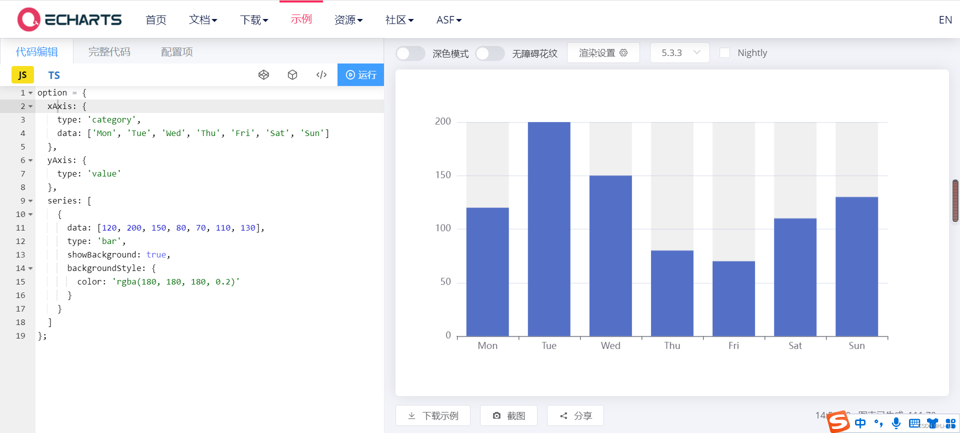
</style>大致结果如图片所示(柱状图一样)

4.到这就结束去写写吧

基于 Vue 的企业级 UI 组件库和中后台系统解决方案,为数万开发者服务。
更多推荐

 7
7 0
0- 0


 已为社区贡献1条内容

所有评论(0)