vue中echart折线图的使用(多条纵坐标轴)(警戒线横向纵向)使用(markLine),以及多坐标轴叠在一起解决
近期所用到的项目中涉及到相关的折线图的展示,特此对于折线图基本使用到的功能进行总结,避免各位掉坑,话不多说,直接上代码;首先在HTML中使用:<el-row span="24"><div id="detail" style="width: 100%; height: 380%;"></div></el-row>id为detail,下文引用;intCh
近期所用到的项目中涉及到相关的折线图的展示,特此对于折线图基本使用到的功能进行总结,避免各位掉坑,话不多说,直接上代码;首先在HTML中使用:
<el-row span="24">
	<div id="detail" style="width: 100%; height: 380%;"></div>
</el-row>
id为detail,下文引用;
intChart(data) {
detail = this.$echarts.init(document.getElementById("detail"));
var option = {
tooltip: {
//设置tip提示
trigger: "axis",
show: true
},
legend: {
//设置哪条线属于什么
data: [
this.dataName4,
this.dataName3,
this.dataName2,
this.dataName1
],
x: "15%",
top: "1%",
textStyle: {
color: "#55aa00"
}
},
grid: {
left: "5%",
right: "5%",
top: "10%",
bottom: "13%",
containLabel: true
},
xAxis: [
{
//设置X轴
type: "category",
//type: "value",
data: this.timedata,
boundaryGap: false,
// axisLabel:
// {
// //设置x轴文字倾斜显示
// interval:0,
// rotate:40
// },
axisLine: {
//坐标轴的轴线相关设置
lineStyle: {
color: "#8392A5"
}
}
},
{
type: "value",
show: false,
data: this.tempData
}
],
yAxis: [
{
type: "value",
name: this.dataName1,
// scale: true,
axisLine: {
lineStyle: {
color: "#8392A5"
}
},
splitLine: {
show: false
},
position: "left"
// axisLabel: {
// formatter: '{value}A'
// }
},
{
type: "value",
position: "right",
name: this.dataName2,
//scale: true,
axisLine: {
lineStyle: {
color: "#8392A5"
}
},
splitLine: {
show: false
},
axisLabel: {
formatter: "{value}A"
}
},
{
type: "value",
position: "right",
name: this.dataName3,
//scale: true,
offset: 70,
axisLine: {
lineStyle: {
color: "#8392A5"
}
},
splitLine: {
show: false
},
axisLabel: {
formatter: "{value}V"
}
},
{
type: "value",
position: "right",
name: this.dataName4,
//scale: true,
offset: 120,
axisLine: {
lineStyle: {
color: "#8392A5"
}
},
splitLine: {
show: false
},
axisLabel: {
formatter: "{value}kw/h"
}
}
],
//下面可以根据自己个性化一些 STYLE
dataZoom: [
{
show: true,
height: 30,
xAxisIndex: [0],
bottom: 5,
start: 0,
end: 100,
handleStyle: {
color: "#5B3AAE"
}
},
{
type: "inside",
show: true,
start: 1,
end: 35
}
],
series: [
{
name: this.dataName3,
type: "line",
smooth: true,
symbol: "circle",
yAxisIndex: 2,
symbolSize: 8,
lineStyle: {
normal: {
width: 1.5,
shadowColor: "rgba(255, 0, 0, 0.0)",
shadowBlur: 5,
shadowOffsetY: 20,
shadowOffsetX: 0,
color: "#ff007f"
}
},
itemStyle: {
color: "#ff007f",
borderColor: "#fff",
borderWidth: 2
},
data: this.ydata3
},
{
name: this.dataName2,
type: "line",
smooth: true,
yAxisIndex: 1,
symbol: "circle",
symbolSize: 8,
lineStyle: {
normal: {
width: 1.5,
shadowColor: "rgba(155, 18, 184, 0)",
shadowBlur: 5,
shadowOffsetY: 20,
shadowOffsetX: 0,
color: "#0000ff"
}
},
itemStyle: {
color: "#0000ff",
borderColor: "#fff",
borderWidth: 2
},
data: this.ydata2
},
{
name: this.dataName1,
type: "line", //pie
smooth: true,
yAxisIndex: 0,
symbol: "circle",
symbolSize: 8,
lineStyle: {
normal: {
width: 1.5,
shadowColor: "rgba(85, 170, 0, 0.0)",
shadowBlur: 5,
shadowOffsetY: 40,
shadowOffsetX: 0,
color: "#aa5500"
}
},
itemStyle: {
color: "#aa5500",
borderColor: "#fff",
borderWidth: 2
},
data: this.ydata1
},
{
name: this.dataName4,
type: "line", //pie
smooth: true,
yAxisIndex: 3,
symbol: "circle",
symbolSize: 8,
lineStyle: {
normal: {
width: 1.5,
shadowColor: "rgba(85, 170, 0, 0.0)",
shadowBlur: 5,
shadowOffsetY: 40,
shadowOffsetX: 0,
color: "#55aa00"
}
},
itemStyle: {
color: "#55aa00",
borderColor: "#fff",
borderWidth: 2
},
data: this.ydata4
},
{
name: "氧化趋势线",
type: "line",
markLine: {
symbol: ["none", "none"],
itemStyle: {
normal: {
// lineStyle: {
// type: 'dashed',
// color: 'red',
// },
label: {
show: true,
position: "middle",
distance: 20,
textStyle: {
color: "red",
fontSize: 14
},
formatter: function() {
return "开始氧化时间";
}
}
}
},
data: [
{
xAxis: this.oxyMarkNum
}
]
}
},
{
name: "还原趋势线",
type: "line",
markLine: {
symbol: ["none", "none"],
itemStyle: {
normal: {
// lineStyle: {
// type: 'dashed',
// color: 'red',
// },
label: {
show: true,
position: "middle",
distance: 20,
textStyle: {
color: "red",
fontSize: 14
},
formatter: function() {
return "开始还原时间";
}
}
}
},
data: [
{
xAxis: this.deoxidMarkNum
}
]
}
}
]
};
detail.setOption(option, true);
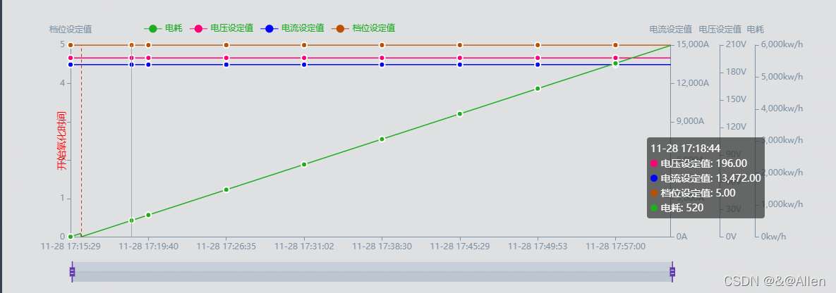
},效果图如下:

多条纵坐标,并且包含警戒线,下面一一来说明:首先基本的折线图用法网络很多,比较简单,不在赘述,不理解可以私信我就可,重点说说两个功能:
1.多条坐标轴:

有时候一条坐标轴之间数值差距较大,所以显示会不明显,我们需要多条坐标轴来显示:
其实很简单在y坐标里面就重复写多个,x轴也一样,如下:
  yAxis: [
          {
            type: "value",
            name: this.dataName1,
            // scale: true,
            axisLine: {
              lineStyle: {
                color: "#8392A5"
              }
            },
            splitLine: {
              show: false
            },
            position: "left"
            // axisLabel: {
            //     formatter: '{value}A'
            //  }
          },
          {
            type: "value",
            position: "right",
            name: this.dataName2,
            //scale: true,
            axisLine: {
              lineStyle: {
                color: "#8392A5"
              }
            },
            splitLine: {
              show: false
            },
            axisLabel: {
              formatter: "{value}A"
            }
          },
          {
            type: "value",
            position: "right",
            name: this.dataName3,
            //scale: true,
            offset: 70,
            axisLine: {
              lineStyle: {
                color: "#8392A5"
              }
            },
            splitLine: {
              show: false
            },
            axisLabel: {
              formatter: "{value}V"
            }
          },
          {
            type: "value",
            position: "right",
            name: this.dataName4,
            //scale: true,
            offset: 120,
            axisLine: {
              lineStyle: {
                color: "#8392A5"
              }
            },
            splitLine: {
              show: false
            },
            axisLabel: {
              formatter: "{value}kw/h"
            }
          }
        ],
这就是三条Y坐标轴,对应的name,data我的是从后端接口取过来的数值,大家根据自己使用的数据来源换成自己的就好,这儿要强调一个坑,是不是有的人设置的坐标轴叠在一起;那是因为你没有配置
offset: 120, offset是什么?答案就是坐标轴的偏移量,就是每个轴之间的距离,不设置会默认0,根据需要设置,另外 position: "right",就是设置你的纵坐标是在左边还是右边;此外就是下面的serices中绑定轴: data: this.ydata3这地方就对应你的多条坐标轴的具体哪一条:
  series: [
          {
            name: this.dataName3,
            type: "line",
            smooth: true,
            symbol: "circle",
            yAxisIndex: 2,
            symbolSize: 8,
            lineStyle: {
              normal: {
                width: 1.5,
                shadowColor: "rgba(255, 0, 0, 0.0)",
                shadowBlur: 5,
                shadowOffsetY: 20,
                shadowOffsetX: 0,
                color: "#ff007f"
              }
            },
            itemStyle: {
              color: "#ff007f",
              borderColor: "#fff",
              borderWidth: 2
            },
            data: this.ydata3
          },
          {
            name: this.dataName2,
            type: "line",
            smooth: true,
            yAxisIndex: 1,
            symbol: "circle",
            symbolSize: 8,
            lineStyle: {
              normal: {
                width: 1.5,
                shadowColor: "rgba(155, 18, 184, 0)",
                shadowBlur: 5,
                shadowOffsetY: 20,
                shadowOffsetX: 0,
                color: "#0000ff"
              }
            },
            itemStyle: {
              color: "#0000ff",
              borderColor: "#fff",
              borderWidth: 2
            },
            data: this.ydata2
          },
          {
            name: this.dataName1,
            type: "line", //pie
            smooth: true,
            yAxisIndex: 0,
            symbol: "circle",
            symbolSize: 8,
            lineStyle: {
              normal: {
                width: 1.5,
                shadowColor: "rgba(85, 170, 0, 0.0)",
                shadowBlur: 5,
                shadowOffsetY: 40,
                shadowOffsetX: 0,
                color: "#aa5500"
              }
            },
            itemStyle: {
              color: "#aa5500",
              borderColor: "#fff",
              borderWidth: 2
            },
            data: this.ydata1
          },
          {
            name: this.dataName4,
            type: "line", //pie
            smooth: true,
            yAxisIndex: 3,
            symbol: "circle",
            symbolSize: 8,
            lineStyle: {
              normal: {
                width: 1.5,
                shadowColor: "rgba(85, 170, 0, 0.0)",
                shadowBlur: 5,
                shadowOffsetY: 40,
                shadowOffsetX: 0,
                color: "#55aa00"
              }
            },
            itemStyle: {
              color: "#55aa00",
              borderColor: "#fff",
              borderWidth: 2
            },
            data: this.ydata4
          },

        ]
多条轴说清楚了吧,X轴也一样的道理,不在概述;
2.警示线

想要警示线,就是一个参考线,这地方会有一个坑,待下文慢慢概述:
 series: [
         ...
          {
            name: "氧化趋势线",
            type: "line",
            markLine: {
              symbol: ["none", "none"],
              itemStyle: {
                normal: {
                  // lineStyle: {
                  //   type: 'dashed',
                  //   color: 'red',
                  // },
                  label: {
                    show: true,
                    position: "middle",
                    distance: 20,
                    textStyle: {
                      color: "red",
                      fontSize: 14
                    },
                    formatter: function() {
                      return "开始氧化时间";
                    }
                  }
                }
              },
              data: [
                {
                  xAxis: this.oxyMarkNum
                }
              ]
            }
          },
          {
            name: "还原趋势线",
            type: "line",
            markLine: {
              symbol: ["none", "none"],
              itemStyle: {
                normal: {
                  // lineStyle: {
                  //   type: 'dashed',
                  //   color: 'red',
                  // },
                  label: {
                    show: true,
                    position: "middle",
                    distance: 20,
                    textStyle: {
                      color: "red",
                      fontSize: 14
                    },
                    formatter: function() {
                      return "开始还原时间";
                    }
                  }
                }
              },
              data: [
                {
                  xAxis: this.deoxidMarkNum
                }
              ]
            }
          }
        ]
在serices中加入如上代码,基本代码的用途以及markLine的配置都比较简单,但是这边有一个坑需要注意,是不是大家在x轴添加都没问题,竖直的警示线代码中
data: [
{
xAxis: this.deoxidMarkNum,这个地方写xAxis//平行X轴的横向写yAxis,后面加具体的数据,比如4,就是在4的位置;
}
]
此处是不是好多人横向线没问题,纵向出问题,那是因为你看看坐标轴的配置:
yAxis: [
{
type: "value",
name: this.dataName1,
y轴 type: "value",但是x轴如下:
xAxis: [
{
//设置X轴
type: "category",
因为类型的原因,所以你想显示横坐标是时间有两种途径,一种就是将 type改掉:
xAxis: [
{
//设置X轴
type: "time",
这时候系统会自动计算时间,但是有的小伙伴的横坐标是后端返回来的时间是一个字符串数组,这样会出问题,有木有,下面就是自己搞出来的一点小方法,仅供参考、、:
xAxis: [
{
//设置X轴
type: "category",
我的这一条轴类型不变,但是我会给他加一条隐藏的X轴:
        xAxis: [
          {
            //设置X轴
            type: "category",
            //type: "value",
            data: this.timedata,
            boundaryGap: false,
            // axisLabel:
            //      {
            //       //设置x轴文字倾斜显示
            //        interval:0,
            //        rotate:40
            //       },
            axisLine: {
              //坐标轴的轴线相关设置
              lineStyle: {
                color: "#8392A5"
              }
            }
          },
          {
            type: "value",
            show: false,
            data: this.tempData
          }
        ],
看到没:
{
type: "value",
show: false,
data: this.tempData
}
这条X轴不会显示出来show:false;
然后我在加警示线,他就会参考这一条轴就显示出来,也不影响之前的数据;
好了,本文就是一点折线图使用的概述,如果有疑惑的地方可以私信我,顿首,,,,

前往低代码交流专区
更多推荐
 2
2 0
0- 0


 已为社区贡献3条内容

所有评论(0)