基于NLP的COVID-19虚假新闻检测
基于NLP的COVID-19虚假新闻检测摘要全文约2400字,建议阅读时间7分钟。本文为大家介绍了基于自然语言处理的COVID-19虚假新闻检测方法以及可视化方法,并结合真实的新闻数据集以及完整的代码复现了检测以及可视化的过程。最近有这样一则新闻:一半的加拿大人被COVID-19的阴谋论所愚弄,这个新闻真的令人心碎。世界卫生组织(WHO)称,与COVID-19相关的信息流行病与病毒本身同样危险。同
基于NLP的COVID-19虚假新闻检测
摘要
全文约2400字,建议阅读时间7分钟。本文为大家介绍了基于自然语言处理的COVID-19虚假新闻检测方法以及可视化方法,并结合真实的新闻数据集以及完整的代码复现了检测以及可视化的过程。
最近有这样一则新闻:一半的加拿大人被COVID-19的阴谋论所愚弄,这个新闻真的令人心碎。
世界卫生组织(WHO)称,与COVID-19相关的信息流行病与病毒本身同样危险。同样地,阴谋论、神话和夸大的事实可能会产生超出公共健康范围的后果。
多亏了Lead Stories,Poynter,FactCheck.org,Snopes,EuVsDisinfo等项目可以监视、识别和检查散布在世界各地的虚假信息。
为了探究COVID-19虚假新闻的内容,我对于真实新闻和虚假新闻进行了严格的定义。具体来说,真实新闻是众所周知的真实报道并且来自可信赖的新闻机构;虚假新闻是众所周知的虚假报道并且来自知名的有意试图散布错误信息的虚假新闻网站。
基于以上定义,我从各种新资源中收集了1100篇有关COVID-19的新闻文章和社交网络帖子并对其进行了标记。数据集可以在这里找到。
数据
from nltk.corpus import stopwords
STOPWORDS = set(stopwords.words('english'))
from sklearn.feature_extraction.text import CountVectorizer

from textblob import TextBlob
import plotly.express as px
import plotly.figure_factory as ff
import plotly.graph_objects as go

df = pd.read_csv('data/corona_fake.csv')
df.loc[df['label'] == 'Fake', ['label']] = 'FAKE'
df.loc[df['label'] == 'fake', ['label']] = 'FAKE'
df.loc[df['source'] == 'facebook', ['source']] = 'Facebook'

df.loc[5]['label'] = 'FAKE'
df.loc[15]['label'] = 'TRUE'
df.loc[43]['label'] = 'FAKE'
df.loc[131]['label'] = 'TRUE'
df.loc[242]['label'] = 'FAKE'

df = df.sample(frac=1).reset_index(drop=True)
df.label.value_counts()
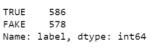
经过数据清洗,我们可以看到共有586篇真实新闻和578篇虚假新闻。
df.loc[df['label'] == 'TRUE'].source.value_counts()

真实新闻主要来自哈佛健康出版社(Harvard Health Publishing)、《纽约时报》(The New York Times)、约翰霍普金斯大学彭博公共卫生学院(Johns Hopkins Bloomberg School of Public Health)、世卫组织(WHO)以及疾病预防控制中心(CDC)等机构。
df.loc[df['label'] == 'FAKE'].source.value_counts()

其中的几个虚假新闻是从Facebook的帖子中收集的,其是一个名为Natural News的极右网站和一个名为orthomolecular.org的替代医学网站。一些文章或帖子已从互联网或社交网络中删除,但是,他们仍能够进入在网络中被查询到。
使用下面的函数,我们将能够阅读任何给定的新闻内容并由此确定如何清洗它们:
def print_plot(index):
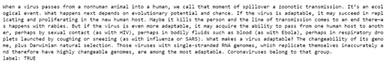
example = df[df.index == index][['text','label']].values[0]
if len(example) > 0:
print(example[0])
print('label:', example[1])
print_plot(500)

print_plot(1000)
由于我们数据集中文章内容很清晰,所以我们仅需要删除标点符号并将大写字母改为小写即可。
df['text'] = df['text'].str.replace('[^\w\s]','')
df['text'] = df['text'].str.lower()
文章长度
在接下来的步骤中:
- 获取每篇新闻的情感得分,并分数控制在[-1,1]范围内,其中1表示积极情绪,-1表示消极情绪。
- 获取每篇文章的长度(字数)。
df['polarity'] = df['text'].map(lambda text:TextBlob(text).sentiment.polarity)

def text_len(x):
    if type(x) is str:
        return len(x.split())
    else:
        return 0

df['text_len'] = df['text'].apply(text_len)
nums_text = df.query('text_len > 0')['text_len']

fig = ff.create_distplot(hist_data = [nums_text], group_labels = ['Text'])
fig.update_layout(title_text='Distribution of article length', template="plotly_white")
fig.show()

数据集中的大多数文章少于1000个单词。不过,有少数文章包含超过4000个单词。
当我们按标签分开时,就文章的长度而言,真实新闻和虚假新闻之间没有明显的区别,尽管在数据集中大多数真实新闻似乎都比虚假新闻短一些。
fig = px.histogram(df, x="text_len", y="text", color="label",
                   marginal="box",
                   hover_data=df.columns, nbins=100)
fig.update_layout(title_text='Distribution of article length', template="plotly_white")
fig.show()

为了显示不同新闻的文本长度的概率密度,我们使用小提琴图(violin plot)表示:
fig = px.violin(df, y='text_len', color='label',
                violinmode='overlay',
                hover_data=df.columns, template='plotly_white')
fig.show()

Facebook vs. Harvard
平均而言,Facebook的帖子比哈佛健康的文章短得多:
df_new = df.loc[(df['source'] == 'Facebook') | (df['source'] == 'https://www.health.harvard.edu/')]

fig = px.histogram(df_new, x="text_len", y="text", color='source',
                   marginal="box",
                   hover_data=df_new.columns, nbins=100)
fig.update_layout(title_text='Distribution of article length of two sources', template="plotly_white")
fig.show()

我们也可以使用小提琴图(violin plot)来呈现:
fig = px.violin(df_new, y='text_len', color='source',
                violinmode='overlay',
                hover_data=df_new.columns, template='plotly_white')
fig.show()

也许我们大家都很熟悉,Facebook虚假帖子的内容往往更短。发表文章的人试图通过试探法而非说服力来说服读者。
情感极性
x1 = df.loc[df['label']=='TRUE']['polarity']
x2 = df.loc[df['label'] == 'FAKE']['polarity']

group_labels = ['TRUE', 'FAKE']

colors = ['rgb(0, 0, 100)', 'rgb(0, 200, 200)']

fig = ff.create_distplot(
    [x1, x2], group_labels,colors=colors)

fig.update_layout(title_text='polarity', template="plotly_white")
fig.show()

真实新闻与虚假新闻在情感方面没有明显差异,我们可以使用小提琴图(violin plot)来证实:
fig = px.violin(df, y='polarity', color="label",
                violinmode='overlay',
                template='plotly_white')
fig.show()

当我们比较这四个来源之间的情绪极性时,我们可以看到《纽约时报》和《自然新闻》的情绪分布比哈佛健康新闻和Facebook的情绪分布要窄得多。
x1 = df.loc[df['source']=='Facebook']['polarity']
x2 = df.loc[df['source'] == 'https://www.health.harvard.edu/']['polarity']
x3 = df.loc[df['source'] == 'https://www.nytimes.com/']['polarity']
x4 = df.loc[df['source'] == 'https://www.naturalnews.com/']['polarity']
group_labels = ['Facebook', 'Harvard', 'nytimes', 'naturalnews']

colors = ['rgb(0, 0, 100)', 'rgb(0, 200, 200)', 'rgb(100, 0, 0)', 'rgb(200, 0, 200)']

# Create distplot with custom bin_size
fig = ff.create_distplot(
    [x1, x2, x3, x4], group_labels,colors=colors)

fig.update_layout(title_text='polarity', template="plotly_white")
fig.show()

这意味着《纽约时报》的新闻和数据中的自然新闻听起来不那么具有情绪。
可以用以下小提琴图(violin plot)来证实:
fig = go.Figure()

sources = ['https://www.health.harvard.edu/', 'https://www.nytimes.com/', 'Facebook', 'https://www.naturalnews.com/']

for source in sources:
    fig.add_trace(go.Violin(x=df['source'][df['source'] == source],
                            y=df['polarity'][df['source'] == source],
                            name=source,
                            box_visible=True,
                            meanline_visible=True))
fig.update_layout(title_text='Polarity of four sources', template='plotly_white')
fig.show()

情绪vs文章长度vs真实性
我注意到我收集的新闻和帖子既不是非常积极,也不是非常消极。它们大多数处于适度的正数范围内,并且大多数长度少于1000个字。
fig = px.density_contour(df, x='polarity', y='text_len', marginal_x='histogram', marginal_y='histogram', template='plotly_white')
fig.update_layout(title_text='Sentiment vs. Article length')
fig.show()

情感与文章的长度之间没有明显的关系。通常,文章的情感或篇幅不能反映其真实性。虚假新闻与真实新闻之间的区别可能是相当随意的。
fig = px.scatter(df, x='polarity', y='text_len', color='label', template="plotly_white")
fig.update_layout(title_text='Sentiment polarity')
fig.show()

df.groupby(['source']).mean().sort_values('polarity', ascending=False)

我注意到鲁迪·朱利安妮(Rudy Giuliani)的帖子是情感评分最高的帖子之一,所以我很好奇想知道这篇帖子是关于什么的:
df.loc[df['source'] == 'RudyGiuliani']['text'][880]

当然是关于羟氯喹(Hydroxychloroquine)的啦~。
真实与虚假新闻的内容
现在,我们将了解数据集中包含哪些主题:
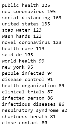
common_bigram_true = get_top_n_bigram(df.loc[df['label'] == 'TRUE']['text'], 20)
for word, freq in common_bigram_true:
    print(word, freq)
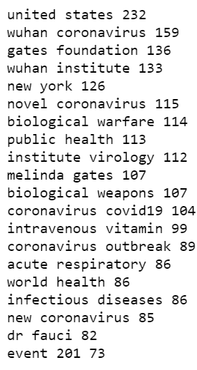
common_bigram_fake = get_top_n_bigram(df.loc[df['label'] == 'FAKE']['text'], 20)
for word, freq in common_bigram_fake:
    print(word, freq)
- 促进治愈:这包括使用大剂量静脉注射维生素C。
- 关于起源的推测:这个主题包括声称冠状病毒是在用于生物武器的实验室中制造的,或者是5G技术导致了这种疾病。
- 关于有影响力人士的谣言:例如比尔·盖茨和福西博士代表制药公司策划了冠状病毒。
- 应对人们的恐惧:例如梅林达·盖茨基金会和约翰·霍普金斯大学在三个月前通过Event 201预测了冠状病毒。
从我们的数据来看,真实和虚假新闻内容之间的一个明显区别是,虚假新闻似乎更多地使用了人们的名字,这表明虚假新闻可能更加个性化。
naturalnews.com vs orthomolecular.org
以上两个新闻来源都提倡阴谋论,但是它们却关注不同的主题。
naturalnews_bigram = get_top_n_bigram(df.loc[df['source'] == 'https://www.naturalnews.com/']['text'], 20)
for word, freq in naturalnews_bigram:
    print(word, freq)

naturalnews.com一直在传播虚假信息,例如在中国实验室将冠状病毒设计为生物武器,并且/或者传播病毒来掩盖暴露于5G无线技术有关有害健康的影响。
ortho_bigram = get_top_n_bigram(df.loc[df['source'] == 'http://orthomolecular.org/']['text'], 20)
for word, freq in ortho_bigram:
    print(word, freq)

orthomolecular.org一直在推广使用大剂量静脉注射维生素C作为治疗方法,但尚无根据。
根据以上分析,大家可以随时自行判断其他新闻的真实性。
总结
首先,我们不知道在收集数据时是否存在选择偏差。其次,虽然以上的新闻都是用户参与度很高的新闻,但我们无法说出这些新闻报导产生的实际流量。尽管有这些不足,但此数据集提供了合理的标签,并且我们知道其内的所有新闻都已被广泛阅读和分享。

CSDN联合极客时间,共同打造面向开发者的精品内容学习社区,助力成长!
更多推荐


 9
9 0
0- 0


 已为社区贡献5条内容

所有评论(0)