Matplotlib - 基于光谱颜色的曲线下颜色
·
问题:Matplotlib - 基于光谱颜色的曲线下颜色
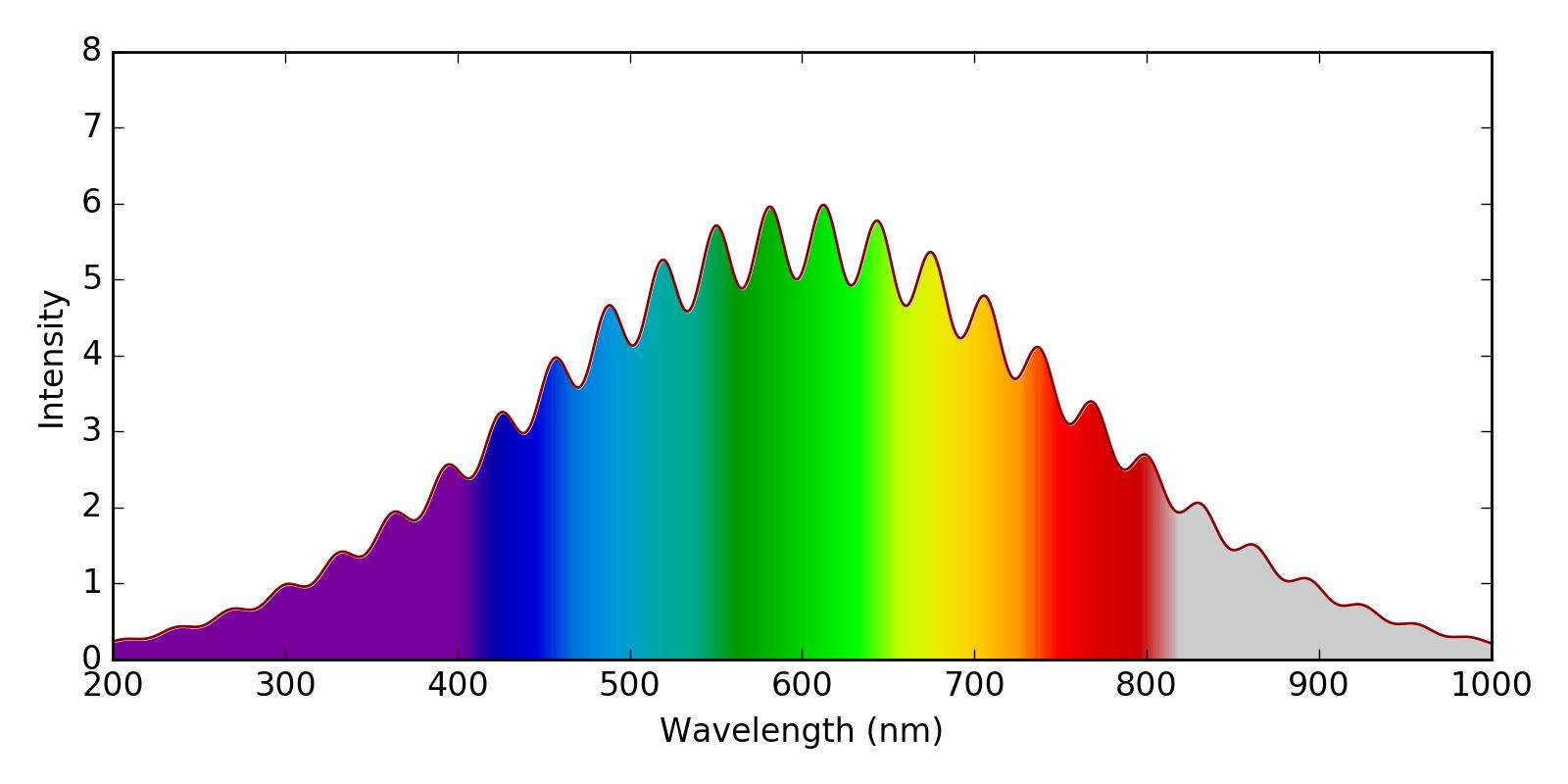
我想绘制一个光谱图,其中曲线下的区域将根据光的相应颜色进行着色。很像这个情节:
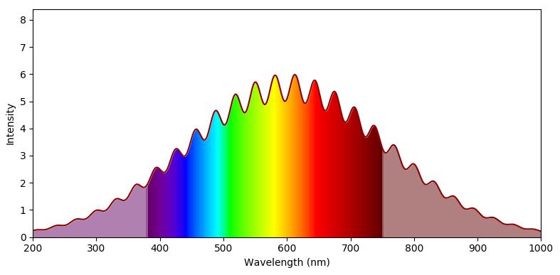
我试图在 matplotlib 中模拟这一点,通过使用imshow和spectral颜色图来绘制颜色,并使用白色fill_between来覆盖曲线上方的区域。我对结果相当满意,除了两件事:
1)我绘制的颜色与可见光谱不太一致。例如,当它是红色时,我将 700 nm 显示为黄色/橙色。我对某种风格化的表示感到满意(例如,我认为第二个答案此处中显示的准确颜色很无聊),但总的来说,我希望波长与它们的可见颜色对齐。
2)我喜欢上面的光谱如何将可见区域之外的区域用 alpha<1.0 着色。我不确定如何实现这一目标。
这是我到目前为止所拥有的:
import numpy as np
import matplotlib.pyplot as plt

fig, axs = plt.subplots(1, 1, figsize=(8,4), tight_layout=True)

wavelengths = np.linspace(200, 1000, 1000)
spectrum = (5 + np.sin(wavelengths*0.1)**2) * np.exp(-0.00002*(wavelengths-600)**2)
plt.plot(wavelengths, spectrum, color='darkred')

y = np.linspace(0, 6, 100)
X,Y = np.meshgrid(wavelengths, y)
X[X<400] = 400
extent=(np.min(wavelengths), np.max(wavelengths), np.min(y), np.max(y))

plt.imshow(X, clim=(350,820),  extent=extent, cmap=plt.get_cmap('spectral'), aspect='auto')
plt.xlabel('Wavelength (nm)')
plt.ylabel('Intensity')

plt.fill_between(wavelengths, spectrum, 8, color='w')
plt.savefig('WavelengthColors.png', dpi=200)

plt.show()
解答
首先,您需要一个将波长作为输入并返回 RGB 颜色的函数。这样的功能可以在这里找到。可以调整它以返回一个 alpha 值,该值小于可见颜色范围之外的 1。
此功能可用于创建颜色图。使用适当的归一化允许将波长范围映射到 0 到 1 之间的范围,以便可以在 imshow 图中使用此颜色图。
import numpy as np
import matplotlib.pyplot as plt
import matplotlib.colors


def wavelength_to_rgb(wavelength, gamma=0.8):
    ''' taken from http://www.noah.org/wiki/Wavelength_to_RGB_in_Python
    This converts a given wavelength of light to an
    approximate RGB color value. The wavelength must be given
    in nanometers in the range from 380 nm through 750 nm
    (789 THz through 400 THz).

    Based on code by Dan Bruton
    http://www.physics.sfasu.edu/astro/color/spectra.html
    Additionally alpha value set to 0.5 outside range
    '''
    wavelength = float(wavelength)
    if wavelength >= 380 and wavelength <= 750:
        A = 1.
    else:
        A=0.5
    if wavelength < 380:
        wavelength = 380.
    if wavelength >750:
        wavelength = 750.
    if wavelength >= 380 and wavelength <= 440:
        attenuation = 0.3 + 0.7 * (wavelength - 380) / (440 - 380)
        R = ((-(wavelength - 440) / (440 - 380)) * attenuation) ** gamma
        G = 0.0
        B = (1.0 * attenuation) ** gamma
    elif wavelength >= 440 and wavelength <= 490:
        R = 0.0
        G = ((wavelength - 440) / (490 - 440)) ** gamma
        B = 1.0
    elif wavelength >= 490 and wavelength <= 510:
        R = 0.0
        G = 1.0
        B = (-(wavelength - 510) / (510 - 490)) ** gamma
    elif wavelength >= 510 and wavelength <= 580:
        R = ((wavelength - 510) / (580 - 510)) ** gamma
        G = 1.0
        B = 0.0
    elif wavelength >= 580 and wavelength <= 645:
        R = 1.0
        G = (-(wavelength - 645) / (645 - 580)) ** gamma
        B = 0.0
    elif wavelength >= 645 and wavelength <= 750:
        attenuation = 0.3 + 0.7 * (750 - wavelength) / (750 - 645)
        R = (1.0 * attenuation) ** gamma
        G = 0.0
        B = 0.0
    else:
        R = 0.0
        G = 0.0
        B = 0.0
    return (R,G,B,A)

clim=(350,780)
norm = plt.Normalize(*clim)
wl = np.arange(clim[0],clim[1]+1,2)
colorlist = list(zip(norm(wl),[wavelength_to_rgb(w) for w in wl]))
spectralmap = matplotlib.colors.LinearSegmentedColormap.from_list("spectrum", colorlist)

fig, axs = plt.subplots(1, 1, figsize=(8,4), tight_layout=True)

wavelengths = np.linspace(200, 1000, 1000)
spectrum = (5 + np.sin(wavelengths*0.1)**2) * np.exp(-0.00002*(wavelengths-600)**2)
plt.plot(wavelengths, spectrum, color='darkred')

y = np.linspace(0, 6, 100)
X,Y = np.meshgrid(wavelengths, y)

extent=(np.min(wavelengths), np.max(wavelengths), np.min(y), np.max(y))

plt.imshow(X, clim=clim,  extent=extent, cmap=spectralmap, aspect='auto')
plt.xlabel('Wavelength (nm)')
plt.ylabel('Intensity')

plt.fill_between(wavelengths, spectrum, 8, color='w')
plt.savefig('WavelengthColors.png', dpi=200)

plt.show()

Python社区为您提供最前沿的新闻资讯和知识内容
更多推荐

 0
0 0
0- 0


 已为社区贡献126445条内容

所有评论(0)