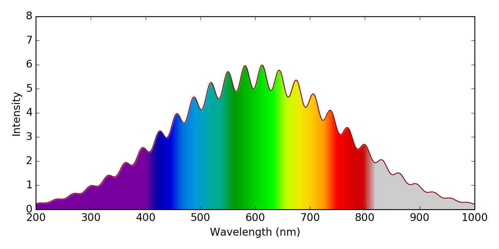
I would like to make a plot of of a spectrum, where the area under the curve will be shaded according the the corresponding color of the light. Much like this plot:
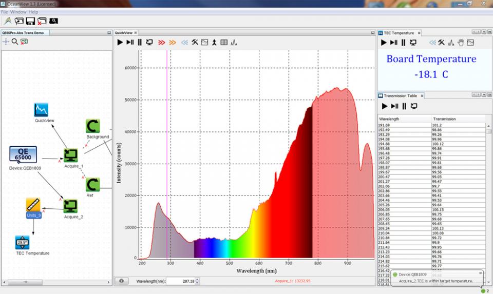
I have tried to emulate this in matplotlib, by using imshow with the spectral colormap to plot the colors, and a white fill_between to cover up the region above the curve. I am fairly happy with the result, except for two things:
1) The colors that I am plotting do not quite align with the visible spectrum. For example I show 700 nm as yellow/orange, when it is red. I am happy with a somewhat stylized representation (for example, I think that the accurate colors shown in the second answer here are boring), but in general, I would like to wavelengths to align with their visible colors.
2) I like how the spectrum above has the regions outside of the visible region colored with alpha<1.0. I am not sure how to achieve this.
Here is what I have so far:
import numpy as np
import matplotlib.pyplot as plt

fig, axs = plt.subplots(1, 1, figsize=(8,4), tight_layout=True)

wavelengths = np.linspace(200, 1000, 1000)
spectrum = (5 + np.sin(wavelengths*0.1)**2) * np.exp(-0.00002*(wavelengths-600)**2)
plt.plot(wavelengths, spectrum, color='darkred')

y = np.linspace(0, 6, 100)
X,Y = np.meshgrid(wavelengths, y)
X[X<400] = 400
extent=(np.min(wavelengths), np.max(wavelengths), np.min(y), np.max(y))

plt.imshow(X, clim=(350,820),  extent=extent, cmap=plt.get_cmap('spectral'), aspect='auto')
plt.xlabel('Wavelength (nm)')
plt.ylabel('Intensity')

plt.fill_between(wavelengths, spectrum, 8, color='w')
plt.savefig('WavelengthColors.png', dpi=200)

plt.show()
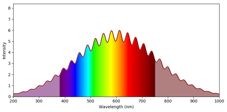
First of all you would need a function that takes the wavelength as input and returns an RGB color. Such a function can be found here. One may adapt it to also return an alpha value, which is smaller 1 outside the range of visible colors.
This function can be used to make create a colormap. Using a decent normalization allows to have the range of wavelengths mapped to the range between 0 and 1, such that this colormap may be used in an imshow plot.
import numpy as np
import matplotlib.pyplot as plt
import matplotlib.colors


def wavelength_to_rgb(wavelength, gamma=0.8):
    ''' taken from http://www.noah.org/wiki/Wavelength_to_RGB_in_Python
    This converts a given wavelength of light to an
    approximate RGB color value. The wavelength must be given
    in nanometers in the range from 380 nm through 750 nm
    (789 THz through 400 THz).

    Based on code by Dan Bruton
    http://www.physics.sfasu.edu/astro/color/spectra.html
    Additionally alpha value set to 0.5 outside range
    '''
    wavelength = float(wavelength)
    if wavelength >= 380 and wavelength <= 750:
        A = 1.
    else:
        A=0.5
    if wavelength < 380:
        wavelength = 380.
    if wavelength >750:
        wavelength = 750.
    if wavelength >= 380 and wavelength <= 440:
        attenuation = 0.3 + 0.7 * (wavelength - 380) / (440 - 380)
        R = ((-(wavelength - 440) / (440 - 380)) * attenuation) ** gamma
        G = 0.0
        B = (1.0 * attenuation) ** gamma
    elif wavelength >= 440 and wavelength <= 490:
        R = 0.0
        G = ((wavelength - 440) / (490 - 440)) ** gamma
        B = 1.0
    elif wavelength >= 490 and wavelength <= 510:
        R = 0.0
        G = 1.0
        B = (-(wavelength - 510) / (510 - 490)) ** gamma
    elif wavelength >= 510 and wavelength <= 580:
        R = ((wavelength - 510) / (580 - 510)) ** gamma
        G = 1.0
        B = 0.0
    elif wavelength >= 580 and wavelength <= 645:
        R = 1.0
        G = (-(wavelength - 645) / (645 - 580)) ** gamma
        B = 0.0
    elif wavelength >= 645 and wavelength <= 750:
        attenuation = 0.3 + 0.7 * (750 - wavelength) / (750 - 645)
        R = (1.0 * attenuation) ** gamma
        G = 0.0
        B = 0.0
    else:
        R = 0.0
        G = 0.0
        B = 0.0
    return (R,G,B,A)

clim=(350,780)
norm = plt.Normalize(*clim)
wl = np.arange(clim[0],clim[1]+1,2)
colorlist = list(zip(norm(wl),[wavelength_to_rgb(w) for w in wl]))
spectralmap = matplotlib.colors.LinearSegmentedColormap.from_list("spectrum", colorlist)

fig, axs = plt.subplots(1, 1, figsize=(8,4), tight_layout=True)

wavelengths = np.linspace(200, 1000, 1000)
spectrum = (5 + np.sin(wavelengths*0.1)**2) * np.exp(-0.00002*(wavelengths-600)**2)
plt.plot(wavelengths, spectrum, color='darkred')

y = np.linspace(0, 6, 100)
X,Y = np.meshgrid(wavelengths, y)

extent=(np.min(wavelengths), np.max(wavelengths), np.min(y), np.max(y))

plt.imshow(X, clim=clim,  extent=extent, cmap=spectralmap, aspect='auto')
plt.xlabel('Wavelength (nm)')
plt.ylabel('Intensity')

plt.fill_between(wavelengths, spectrum, 8, color='w')
plt.savefig('WavelengthColors.png', dpi=200)

plt.show()


 已为社区贡献126442条内容

所有评论(0)