I have the below data:
prop_tenure  prop_12m  prop_6m
0.00         0.00      0.00
0.00         0.00      0.00
0.06         0.06      0.10
0.38         0.38      0.25
0.61         0.61      0.66
0.01         0.01      0.02
0.10         0.10      0.12
0.04         0.04      0.04
0.22         0.22      0.22
and I am doing a pairplot as below:
sns.pairplot(data)
plt.show()
However I would like to display the correlation coefficient among the variables and if possible the skewness and kurtosis of each variable. How do you do that in seaborn?
As far as I'm aware, there is no out of the box function to do this, you'll have to create your own:
from scipy.stats import pearsonr
import matplotlib.pyplot as plt

def corrfunc(x, y, ax=None, **kws):
    """Plot the correlation coefficient in the top left hand corner of a plot."""
    r, _ = pearsonr(x, y)
    ax = ax or plt.gca()
    ax.annotate(f'ρ = {r:.2f}', xy=(.1, .9), xycoords=ax.transAxes)
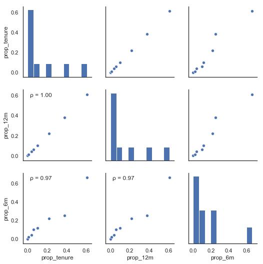
Example using your input:
import seaborn as sns; sns.set(style='white')
import pandas as pd

data = {'prop_tenure': [0.0, 0.0, 0.06, 0.38, 0.61, 0.01, 0.10, 0.04, 0.22],
        'prop_12m':    [0.0, 0.0, 0.06, 0.38, 0.61, 0.01, 0.10, 0.04, 0.22],
        'prop_6m':     [0.0, 0.0, 0.10, 0.25, 0.66, 0.02, 0.12, 0.04, 0.22]}

df = pd.DataFrame(data)

g = sns.pairplot(df)
g.map_lower(corrfunc)
plt.show()


 已为社区贡献126445条内容

所有评论(0)