Currently seaborn offers functionality for split violinplots by setting split=True, according to a hue variable. I would like to make a 'half' violin plot, i.e. a plot where half of each violin is omitted. Such a plot depicts something similar to a pdf for each continuous variable, plotted on one side of each vertical line of each categorical variable only.
I have managed to trick seaborn to plot this with an extra data point outside the plotted range of values and an extra dummy hue, but I would like to know if this can be done without actually altering the dataset, e.g. within sns.violinplot() arguments.
For instance, this graph:
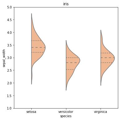
Was created by this snippet:
# imports
import pandas as pd
import seaborn as sns
import matplotlib.pyplot as plt

# load dataset from seaborn
datalist = sns.get_dataset_names()
dataset_name = 'iris'
if dataset_name in datalist:
    df = sns.load_dataset(dataset_name)
else:
    print("Dataset with name: " + dataset_name + " was not found in the available datasets online by seaborn.")

# prepare data
df2 = df.append([-999,-999,-999,-999,'setosa'])
df2['huecol'] = 0.0
df2['huecol'].iloc[-1]= -999

# plot
fig = plt.figure(figsize=(6,6))
sns.violinplot(x='species',y="sepal_width",
            split=True, hue ='huecol', inner = 'quartile',
            palette="pastel", data=df2, legend=False)
plt.title('iris')

# remove hue legend
leg = plt.gca().legend()
leg.remove()
plt.ylim([1,5.0])
plt.show()
I was looking for a solution similar to this but did not find anything satisfactory. I ended up calling seaborn.kdeplot multiple times as violinplot is essentially a one-sided kernel density plot.
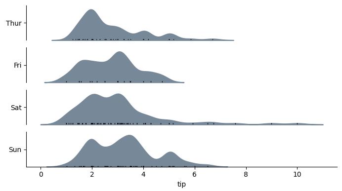
Example
Function definition for categorical_kde_plot below
categorical_kde_plot(
    df,
    variable="tip",
    category="day",
    category_order=["Thur", "Fri", "Sat", "Sun"],
    horizontal=False,
)
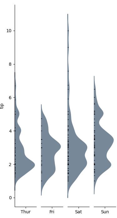
with horizontal=True, the output would look like:
Code
import seaborn as sns
from matplotlib import pyplot as plt


def categorical_kde_plot(
    df,
    variable,
    category,
    category_order=None,
    horizontal=False,
    rug=True,
    figsize=None,
):
    """Draw a categorical KDE plot

    Parameters
    ----------
    df: pd.DataFrame
        The data to plot
    variable: str
        The column in the `df` to plot (continuous variable)
    category: str
        The column in the `df` to use for grouping (categorical variable)
    horizontal: bool
        If True, draw density plots horizontally. Otherwise, draw them
        vertically.
    rug: bool
        If True, add also a sns.rugplot.
    figsize: tuple or None
        If None, use default figsize of (7, 1*len(categories))
        If tuple, use that figsize. Given to plt.subplots as an argument.
    """
    if category_order is None:
        categories = list(df[category].unique())
    else:
        categories = category_order[:]

    figsize = (7, 1.0 * len(categories))

    fig, axes = plt.subplots(
        nrows=len(categories) if horizontal else 1,
        ncols=1 if horizontal else len(categories),
        figsize=figsize[::-1] if not horizontal else figsize,
        sharex=horizontal,
        sharey=not horizontal,
    )

    for i, (cat, ax) in enumerate(zip(categories, axes)):
        sns.kdeplot(
            data=df[df[category] == cat],
            x=variable if horizontal else None,
            y=None if horizontal else variable,
            # kde kwargs
            bw_adjust=0.5,
            clip_on=False,
            fill=True,
            alpha=1,
            linewidth=1.5,
            ax=ax,
            color="lightslategray",
        )

        keep_variable_axis = (i == len(fig.axes) - 1) if horizontal else (i == 0)

        if rug:
            sns.rugplot(
                data=df[df[category] == cat],
                x=variable if horizontal else None,
                y=None if horizontal else variable,
                ax=ax,
                color="black",
                height=0.025 if keep_variable_axis else 0.04,
            )

        _format_axis(
            ax,
            cat,
            horizontal,
            keep_variable_axis=keep_variable_axis,
        )

    plt.tight_layout()
    plt.show()


def _format_axis(ax, category, horizontal=False, keep_variable_axis=True):

    # Remove the axis lines
    ax.spines["top"].set_visible(False)
    ax.spines["right"].set_visible(False)

    if horizontal:
        ax.set_ylabel(None)
        lim = ax.get_ylim()
        ax.set_yticks([(lim[0] + lim[1]) / 2])
        ax.set_yticklabels([category])
        if not keep_variable_axis:
            ax.get_xaxis().set_visible(False)
            ax.spines["bottom"].set_visible(False)
    else:
        ax.set_xlabel(None)
        lim = ax.get_xlim()
        ax.set_xticks([(lim[0] + lim[1]) / 2])
        ax.set_xticklabels([category])
        if not keep_variable_axis:
            ax.get_yaxis().set_visible(False)
            ax.spines["left"].set_visible(False)


if __name__ == "__main__":
    df = sns.load_dataset("tips")

    categorical_kde_plot(
        df,
        variable="tip",
        category="day",
        category_order=["Thur", "Fri", "Sat", "Sun"],
        horizontal=True,
    )


 已为社区贡献126442条内容

所有评论(0)