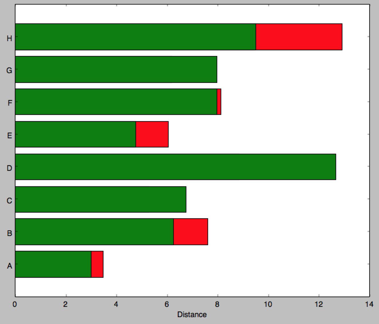
I am trying to replicate the following image in matplotlib and it seems barh is my only option. Though it appears that you can't stack barh graphs so I don't know what to do

If you know of a better python library to draw this kind of thing, please let me know.
This is all I could come up with as a start:
import matplotlib.pyplot as plt; plt.rcdefaults()
import numpy as np
import matplotlib.pyplot as plt

people = ('A','B','C','D','E','F','G','H')
y_pos = np.arange(len(people))
bottomdata = 3 + 10 * np.random.rand(len(people))
topdata = 3 + 10 * np.random.rand(len(people))
fig = plt.figure(figsize=(10,8))
ax = fig.add_subplot(111)
ax.barh(y_pos, bottomdata,color='r',align='center')
ax.barh(y_pos, topdata,color='g',align='center')
ax.set_yticks(y_pos)
ax.set_yticklabels(people)
ax.set_xlabel('Distance')

plt.show()
I would then have to add labels individually using ax.text which would be tedious. Ideally I would like to just specify the width of the part to be inserted then it updates the center of that section with a string of my choosing. The labels on the outside (e.g. 3800) I can add myself later, it is mainly the labeling over the bar section itself and creating this stacked method in a nice way I'm having problems with. Can you even specify a 'distance' i.e. span of color in any way?
Edit 2: for more heterogeneous data. (I've left the above method since I find it more usual to work with the same number of records per series)
Answering the two parts of the question:
a) barh returns a container of handles to all the patches that it drew. You can use the coordinates of the patches to aid the text positions.
b) Following these two answers to the question that I noted before (see Horizontal stacked bar chart in Matplotlib), you can stack bar graphs horizontally by setting the 'left' input.
and additionally c) handling data that is less uniform in shape.
Below is one way you could handle data that is less uniform in shape is simply to process each segment independently.
import numpy as np
import matplotlib.pyplot as plt

# some labels for each row
people = ('A','B','C','D','E','F','G','H')
r = len(people)

# how many data points overall (average of 3 per person)
n = r * 3

# which person does each segment belong to?
rows = np.random.randint(0, r, (n,))
# how wide is the segment?
widths = np.random.randint(3,12, n,)
# what label to put on the segment (xrange in py2.7, range for py3)
labels = range(n)
colors ='rgbwmc'

patch_handles = []

fig = plt.figure(figsize=(10,8))
ax = fig.add_subplot(111)


left = np.zeros(r,)
row_counts = np.zeros(r,)

for (r, w, l) in zip(rows, widths, labels):
    print r, w, l
    patch_handles.append(ax.barh(r, w, align='center', left=left[r],
        color=colors[int(row_counts[r]) % len(colors)]))
    left[r] += w
    row_counts[r] += 1
    # we know there is only one patch but could enumerate if expanded
    patch = patch_handles[-1][0]
    bl = patch.get_xy()
    x = 0.5*patch.get_width() + bl[0]
    y = 0.5*patch.get_height() + bl[1]
    ax.text(x, y, "%d%%" % (l), ha='center',va='center')

y_pos = np.arange(8)
ax.set_yticks(y_pos)
ax.set_yticklabels(people)
ax.set_xlabel('Distance')

plt.show()
Which produces a graph like this 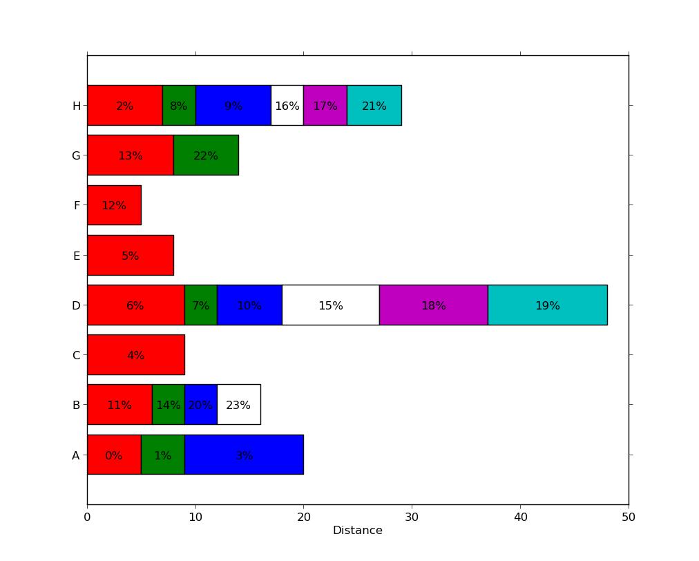 , with a different number of segments present in each series.
Note that this is not particularly efficient since each segment used an individual call to ax.barh. There may be more efficient methods (e.g. by padding a matrix with zero-width segments or nan values) but this likely to be problem-specific and is a distinct question.
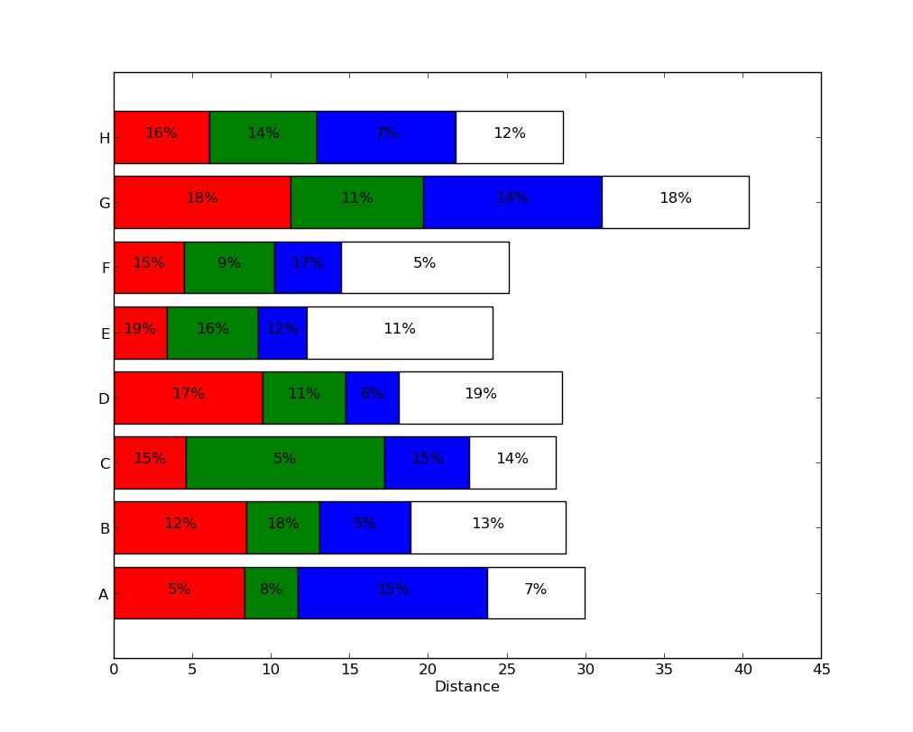
Edit: updated to answer both parts of the question.
import numpy as np
import matplotlib.pyplot as plt

people = ('A','B','C','D','E','F','G','H')
segments = 4

# generate some multi-dimensional data & arbitrary labels
data = 3 + 10* np.random.rand(segments, len(people))
percentages = (np.random.randint(5,20, (len(people), segments)))
y_pos = np.arange(len(people))

fig = plt.figure(figsize=(10,8))
ax = fig.add_subplot(111)

colors ='rgbwmc'
patch_handles = []
left = np.zeros(len(people)) # left alignment of data starts at zero
for i, d in enumerate(data):
    patch_handles.append(ax.barh(y_pos, d,
      color=colors[i%len(colors)], align='center',
      left=left))
    # accumulate the left-hand offsets
    left += d

# go through all of the bar segments and annotate
for j in range(len(patch_handles)):
    for i, patch in enumerate(patch_handles[j].get_children()):
        bl = patch.get_xy()
        x = 0.5*patch.get_width() + bl[0]
        y = 0.5*patch.get_height() + bl[1]
        ax.text(x,y, "%d%%" % (percentages[i,j]), ha='center')

ax.set_yticks(y_pos)
ax.set_yticklabels(people)
ax.set_xlabel('Distance')

plt.show()
You can achieve a result along these lines (note: the percentages I used have nothing to do with the bar widths, as the relationship in the example seems unclear):
See Horizontal stacked bar chart in Matplotlib for some ideas on stacking horizontal bar plots.


 已为社区贡献126445条内容

所有评论(0)