Answer a question

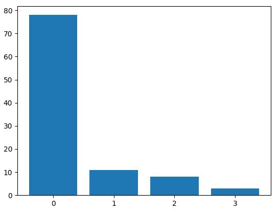
I have a numpy array results that looks like

[ 0.  2.  0.  0.  0.  0.  3.  0.  0.  0.  0.  0.  0.  0.  0.  2.  0.  0.
  0.  0.  0.  1.  0.  0.  0.  0.  0.  0.  0.  1.  0.  0.  0.  0.  0.  0.
  0.  1.  1.  0.  0.  0.  0.  2.  0.  3.  1.  0.  0.  2.  2.  0.  0.  0.
  0.  0.  0.  0.  0.  1.  1.  0.  0.  0.  0.  0.  0.  2.  0.  0.  0.  0.
  0.  1.  0.  0.  0.  0.  0.  0.  0.  0.  0.  3.  1.  0.  0.  0.  0.  0.
  0.  0.  0.  1.  0.  0.  0.  1.  2.  2.]

I would like to plot a histogram of it. I have tried

import matplotlib.pyplot as plt
plt.hist(results, bins=range(5))
plt.show()

This gives me a histogram with the x-axis labelled 0.0 0.5 1.0 1.5 2.0 2.5 3.0. 3.5 4.0.

I would like the x-axis to be labelled 0 1 2 3 instead with the labels in the center of each bar. How can you do that?

Answers

The other answers just don't do it for me. The benefit of using plt.bar over plt.hist is that bar can use align='center':

import numpy as np
import matplotlib.pyplot as plt

arr = np.array([ 0.,  2.,  0.,  0.,  0.,  0.,  3.,  0.,  0.,  0.,  0.,  0.,  0.,
        0.,  0.,  2.,  0.,  0.,  0.,  0.,  0.,  1.,  0.,  0.,  0.,  0.,
        0.,  0.,  0.,  1.,  0.,  0.,  0.,  0.,  0.,  0.,  0.,  1.,  1.,
        0.,  0.,  0.,  0.,  2.,  0.,  3.,  1.,  0.,  0.,  2.,  2.,  0.,
        0.,  0.,  0.,  0.,  0.,  0.,  0.,  1.,  1.,  0.,  0.,  0.,  0.,
        0.,  0.,  2.,  0.,  0.,  0.,  0.,  0.,  1.,  0.,  0.,  0.,  0.,
        0.,  0.,  0.,  0.,  0.,  3.,  1.,  0.,  0.,  0.,  0.,  0.,  0.,
        0.,  0.,  1.,  0.,  0.,  0.,  1.,  2.,  2.])

labels, counts = np.unique(arr, return_counts=True)
plt.bar(labels, counts, align='center')
plt.gca().set_xticks(labels)
plt.show()

centering labels in a histogram

Logo

学AI,认准AI Studio!GPU算力,限时免费领,邀请好友解锁更多惊喜福利 >>>

更多推荐