

Here is my question:
I plot 7 variable's coefficient using sns.clustermap()
figure here:
http://i4.tietuku.com/ab10ee8d1983361f.png
- x/y tickslabel seems really small(In my case, s1,s2,... s9)
My attempt
label='big==> no effect- plt.tick_params(axis='both', which='minor', labelsize=12) ===> cbar lable has changed, but the x/y axes looks the same.
http://i11.tietuku.com/5068224d5bbc7c00.png
Add
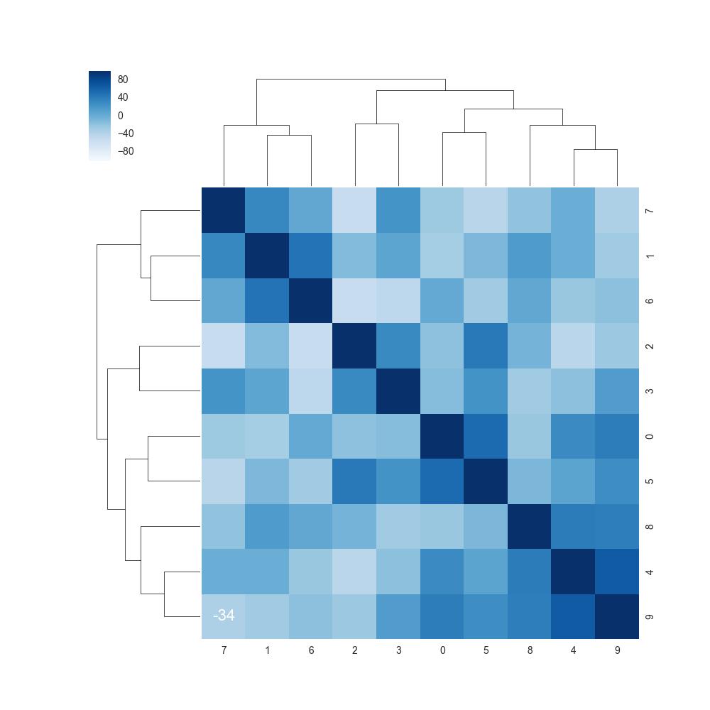
My code:
 ds =  pd.read_csv("xxxx.csv")
 corr = ds.corr().mul(100).astype(int)

 cmap = sns.diverging_palette(h_neg=210, h_pos=350, s=90, l=30, as_cmap=True)

 sns.clustermap(data=corr_s, annot=True, fmt='d',cmap = "Blues",annot_kws={"size": 16},)


 已为社区贡献126445条内容

所有评论(0)