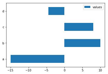
I have a pandas dataframe with positive and negative values and want to plot it as a bar chart.
I want to plot the positive colors 'green' and the negative values 'red' (very original...lol).
I'm not sure how to pass if > 0 'green' else < 0 'red'?
data = pd.DataFrame([[-15], [10], [8], [-4.5]],
                    index=['a', 'b', 'c', 'd'],
                    columns=['values'])
data.plot(kind='barh')
I would create a dummy column for whether the observation is larger than 0.
In [39]: data['positive'] = data['values'] > 0

In [40]: data
Out[40]:
   values positive
a   -15.0    False
b    10.0     True
c     8.0     True
d    -4.5    False

[4 rows x 2 columns]

In [41]: data['values'].plot(kind='barh',
                             color=data.positive.map({True: 'g', False: 'r'}))
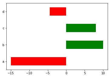
Also, you may want to be careful not to have column names that overlap with DataFrame attributes. DataFrame.values give the underlying numpy array for a DataFrame. Having overlapping names prevents you from using the df.<column name> syntax.


 已为社区贡献126445条内容

所有评论(0)