suppose I have DataFrame with columns ['X_Axis','col_2','col_3',...,'col_n',]
I need to plot the first column on X-Axis and rest on Y-Axis. FYI : all the values have been grouped according to X-Axis, the X-Axis values range from 0-25 and all other column values have been normalized to the scale of 0 - 1. I want it on same graph plot, not subplots.
Preferred : FactorPlot , normal line graph.
- Some seaborn plots will accept a wide dataframe,
sns.pointplot(data=df, x='X_Axis', y='col_2'), but not sns.pointplot(data=df, x='X_Axis', y=['col_2', 'col_3']), so it's better to reshape the DataFrame.
- Reshape the DataFrame from wide to long with
pandas.DataFrame.melt.
- Converting the dataframe from a wide to long form is standard for all seaborn plots, not just the examples shown.
- Tested in
python 3.8.12, pandas 1.3.4, matplotlib 3.4.3, seaborn 0.11.2
Sample DataFrame
import pandas as pd
import seaborn as sns

df = pd.DataFrame({'X_Axis':[1,3,5,7,10,20],
                   'col_2':[.4,.5,.4,.5,.5,.4],
                   'col_3':[.7,.8,.9,.4,.2,.3],
                   'col_4':[.1,.3,.5,.7,.1,.0],
                   'col_5':[.5,.3,.6,.9,.2,.4]})

# display(df)
   X_Axis  col_2  col_3  col_4  col_5
0       1    0.4    0.7    0.1    0.5
1       3    0.5    0.8    0.3    0.3
2       5    0.4    0.9    0.5    0.6
3       7    0.5    0.4    0.7    0.9
4      10    0.5    0.2    0.1    0.2
5      20    0.4    0.3    0.0    0.4

# convert to long (tidy) form
dfm = df.melt('X_Axis', var_name='cols', value_name='vals')

# display(dfm.head())
   X_Axis   cols  vals
0       1  col_2   0.4
1       3  col_2   0.5
2       5  col_2   0.4
3       7  col_2   0.5
4      10  col_2   0.5
Current Plot Methods
catplot: figure-level
Use seaborn.catplot with kind= (e.g. kind='point' to reproduce the FactorPlot default):
g = sns.catplot(x="X_Axis", y="vals", hue='cols', data=dfm, kind='point')
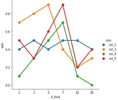
pointplot: axes-level
sns.pointplot(x="X_Axis", y="vals", hue='cols', data=dfm)
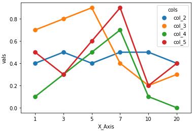
Original
factorplot: was renamed to catplot v0.9.0 (July 2018)
New versions of seaborn get warning:
The factorplot function has been renamed to catplot. The original name will be removed in a future release. Please update your code. Note that the default kind in factorplot ('point') has changed 'strip' in catplot.
g = sns.factorplot(x="X_Axis", y="vals", hue='cols', data=dfm)

# using pd.melt instead of pd.DataFrame.melt for pandas < 0.20.0
# dfm = pd.melt(df, 'X_Axis', var_name='cols',  value_name='vals')
# g = sns.factorplot(x="X_Axis", y="vals", hue='cols', data=dfm)


 已为社区贡献126442条内容

所有评论(0)