I do this linear regression with StatsModels:
import numpy as np
import statsmodels.api as sm
from statsmodels.sandbox.regression.predstd import wls_prediction_std

n = 100

x = np.linspace(0, 10, n)
e = np.random.normal(size=n)
y = 1 + 0.5*x + 2*e
X = sm.add_constant(x)

re = sm.OLS(y, X).fit()
print(re.summary())

prstd, iv_l, iv_u = wls_prediction_std(re)
My questions are, iv_l and iv_u are the upper and lower confidence intervals or prediction intervals?
How I get others?
I need the confidence and prediction intervals for all points, to do a plot.
update see the second answer which is more recent. Some of the models and results classes have now a get_prediction method that provides additional information including prediction intervals and/or confidence intervals for the predicted mean.
old answer:
iv_l and iv_u give you the limits of the prediction interval for each point.
Prediction interval is the confidence interval for an observation and includes the estimate of the error.
I think, confidence interval for the mean prediction is not yet available in statsmodels. (Actually, the confidence interval for the fitted values is hiding inside the summary_table of influence_outlier, but I need to verify this.)
Proper prediction methods for statsmodels are on the TODO list.
Addition
Confidence intervals are there for OLS but the access is a bit clumsy.
To be included after running your script:
from statsmodels.stats.outliers_influence import summary_table
st, data, ss2 = summary_table(re, alpha=0.05)
fittedvalues = data[:, 2]
predict_mean_se = data[:, 3]
predict_mean_ci_low, predict_mean_ci_upp = data[:, 4:6].T
predict_ci_low, predict_ci_upp = data[:, 6:8].T
# Check we got the right things
print np.max(np.abs(re.fittedvalues - fittedvalues))
print np.max(np.abs(iv_l - predict_ci_low))
print np.max(np.abs(iv_u - predict_ci_upp))
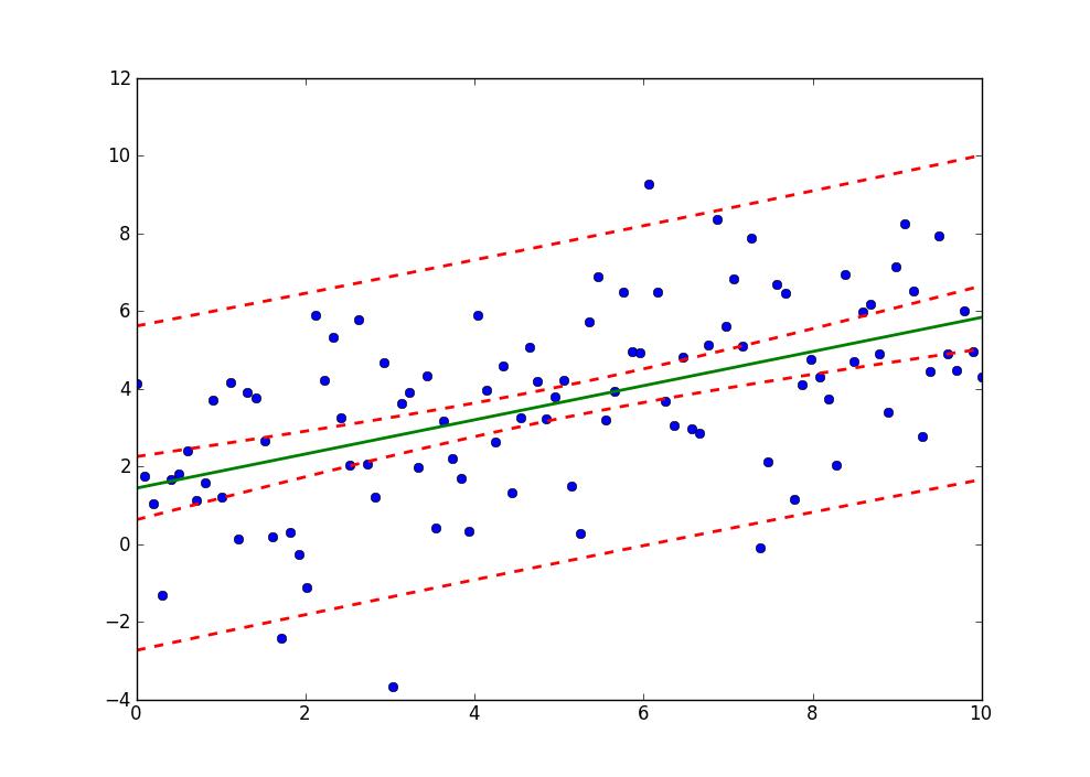
plt.plot(x, y, 'o')
plt.plot(x, fittedvalues, '-', lw=2)
plt.plot(x, predict_ci_low, 'r--', lw=2)
plt.plot(x, predict_ci_upp, 'r--', lw=2)
plt.plot(x, predict_mean_ci_low, 'r--', lw=2)
plt.plot(x, predict_mean_ci_upp, 'r--', lw=2)
plt.show()
This should give the same results as SAS, http://jpktd.blogspot.ca/2012/01/nice-thing-about-seeing-zeros.html


 已为社区贡献126448条内容

所有评论(0)