seaborn 不在定义的子图中绘制
·
回答问题
我正在尝试使用此代码并排绘制两个分布图
fig,(ax1,ax2) = plt.subplots(1,2)

sns.displot(x =X_train['Age'], hue=y_train, ax=ax1)
sns.displot(x =X_train['Fare'], hue=y_train, ax=ax2)
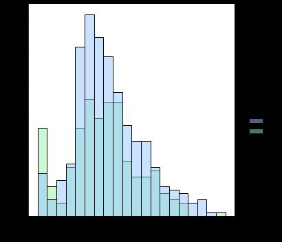
它返回以下结果(两个空子图,然后在两行上分别显示一个)-

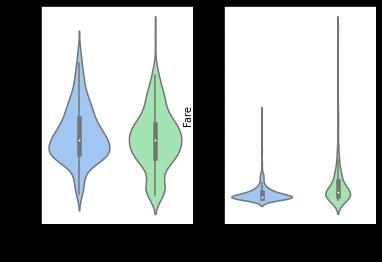
如果我用 violinplot 尝试相同的代码,它会按预期返回结果
fig,(ax1,ax2) = plt.subplots(1,2)

sns.violinplot(y_train, X_train['Age'], ax=ax1)
sns.violinplot(y_train, X_train['Fare'], ax=ax2)
为什么 displot 返回不同类型的输出,我该怎么做才能在同一行输出两个图?
Answers
-
来自
seaborn.distplot的文档,在seaborn 0.11中一直是DEPRECATED。 -
.distplot替换为以下内容:
*displot(),一个图形级函数,在绘制的绘图类型上具有类似的灵活性。这是一个FacetGrid,并且没有ax参数。
*histplot(),用于绘制直方图的轴级函数,包括核密度平滑。这确实有ax参数。
-
适用于没有
ax参数的seaborn``FacetGrid地块。使用等效的轴级图。 -
查看图形级别绘图的文档,以找到适合您需要的轴级别绘图功能。
-
参见图级与轴级函数
-
因为需要两个不同列的直方图,所以使用
histplot比较容易。 -
参见如何在多个子图中绘图了解绘图到
maplotlib.pyplot.subplots中的多种不同方式 -
还查看seaborn histplot 和 displot 输出不匹配
-
在
seaborn 0.11.1和matplotlib 3.4.2中测试
fig, (ax1, ax2) = plt.subplots(1, 2)

sns.histplot(x=X_train['Age'], hue=y_train, ax=ax1)
sns.histplot(x=X_train['Fare'], hue=y_train, ax=ax2)
导入和 DataFrame 示例
import seaborn as sns
import matplotlib.pyplot as plt

# load data
penguins = sns.load_dataset("penguins", cache=False)

# display(penguins.head())
  species     island  bill_length_mm  bill_depth_mm  flipper_length_mm  body_mass_g     sex
0  Adelie  Torgersen            39.1           18.7              181.0       3750.0    MALE
1  Adelie  Torgersen            39.5           17.4              186.0       3800.0  FEMALE
2  Adelie  Torgersen            40.3           18.0              195.0       3250.0  FEMALE
3  Adelie  Torgersen             NaN            NaN                NaN          NaN     NaN
4  Adelie  Torgersen            36.7           19.3              193.0       3450.0  FEMALE
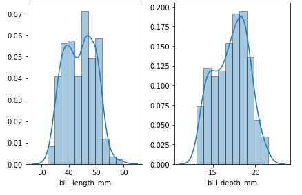
轴水平图
- 对于宽格式的数据,使用
sns.histplot
# select the columns to be plotted
cols = ['bill_length_mm', 'bill_depth_mm']

# create the figure and axes
fig, axes = plt.subplots(1, 2)
axes = axes.ravel()  # flattening the array makes indexing easier

for col, ax in zip(cols, axes):
    sns.histplot(data=penguins[col], kde=True, stat='density', ax=ax)

fig.tight_layout()
plt.show()
人物水平图
- 对于长格式的数据帧,使用
displot
# create a long dataframe
dfl = penguins.melt(id_vars='species', value_vars=['bill_length_mm', 'bill_depth_mm'], var_name='bill_size', value_name='vals')

# display(dfl.head())
  species       bill_size  vals
0  Adelie  bill_length_mm  39.1
1  Adelie   bill_depth_mm  18.7
2  Adelie  bill_length_mm  39.5
3  Adelie   bill_depth_mm  17.4
4  Adelie  bill_length_mm  40.3

# plot
sns.displot(data=dfl, x='vals', col='bill_size', kde=True, stat='density', common_bins=False, common_norm=False, height=4, facet_kws={'sharey': False, 'sharex': False})
多个数据帧
- 如果有多个dataframe,可以和
pd.concat合并,用.assign创建一个标识'source'列,可以用于row=,col=,或者hue=
# list of dataframe
lod = [df1, df2, df3]

# create one dataframe with a new 'source' column to use for row, col, or hue
df = pd.concat((d.assign(source=f'df{i}') for i, d in enumerate(lod, 1)), ignore_index=True)
- 见将多个 csv 文件导入 pandas 并连接到一个 DataFrame以将多个文件读入具有标识列的单个数据帧中。

Python社区为您提供最前沿的新闻资讯和知识内容
更多推荐

 0
0 0
0- 0


 已为社区贡献126445条内容

所有评论(0)