在 matplotlib 3d 绘图中的向量上放置箭头
·
回答问题
我绘制了一些 3D 数据的特征向量,想知道当前是否(已经)有一种方法可以将箭头放在直线上?如果有人给我小费,那就太棒了。 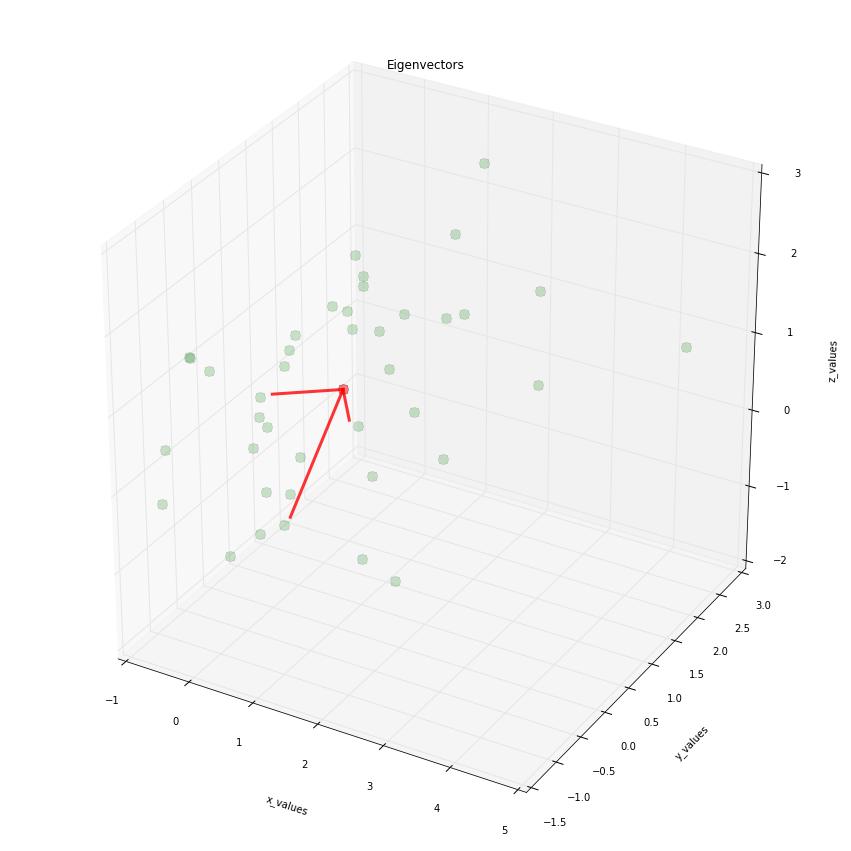
import numpy as np
from matplotlib import pyplot as plt
from mpl_toolkits.mplot3d import Axes3D

####################################################
# This part is just for reference if
# you are interested where the data is
# coming from
# The plot is at the bottom
#####################################################

# Generate some example data
mu_vec1 = np.array([0,0,0])
cov_mat1 = np.array([[1,0,0],[0,1,0],[0,0,1]])
class1_sample = np.random.multivariate_normal(mu_vec1, cov_mat1, 20)

mu_vec2 = np.array([1,1,1])
cov_mat2 = np.array([[1,0,0],[0,1,0],[0,0,1]])
class2_sample = np.random.multivariate_normal(mu_vec2, cov_mat2, 20)

# concatenate data for PCA
samples = np.concatenate((class1_sample, class2_sample), axis=0)

# mean values
mean_x = mean(samples[:,0])
mean_y = mean(samples[:,1])
mean_z = mean(samples[:,2])

#eigenvectors and eigenvalues
eig_val, eig_vec = np.linalg.eig(cov_mat)

################################
#plotting eigenvectors
################################

fig = plt.figure(figsize=(15,15))
ax = fig.add_subplot(111, projection='3d')

ax.plot(samples[:,0], samples[:,1], samples[:,2], 'o', markersize=10, color='green', alpha=0.2)
ax.plot([mean_x], [mean_y], [mean_z], 'o', markersize=10, color='red', alpha=0.5)
for v in eig_vec:
    ax.plot([mean_x, v[0]], [mean_y, v[1]], [mean_z, v[2]], color='red', alpha=0.8, lw=3)
ax.set_xlabel('x_values')
ax.set_ylabel('y_values')
ax.set_zlabel('z_values')

plt.title('Eigenvectors')

plt.draw()
plt.show()
Answers
要将箭头补丁添加到 3D 绘图,简单的解决方案是使用/matplotlib/patches.py中定义的FancyArrowPatch类。但是,它仅适用于 2D 绘图(在撰写本文时),因为它的posA和posB应该是长度为 2 的元组。
因此我们创建了一个新的箭头补丁类,命名为Arrow3D,它继承自FancyArrowPatch。我们唯一需要覆盖它的posA和posB。为此,我们用posA和(0,0)s 的posB启动Arrow3d。然后使用proj3d.proj_transform()将 3D 坐标xs, ys, zs从 3D 投影到 2D,并使用.set_position()方法将生成的 2D 坐标分配给posA和posB,替换(0,0)s。这样我们就可以让 3D 箭头工作了。
投影步骤进入.draw方法,该方法覆盖FancyArrowPatch对象的.draw方法。
这可能看起来像一个黑客。然而,mplot3d目前仅通过提供 3D-2D 投影来提供(同样,仅)简单的 3D 绘图功能,并且基本上以 2D 进行所有绘图,这并不是真正的 3D。
import numpy as np
from numpy import *
from matplotlib import pyplot as plt
from mpl_toolkits.mplot3d import Axes3D
from matplotlib.patches import FancyArrowPatch
from mpl_toolkits.mplot3d import proj3d

class Arrow3D(FancyArrowPatch):
    def __init__(self, xs, ys, zs, *args, **kwargs):
        FancyArrowPatch.__init__(self, (0,0), (0,0), *args, **kwargs)
        self._verts3d = xs, ys, zs

    def draw(self, renderer):
        xs3d, ys3d, zs3d = self._verts3d
        xs, ys, zs = proj3d.proj_transform(xs3d, ys3d, zs3d, renderer.M)
        self.set_positions((xs[0],ys[0]),(xs[1],ys[1]))
        FancyArrowPatch.draw(self, renderer)

####################################################
# This part is just for reference if
# you are interested where the data is
# coming from
# The plot is at the bottom
#####################################################

# Generate some example data
mu_vec1 = np.array([0,0,0])
cov_mat1 = np.array([[1,0,0],[0,1,0],[0,0,1]])
class1_sample = np.random.multivariate_normal(mu_vec1, cov_mat1, 20)

mu_vec2 = np.array([1,1,1])
cov_mat2 = np.array([[1,0,0],[0,1,0],[0,0,1]])
class2_sample = np.random.multivariate_normal(mu_vec2, cov_mat2, 20)
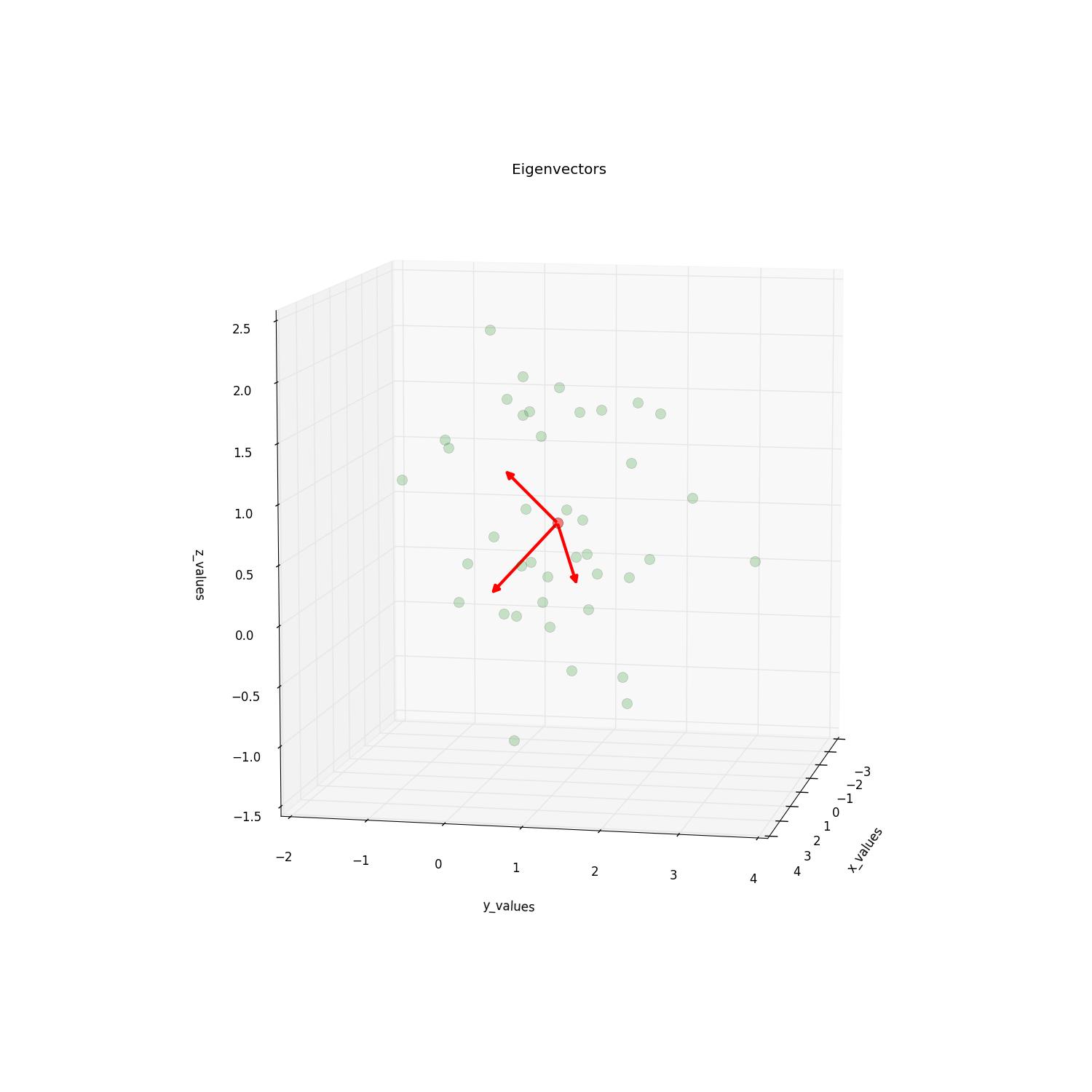
实物图。请注意,我们只需要更改一行代码,添加一个新的箭头艺术家:
# concatenate data for PCA
samples = np.concatenate((class1_sample, class2_sample), axis=0)

# mean values
mean_x = mean(samples[:,0])
mean_y = mean(samples[:,1])
mean_z = mean(samples[:,2])

#eigenvectors and eigenvalues
eig_val, eig_vec = np.linalg.eig(cov_mat1)

################################
#plotting eigenvectors
################################

fig = plt.figure(figsize=(15,15))
ax = fig.add_subplot(111, projection='3d')

ax.plot(samples[:,0], samples[:,1], samples[:,2], 'o', markersize=10, color='g', alpha=0.2)
ax.plot([mean_x], [mean_y], [mean_z], 'o', markersize=10, color='red', alpha=0.5)
for v in eig_vec:
    #ax.plot([mean_x,v[0]], [mean_y,v[1]], [mean_z,v[2]], color='red', alpha=0.8, lw=3)
    #I will replace this line with:
    a = Arrow3D([mean_x, v[0]], [mean_y, v[1]],
                [mean_z, v[2]], mutation_scale=20,
                lw=3, arrowstyle="-|>", color="r")
    ax.add_artist(a)
ax.set_xlabel('x_values')
ax.set_ylabel('y_values')
ax.set_zlabel('z_values')

plt.title('Eigenvectors')

plt.draw()
plt.show()
请检查这篇文章,它激发了这个问题,以获取更多详细信息。

Python社区为您提供最前沿的新闻资讯和知识内容
更多推荐

 0
0 0
0- 0


 已为社区贡献126445条内容

所有评论(0)