如何用 Scipy.signal.butter 实现带通巴特沃斯滤波器
·
回答问题
更新:
我发现了一个基于这个问题的 Scipy 食谱!所以,有兴趣的可以直接去:目录 » 信号处理 » Butterworth Bandpass
我很难实现最初看似简单的任务,即为一维 numpy 数组(时间序列)实现巴特沃斯带通滤波器。
我必须包含的参数是样本_rate、以赫兹为单位的截止频率和可能的顺序(其他参数,如衰减、固有频率等对我来说更模糊,所以任何“默认”值都可以)。
我现在拥有的是这个,它似乎可以用作高通滤波器,但我不确定我是否做得对:
def butter_highpass(interval, sampling_rate, cutoff, order=5):
    nyq = sampling_rate * 0.5

    stopfreq = float(cutoff)
    cornerfreq = 0.4 * stopfreq  # (?)

    ws = cornerfreq/nyq
    wp = stopfreq/nyq

    # for bandpass:
    # wp = [0.2, 0.5], ws = [0.1, 0.6]

    N, wn = scipy.signal.buttord(wp, ws, 3, 16)   # (?)

    # for hardcoded order:
    # N = order

    b, a = scipy.signal.butter(N, wn, btype='high')   # should 'high' be here for bandpass?
    sf = scipy.signal.lfilter(b, a, interval)
    return sf
文档和示例令人困惑且晦涩难懂,但我想实现标为“用于带通”的推荐中呈现的表格。评论中的问号显示我只是复制粘贴了一些示例而不了解发生了什么。
我不是电气工程师或科学家,只是需要对 EMG 信号执行一些相当简单的带通滤波的医疗设备设计师。
Answers
您可以跳过使用 buttord,而只需为过滤器选择一个顺序,看看它是否符合您的过滤条件。要生成带通滤波器的滤波器系数,请给 butter() 滤波器阶数、截止频率Wn=[lowcut, highcut]、采样率fs(以与截止频率相同的单位表示)和频带类型btype="band"。
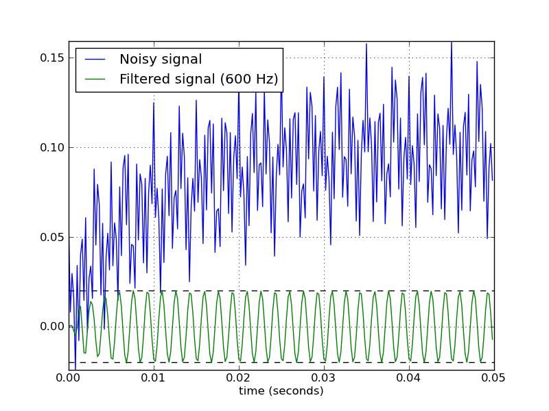
这是一个脚本,它定义了几个使用 Butterworth 带通滤波器的便利函数。当作为脚本运行时,它会生成两个图。一张显示了相同采样率和截止频率下几个滤波器阶数的频率响应。另一个图展示了过滤器(orderu003d6)对样本时间序列的影响。
from scipy.signal import butter, lfilter

def butter_bandpass(lowcut, highcut, fs, order=5):
    return butter(order, [lowcut, highcut], fs=fs, btype='band')

def butter_bandpass_filter(data, lowcut, highcut, fs, order=5):
    b, a = butter_bandpass(lowcut, highcut, fs, order=order)
    y = lfilter(b, a, data)
    return y


if __name__ == "__main__":
    import numpy as np
    import matplotlib.pyplot as plt
    from scipy.signal import freqz

    # Sample rate and desired cutoff frequencies (in Hz).
    fs = 5000.0
    lowcut = 500.0
    highcut = 1250.0

    # Plot the frequency response for a few different orders.
    plt.figure(1)
    plt.clf()
    for order in [3, 6, 9]:
        b, a = butter_bandpass(lowcut, highcut, fs, order=order)
        w, h = freqz(b, a, fs=fs, worN=2000)
        plt.plot(w, abs(h), label="order = %d" % order)

    plt.plot([0, 0.5 * fs], [np.sqrt(0.5), np.sqrt(0.5)],
             '--', label='sqrt(0.5)')
    plt.xlabel('Frequency (Hz)')
    plt.ylabel('Gain')
    plt.grid(True)
    plt.legend(loc='best')

    # Filter a noisy signal.
    T = 0.05
    nsamples = T * fs
    t = np.arange(0, nsamples) / fs
    a = 0.02
    f0 = 600.0
    x = 0.1 * np.sin(2 * np.pi * 1.2 * np.sqrt(t))
    x += 0.01 * np.cos(2 * np.pi * 312 * t + 0.1)
    x += a * np.cos(2 * np.pi * f0 * t + .11)
    x += 0.03 * np.cos(2 * np.pi * 2000 * t)
    plt.figure(2)
    plt.clf()
    plt.plot(t, x, label='Noisy signal')

    y = butter_bandpass_filter(x, lowcut, highcut, fs, order=6)
    plt.plot(t, y, label='Filtered signal (%g Hz)' % f0)
    plt.xlabel('time (seconds)')
    plt.hlines([-a, a], 0, T, linestyles='--')
    plt.grid(True)
    plt.axis('tight')
    plt.legend(loc='upper left')

    plt.show()
以下是此脚本生成的图:


Python社区为您提供最前沿的新闻资讯和知识内容
更多推荐

 0
0 0
0- 0


 已为社区贡献126442条内容

所有评论(0)