

I am trying to plot two different charts in python through plotly. I have two plots, one plot consists of merged graph ( line and bar chart) like the following,
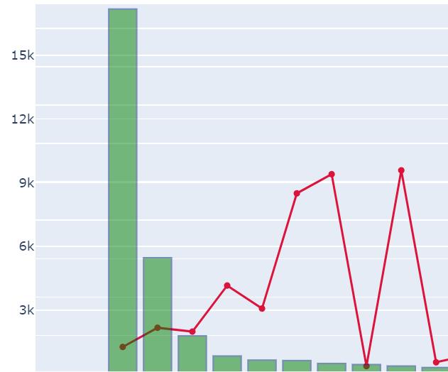 ,
,
and another one is bar chart as follows,
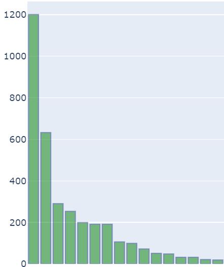
I wanted to display one single chart with these two combined charts and display the same. I have tried this in plotly through make_subplots but I am not able to achieve the results properly. Below are the codes for creating these two charts,
Line_Bar_chart Code:
import plotly.graph_objects as go
from plotly.offline import iplot

trace1  = go.Scatter(
        mode='lines+markers',
        x = df['Days'],
        y = df['Perc_Cases'],
        name="Percentage Cases",
        marker_color='crimson'
    )

trace2 = go.Bar(
        x = df['Days'],
        y = df['Count_Cases'],
        name="Absolute_cases",
        yaxis='y2',
        marker_color ='green',
        marker_line_width=1.5,
        marker_line_color='rgb(8,48,107)',
        opacity=0.5
    )

data = [trace1, trace2]

layout = go.Layout(
    title_text='States_Name',
    yaxis=dict(
        range = [0, 100],
        side = 'right'
    ),
    yaxis2=dict(
        overlaying='y',
        anchor='y3',
    )
)
fig = go.Figure(data=data, layout=layout)
iplot(fig, filename='multiple-axes-double')
**Line_Bar_chart Code**:
Bar_chart Code:
trace2 = go.Bar(
        x = df['Days'],
        y = df['Perc_Cases'],
        yaxis='y2',
        marker_color ='green',
        marker_line_width=1.5,
        marker_line_color='rgb(8,48,107)',
        opacity=0.5,
    )
layout = go.Layout(
    title_text='States_Name',
    yaxis2=dict(
        overlaying='y',

    )
)
fig = go.Figure(data=trace2, layout=layout)
iplot(fig, filename='multiple-axes-double')
Any help on how to make subplots of these two graphs like below would be helpful, 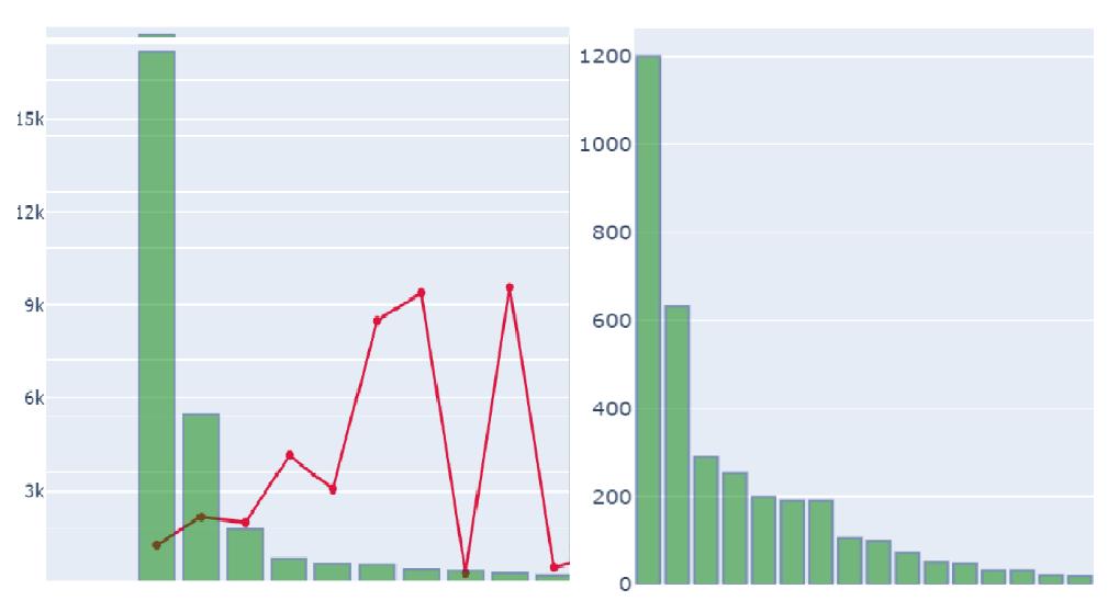


 已为社区贡献126445条内容

所有评论(0)