

I'm having a problem with adding a logarithmic X-axis to my plot. I want to show results based on the sample size with methods A, B and C.
My dataframe:
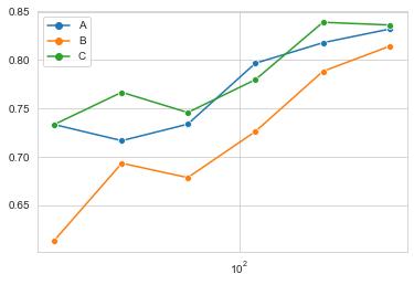
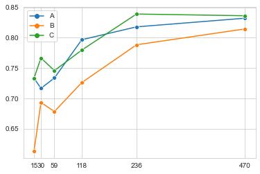
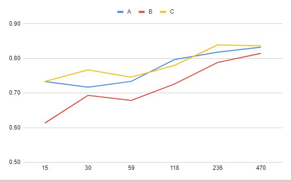
            A         B         C
15   0.733333  0.613333  0.733333
30   0.716667  0.693333  0.766667
59   0.733684  0.678485  0.745763
118  0.796667  0.726087  0.779661
236  0.817862  0.788333  0.838983
470  0.832125  0.814468  0.836170
What I'm trying to make work:
sample_count = np.around(np.logspace(math.log10(15),math.log10(470),6))
sample_count = sample_count.astype(int)

sns.set_style('whitegrid')
g_results=sns.lineplot(data=results,dashes=0,markers=['o','o','o'])
g_results.set(xticks=sample_count)
g_results.set(xscale='log')
However the result is not what I exactly want, as the ticks are completely gone:
Without the last xscale line it looks like this, which is the linear scale of course, but this time with the correct ticks:
What I want to achieve is something like this:
I would appreciate your help with my problem.


 已为社区贡献126445条内容

所有评论(0)