

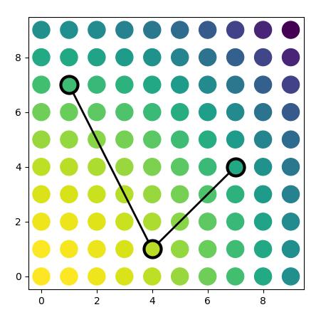
I have a scatter plot showing a data set with the symbols coloured according some colour scale. I want to highlight several of these points, by drawing an open circle around them and connecting these with a line. In other words, in a very simplified example, I want the result to look like this:
 .
.
I can make a plot that looks a bit like that using the following code:
import numpy as np
import matplotlib.pyplot as plt

fig, ax = plt.subplots(figsize=(5,5))

X, Y = np.meshgrid(np.arange(10), np.arange(10))
Z = X**2 + Y**2

plt.scatter(X,Y,c=Z, s=300, cmap='viridis_r')

plt.plot([1, 4, 7], [7, 1, 4], 'k-o', linewidth=3,
         markersize=14, markerfacecolor='none', markeredgewidth=2,
        )
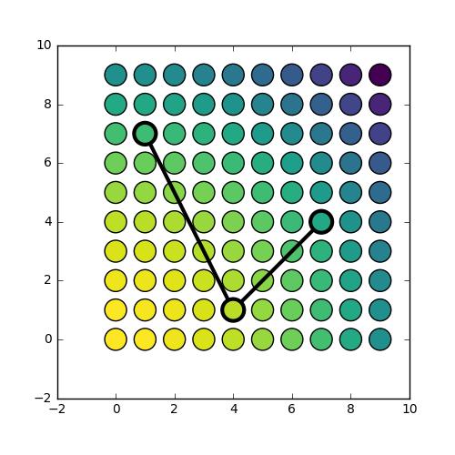
However, the result looks like this:
 .
.
What I would like, is to have the line segments that are within the marker symbol to be hidden from view. This is because I am interested in drawing the attention to specific data points, and do not want to partially hide them from sight.
Workarounds would be:
- to duplicate the data points I want to highlight, and fill the markers with the exact same colour as the original symbol that the marker is hiding. This is not satisfactory because (a) I don't always have access to the data, only to the output figure or axis instance, and (b) I wouldn't know how to do this in the case of semi-transparent symbols, which is the case in my actual dataset.
- to manually compute adapted coordinates to make the connector lines such that they only reach the edge of the markers. This also seems quite unsatisfactory (and I wouldn't know how to go about, given that the coordinate system of the axis and of the symbols are not going to be the same).
My question is: what would be the best way to go about? Is there a better way than options 1 and 2 above, and if not, what would be the best approach? As said, with 1 I foresee issues with transparency (which I am using), and with 2 I foresee coordinate system issues, e.g. in case of zooming in or out, etc.
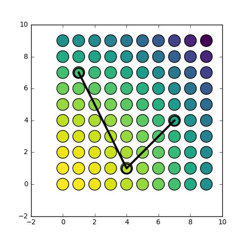
(the other small observation in my example that I'm slightly confused about: plt.plot and plt.scatter don't seem to plot things in quite the same location (see this figure) and also the size definition is inconsistent)


 已为社区贡献126442条内容

所有评论(0)