I'd like to create what my statistics book calls a "dot plot" where the number of dots in the plot equals the number of observations. Here's an example from mathisfun.com:
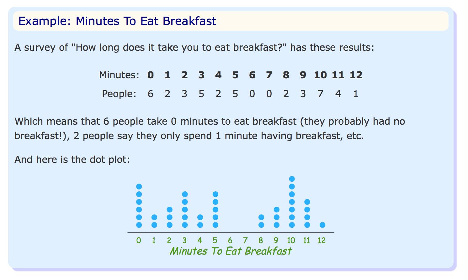
In the example, there are six dots above the 0 value on the X-axis representing the six observations of the value zero.
It seems that a "dot plot" can have several variations. In looking up how to create this with Matplotlib, I only came across what I know of as a scatter plot with a data point representing the relationship between the X and Y value.
Is the type of plot I'm trying to create possible with Matplotlib?
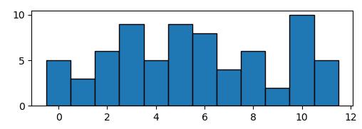
Supoose you have some data that would produce a histogram like the following,
import numpy as np; np.random.seed(13)
import matplotlib.pyplot as plt

data = np.random.randint(0,12,size=72)

plt.hist(data, bins=np.arange(13)-0.5, ec="k")

plt.show()
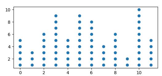
You may create your dot plot by calculating the histogram and plotting a scatter plot of all possible points, the color of the points being white if they exceed the number given by the histogram.
import numpy as np; np.random.seed(13)
import matplotlib.pyplot as plt

data = np.random.randint(0,12,size=72)
bins = np.arange(13)-0.5

hist, edges = np.histogram(data, bins=bins)

y = np.arange(1,hist.max()+1)
x = np.arange(12)
X,Y = np.meshgrid(x,y)

plt.scatter(X,Y, c=Y<=hist, cmap="Greys")

plt.show()
Alternatively you may set the unwanted points to nan,
Y = Y.astype(np.float)
Y[Y>hist] = np.nan

plt.scatter(X,Y)


 已为社区贡献126442条内容

所有评论(0)