

How can I plot a Python Pandas multiindex dataframe as a bar chart with group labels? Do any of the plotting libraries directly support this? This SO post shows a custom solution using matplotlib, but is there direct support for it?
As an example:
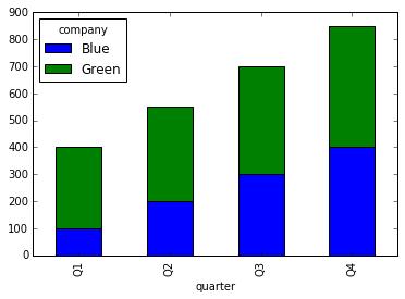
quarter  company
Q1       Blue       100
         Green      300
Q2       Blue       200
         Green      350
Q3       Blue       300
         Green      400
Q4       Blue       400
         Green      450
Name: count, dtype: int64
...can this dataframe be plotted with group labels like this?
Thanks in advance,
Rafi


 已为社区贡献126440条内容

所有评论(0)