I'd like to create a colorbar legend for a heatmap, such that the labels are in the center of each discrete color. Example borrowed from here:
import matplotlib.pyplot as plt
import numpy as np
from matplotlib.colors import ListedColormap

#discrete color scheme
cMap = ListedColormap(['white', 'green', 'blue','red'])

#data
np.random.seed(42)
data = np.random.rand(4, 4)
fig, ax = plt.subplots()
heatmap = ax.pcolor(data, cmap=cMap)

#legend
cbar = plt.colorbar(heatmap)
cbar.ax.set_yticklabels(['0','1','2','>3'])
cbar.set_label('# of contacts', rotation=270)

# put the major ticks at the middle of each cell
ax.set_xticks(np.arange(data.shape[1]) + 0.5, minor=False)
ax.set_yticks(np.arange(data.shape[0]) + 0.5, minor=False)
ax.invert_yaxis()

#labels
column_labels = list('ABCD')
row_labels = list('WXYZ')
ax.set_xticklabels(column_labels, minor=False)
ax.set_yticklabels(row_labels, minor=False)

plt.show()
This generates the following plot:
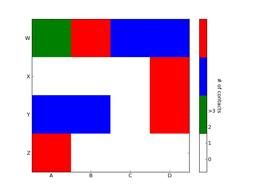
Ideally I'd like to generate a legend bar which has the four colors and for each color, a label in its center: 0,1,2,>3. How can this be achieved?
import matplotlib.pyplot as plt
import numpy as np
from matplotlib.colors import ListedColormap

#discrete color scheme
cMap = ListedColormap(['white', 'green', 'blue','red'])

#data
np.random.seed(42)
data = np.random.rand(4, 4)
fig, ax = plt.subplots()
heatmap = ax.pcolor(data, cmap=cMap)

#legend
cbar = plt.colorbar(heatmap)

cbar.ax.get_yaxis().set_ticks([])
for j, lab in enumerate(['$0$','$1$','$2$','$>3$']):
    cbar.ax.text(.5, (2 * j + 1) / 8.0, lab, ha='center', va='center')
cbar.ax.get_yaxis().labelpad = 15
cbar.ax.set_ylabel('# of contacts', rotation=270)


# put the major ticks at the middle of each cell
ax.set_xticks(np.arange(data.shape[1]) + 0.5, minor=False)
ax.set_yticks(np.arange(data.shape[0]) + 0.5, minor=False)
ax.invert_yaxis()

#labels
column_labels = list('ABCD')
row_labels = list('WXYZ')
ax.set_xticklabels(column_labels, minor=False)
ax.set_yticklabels(row_labels, minor=False)

plt.show()
You were very close. Once you have a reference to the color bar axis, you can do what ever you want to it, including putting text labels in the middle. You might want to play with the formatting to make it more visible.


 已为社区贡献126440条内容

所有评论(0)