

When plotting heatmaps with seaborn (and correlation matrices with matplotlib) the first and the last row is cut in halve. This happens also when I run this minimal code example which I found online.
import pandas as pd
import seaborn as sns
import matplotlib.pyplot as plt

data = pd.read_csv('https://raw.githubusercontent.com/resbaz/r-novice-gapminder-files/master/data/gapminder-FiveYearData.csv')
plt.figure(figsize=(10,5))
sns.heatmap(data.corr())
plt.show()
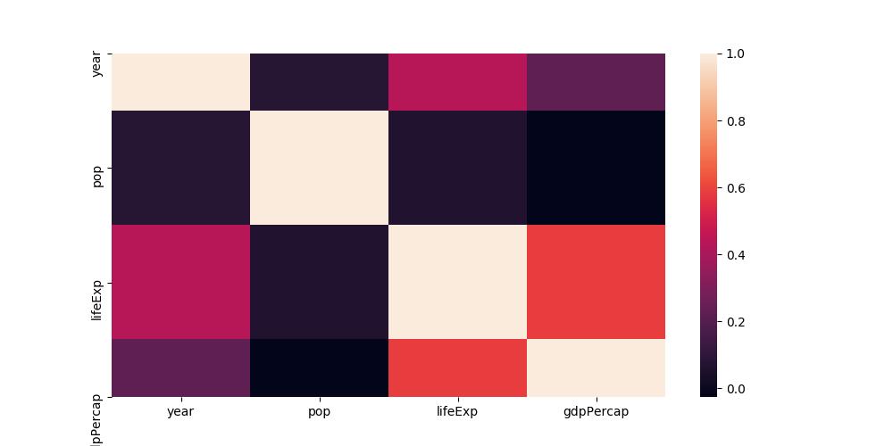 The labels at the y axis are on the correct spot, but the rows aren't completely there.
A few days ago, it work as intended. Since then, I installed texlive-xetex so I removed it again but it didn't solve my problem.
Any ideas what I could be missing?


 已为社区贡献126452条内容

所有评论(0)