How can multiple scales can be implemented in Matplotlib? I am not talking about the primary and secondary axis plotted against the same x-axis, but something like many trends which have different scales plotted in same y-axis and that can be identified by their colors.
For example, if I have trend1 ([0,1,2,3,4]) and trend2 ([5000,6000,7000,8000,9000]) to be plotted against time and want the two trends to be of different colors and in Y-axis, different scales, how can I accomplish this with Matplotlib?
When I looked into Matplotlib, they say that they don't have this for now though it is definitely on their wishlist, Is there a way around to make this happen?
Are there any other plotting tools for python that can make this happen?
If I understand the question, you may interested in this example in the Matplotlib gallery.
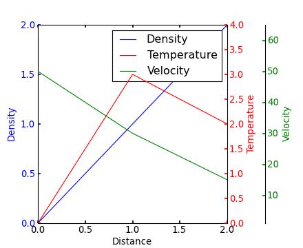
Yann's comment above provides a similar example.
Edit - Link above fixed. Corresponding code copied from the Matplotlib gallery:
from mpl_toolkits.axes_grid1 import host_subplot
import mpl_toolkits.axisartist as AA
import matplotlib.pyplot as plt

host = host_subplot(111, axes_class=AA.Axes)
plt.subplots_adjust(right=0.75)

par1 = host.twinx()
par2 = host.twinx()

offset = 60
new_fixed_axis = par2.get_grid_helper().new_fixed_axis
par2.axis["right"] = new_fixed_axis(loc="right", axes=par2,
                                        offset=(offset, 0))

par2.axis["right"].toggle(all=True)

host.set_xlim(0, 2)
host.set_ylim(0, 2)

host.set_xlabel("Distance")
host.set_ylabel("Density")
par1.set_ylabel("Temperature")
par2.set_ylabel("Velocity")

p1, = host.plot([0, 1, 2], [0, 1, 2], label="Density")
p2, = par1.plot([0, 1, 2], [0, 3, 2], label="Temperature")
p3, = par2.plot([0, 1, 2], [50, 30, 15], label="Velocity")

par1.set_ylim(0, 4)
par2.set_ylim(1, 65)

host.legend()

host.axis["left"].label.set_color(p1.get_color())
par1.axis["right"].label.set_color(p2.get_color())
par2.axis["right"].label.set_color(p3.get_color())

plt.draw()
plt.show()

#plt.savefig("Test")


 已为社区贡献126445条内容

所有评论(0)