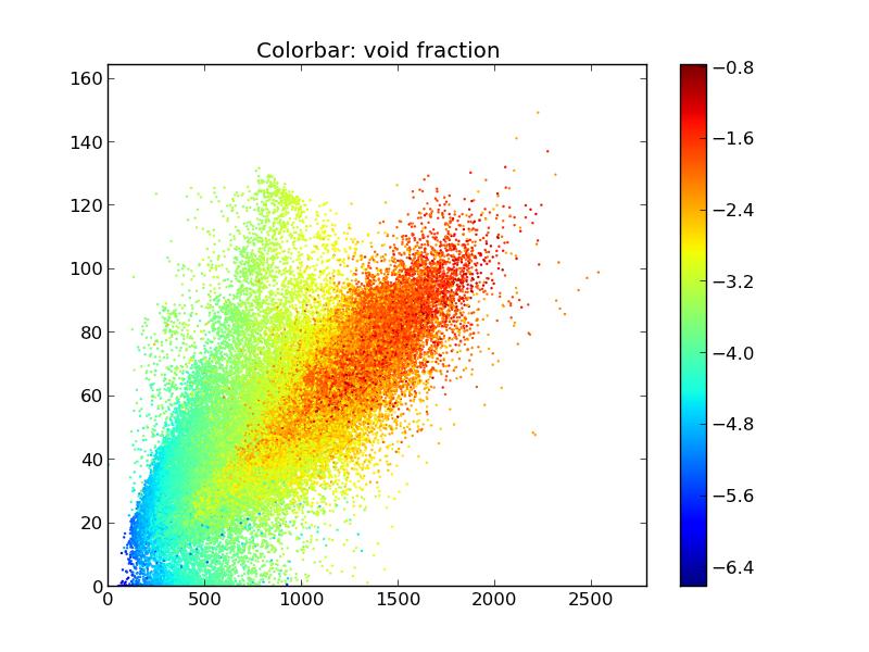
I would like to make the colors of the points on the scatter plot correspond to the value of the void fraction, but on a logarithmic scale to amplify differences. I did this, but now when I do plt.colorbar(), it displays the log of the void fraction, when I really want the actual void fraction. How can I make a log scale on the colorbar with the appropriate labels of the void fraction, which belongs to [0.00001,1]?
Here is an image of the plot I have now, but the void fraction colorbar is not appropriately labeled to correspond to the true void fraction, instead of the log of it.

fig = plt.figure()
plt.scatter(x,y,edgecolors='none',s=marker_size,c=np.log(void_fraction))
plt.colorbar()
plt.title('Colorbar: void fraction')
Thanks for your help.


 已为社区贡献126442条内容

所有评论(0)