Seaborn Distplot:综合指南
嘿伙计!在本文中,我们将详细关注 Seaborn Distplot。
什么是 Seaborn Distplot?
Distplot 或分布图,描述了数据分布的变化。 Seaborn Distplot 表示连续数据变量的整体分布。
Seaborn 模块和 Matplotlib 模块用于描绘具有不同变化的 distplot。 Distplot 通过直方图和与其相结合的线来描述数据。
创建 Seaborn Distplot
Python Seaborn 模块包含各种函数来绘制数据和描述数据变化。seaborn.distplot() function用于绘制 distplot。 distplot 表示数据的单变量分布,即变量的数据分布相对于密度分布。
句法:
seaborn.distplot()
seaborn.distplot() 函数接受数据变量作为参数并返回带有密度分布的图。
示例 1:
import numpy as np
import seaborn as sn
import matplotlib.pyplot as plt

data = np.random.randn(200)
res = sn.distplot(data)
plt.show()
我们使用numpy.random.randn() function来生成随机数据值。此外,使用pyplot.show() function显示绘图。
输出:
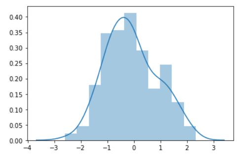
创建一个分布图
示例 2:
import numpy as np
import seaborn as sn
import matplotlib.pyplot as plt
import pandas as pd

data_set = pd.read_csv("C:/mtcars.csv")
data = pd.DataFrame(data_set['mpg'])
res = sn.distplot(data)
plt.show()
pandas.read_csv() function将数据集加载到 Python 环境中。
输出:
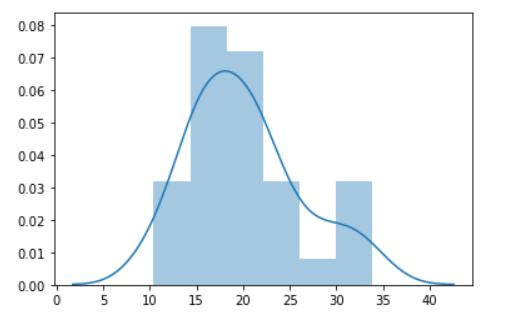
使用数据集创建 DistPlot
给 DistPlot 的轴添加标签
通过使用以下语法将数据值转换为Pandas系列,可以为 Seaborn Distplot 提供轴标签:
句法:
pandas.Series(data,name='name')
seaborn.distplot()
Pandas Series 包含一个参数‘name’来设置数据轴的标签。
例子:
import numpy as np
import seaborn as sn
import matplotlib.pyplot as plt

data = np.random.randn(200)
res = pd.Series(data,name="Range")
plot = sn.distplot(res)
plt.show()
输出:
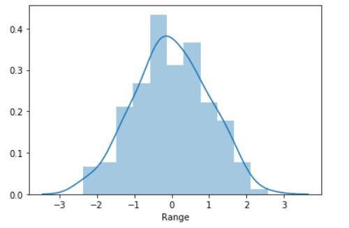
使用系列创建 DistPlot
Seaborn DistPlot 和核密度估计图
Seaborn Distplot 也可以与 Kernel Density Estimate Plot 一起使用,以估计连续变量在各种数据值中的分布概率。
句法:
seaborn.distplot(data,kde=True)
kde参数设置为True以启用核密度图和分布图。
例子:
import numpy as np
import seaborn as sn
import matplotlib.pyplot as plt

data = np.random.randn(100)
res = pd.Series(data,name="Range")
plot = sn.distplot(res,kde=True)
plt.show()
输出:
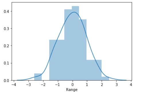
使用 KDE 绘制分布图
使用 Seaborn DistPlot 和 Rug Plot 可视化数据
我们可以将 Seaborn Distplot 与 Rug Plot 一起映射,以描述数据相对于单变量数据变量的 bin 分布。 地毯图以箱的形式描述了数据分布的可视化。
句法:
seaborn.distplot(data, rug=True, hist=False)
'rug' 参数需要设置为True以启用地毯图分布。
例子:
import numpy as np
import seaborn as sn
import matplotlib.pyplot as plt

data = np.random.randn(100)
res = pd.Series(data,name="Range")
plot = sn.distplot(res,rug=True,hist=False)
plt.show()
输出:
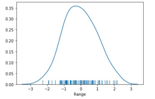
带地毯图的 DistPlot
zoz100037 * *
沿垂直轴绘制 Seaborn Distplot
可以使用以下语法在 y 轴 上绘制整个 Distplot:
句法:
seaborn.distplot(data,vertical=True)
需要将‘vertical’参数设置为True以在 y 轴上绘制 distplot。
例子:
import numpy as np
import seaborn as sn
import matplotlib.pyplot as plt

data = np.random.randn(100)

plot = sn.distplot(data,vertical=True)

plt.show()
输出:
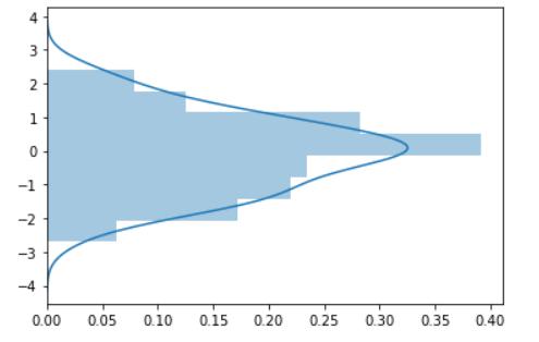
带垂直轴的 DistPlot
使用 seaborn.set() 函数设置不同的样式
Seaborn 有许多内置函数可以为绘图添加额外的背景特征。seaborn.set() function用于为分布图设置不同的背景。
句法:
seaborn.set(style)
例子:
import numpy as np
import seaborn as sn
import matplotlib.pyplot as plt
sn.set(style='dark',)
data = np.random.randn(500)

plot = sn.distplot(data)

plt.show()
输出:
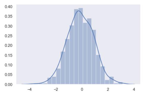
不同背景的 DistPlot
将自定义颜色设置为 Seaborn DistPlot
我们可以使用 seaborn.distplot() 函数的“color”参数为 distplot 设置不同的颜色以添加到数据的可视化中。
句法:
seaborn.distplot(data, color='color')
例子:
import numpy as np
import seaborn as sn
import matplotlib.pyplot as plt

sn.set(style='dark',)
data = np.random.randn(500)
plot = sn.distplot(data,color='purple')

plt.show()
输出:
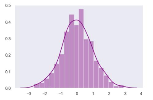
不同颜色的分布图
zoz100057 * *
结论
因此,Seaborn 模块和 Matplotlib 模块有助于数据可视化并描述数据的分布。
我强烈建议所有读者阅读Python Matplotlib 模块以了解数据可视化的基础知识。
参考文献
- Seaborn distplot() 函数 – 文档

Python社区为您提供最前沿的新闻资讯和知识内容
更多推荐

 0
0 0
0- 0


 已为社区贡献126440条内容

所有评论(0)