
构建 Tailwind CSS 按钮组组件
我使用 Tailwind CSS 已经有一段时间了,我喜欢直接从 HTML/React/Vue 或其他模板文件设置用户界面是多么容易。
我注意到的一件事是,当我必须开始一个没有一组开箱即用的组件的新项目时,这非常麻烦。
[ ](https://res.cloudinary.com/practicaldev/image/fetch/s--0fey3lHn--/c_limit%2Cf_auto%2Cfl_progressive%2Cq_auto%2Cw_880/https://dev- to-uploads.s3.amazonaws.com/uploads/articles/4n7jb9rcnum345yedh82.png)
这就是为什么我开始了一个教程系列,介绍如何使用 Tailwind CSS 中的实用程序类构建一些最常用的 Web 组件。
上次我谈到了如何构建一个Tailwind CSS 按钮组件包括不同的样式并使用 SVG 图标。
今天我想谈谈如何创建一组堆叠在一起的按钮,以用于更高级的用户界面。
让我们开始吧!
Tailwind CSS 按钮组组件
首先,我想指定按钮组件可以是使用<a>标记的链接,也可以只是一个<button>元素。
我们将从使用<button>元素开始,并创建该组件所需的基本 HTML。
<div role="group">
  <button type="button">
    Flowbite
  </button>
  <button type="button">
    Tailwind
  </button>
  <button type="button">
    The Practical Dev
  </button>
</div>
进入全屏模式 退出全屏模式
注意到我们已经将role="group"属性添加到父元素div吗?
这个帮助浏览器将识别为一组堆叠在一起的组件,从而帮助残障人士更轻松地浏览您的网站。
接下来我们应该向父元素div添加一些样式来将按钮堆叠在一起。
<div class="inline-flex shadow-sm rounded-md" role="group">
  <button type="button">
    Flowbite
  </button>
  <button type="button">
    Tailwind
  </button>
  <button type="button">
    The Practical Dev
  </button>
</div>
进入全屏模式 退出全屏模式
现在让我们为按钮组件应用一些样式。
<div class="inline-flex shadow-sm rounded-md" role="group">
  <button class="rounded-l-lg border border-gray-200 bg-white text-sm font-medium px-4 py-2 text-gray-900" type="button">
    Flowbite
  </button>
  <button class="border-t border-b border-gray-200 bg-white text-sm font-medium px-4 py-2 text-gray-900" type="button">
    Tailwind
  </button>
  <button class="rounded-r-md border border-gray-200 bg-white text-sm font-medium px-4 py-2 text-gray-900" type="button">
    The Practical Dev
  </button>
</div>
进入全屏模式 退出全屏模式
注意到中间的按钮只有顶部和边框底部了吗?第一个和最后一个元素之间的所有按钮应该只在 Y 轴上有一个边框,以防止元素之间的边框变宽。
现在让我们为按钮添加一些hover和focus样式。
<div class="inline-flex shadow-sm rounded-md" role="group">
  <button type="button" class="rounded-l-lg border border-gray-200 bg-white text-sm font-medium px-4 py-2 text-gray-900 hover:bg-gray-100 hover:text-blue-700 focus:z-10 focus:ring-2 focus:ring-blue-700 focus:text-blue-700">
    Flowbite
  </button>
  <button type="button" class="border-t border-b border-gray-200 bg-white text-sm font-medium px-4 py-2 text-gray-900 hover:bg-gray-100 hover:text-blue-700 focus:z-10 focus:ring-2 focus:ring-blue-700 focus:text-blue-700">
    Tailwind
  </button>
  <button type="button" class="rounded-r-md border border-gray-200 bg-white text-sm font-medium px-4 py-2 text-gray-900 hover:bg-gray-100 hover:text-blue-700 focus:z-10 focus:ring-2 focus:ring-blue-700 focus:text-blue-700">
    The Practical Dev
  </button>
</div>
进入全屏模式 退出全屏模式
惊人的!我们完成了第一个按钮组组件。它应该看起来像这样:
[ ](https://res.cloudinary.com/practicaldev/image/fetch/s--sTJ5Qw48--/c_limit%2Cf_auto%2Cfl_progressive%2Cq_auto%2Cw_880/https://dev -to-uploads.s3.amazonaws.com/uploads/articles/quwhe1rd79530lu3kdg1.png)
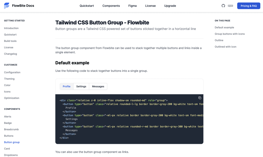
按钮组作为链接
您还可以将按钮组组件用作链接堆栈。
<div class="inline-flex shadow-sm rounded-md">
  <a href="#" aria-current="page" class="rounded-l-lg border border-gray-200 bg-white text-sm font-medium px-4 py-2  hover:bg-gray-100 text-blue-700 focus:z-10 focus:ring-2 focus:ring-blue-700 focus:text-blue-700">
    Profile
  </a>
  <a href="#" class="border-t border-b border-gray-200 bg-white text-sm font-medium px-4 py-2 text-gray-900 hover:bg-gray-100 hover:text-blue-700 focus:z-10 focus:ring-2 focus:ring-blue-700 focus:text-blue-700">
    Settings
  </a>
  <a href="#" class="rounded-r-md border border-gray-200 bg-white text-sm font-medium px-4 py-2 text-gray-900 hover:bg-gray-100 hover:text-blue-700 focus:z-10 focus:ring-2 focus:ring-blue-700 focus:text-blue-700">
    Messages
  </a>
</div>
进入全屏模式 退出全屏模式
带图标的按钮组
您还可以将 SVG 图标与按钮组元素一起使用。
<div class="inline-flex shadow-sm rounded-md" role="group">
  <button type="button" class="rounded-l-lg border border-gray-200 bg-white text-sm font-medium px-4 py-2 text-gray-900 hover:bg-gray-100 hover:text-blue-700 focus:z-10 focus:ring-2 focus:ring-blue-700 focus:text-blue-700 inline-flex items-center ">
    <svg class="w-4 h-4 mr-2 fill-current" fill="currentColor" viewBox="0 0 20 20" xmlns="http://www.w3.org/2000/svg"><path fill-rule="evenodd" d="M18 10a8 8 0 11-16 0 8 8 0 0116 0zm-6-3a2 2 0 11-4 0 2 2 0 014 0zm-2 4a5 5 0 00-4.546 2.916A5.986 5.986 0 0010 16a5.986 5.986 0 004.546-2.084A5 5 0 0010 11z" clip-rule="evenodd"></path></svg>
    Profile
  </button>
  <button type="button" class="border-t border-b border-gray-200 bg-white text-sm font-medium px-4 py-2 text-gray-900 hover:bg-gray-100 hover:text-blue-700 focus:z-10 focus:ring-2 focus:ring-blue-700 focus:text-blue-700 inline-flex items-center">
    <svg class="w-4 h-4 mr-2 fill-current" fill="currentColor" viewBox="0 0 20 20" xmlns="http://www.w3.org/2000/svg"><path d="M5 4a1 1 0 00-2 0v7.268a2 2 0 000 3.464V16a1 1 0 102 0v-1.268a2 2 0 000-3.464V4zM11 4a1 1 0 10-2 0v1.268a2 2 0 000 3.464V16a1 1 0 102 0V8.732a2 2 0 000-3.464V4zM16 3a1 1 0 011 1v7.268a2 2 0 010 3.464V16a1 1 0 11-2 0v-1.268a2 2 0 010-3.464V4a1 1 0 011-1z"></path></svg>
    Settings
  </button>
  <button type="button" class="rounded-r-md border border-gray-200 bg-white text-sm font-medium px-4 py-2 text-gray-900 hover:bg-gray-100 hover:text-blue-700 focus:z-10 focus:ring-2 focus:ring-blue-700 focus:text-blue-700 inline-flex items-center">
    <svg class="w-4 h-4 mr-2 fill-current" fill="currentColor" viewBox="0 0 20 20" xmlns="http://www.w3.org/2000/svg"><path fill-rule="evenodd" d="M2 9.5A3.5 3.5 0 005.5 13H9v2.586l-1.293-1.293a1 1 0 00-1.414 1.414l3 3a1 1 0 001.414 0l3-3a1 1 0 00-1.414-1.414L11 15.586V13h2.5a4.5 4.5 0 10-.616-8.958 4.002 4.002 0 10-7.753 1.977A3.5 3.5 0 002 9.5zm9 3.5H9V8a1 1 0 012 0v5z" clip-rule="evenodd"></path></svg>
    Downloads
  </button>
</div>
进入全屏模式 退出全屏模式
目前为止就这样了!我希望你喜欢这个教程。
Flowbite - Tailwind 组件库
这个Tailwind CSS 按钮组组件是更大的开源组件库 Flowbite 的一部分。
[ ](https://res.cloudinary.com/practicaldev/image/fetch/s--49Z09V2d--/c_limit%2Cf_auto%2Cfl_progressive%2Cq_auto%2Cw_880/https://dev -to-uploads.s3.amazonaws.com/uploads/articles/7e74xtygspba1qcp5ayi.png)
您可以查看Flowbite 的 Tailwind 组件文档来查看更多组件和示例。

ModelScope旨在打造下一代开源的模型即服务共享平台,为泛AI开发者提供灵活、易用、低成本的一站式模型服务产品,让模型应用更简单!
更多推荐
 0
0 0
0- 0


 已为社区贡献27134条内容

所有评论(0)