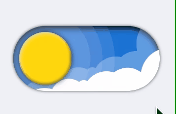
就这个特效按钮,这能气死哪个前端,很难吗?
白天黑夜切换按钮实现
·
网上刷到一个气死前端的按钮,白天黑夜切换的效果。

我想着,这不纯代码就能实现嘛。
看下我实现的效果:

也就70多行html,280多行css
纯手撸代码,拿走不谢
React:
import cx from 'classnames';
import React from 'react';
import styles from './index.less';

const Star = ({
  color = '#fff'
}: {
  color?: string
}) => {
  const width = 20;
  const half = 10  //width/2;
  const quat = 5   //width/4;
  return <svg version="1.1"
    viewBox={"0 0 "+width+" "+width+""}
    height={width} width={width} style={{
      width: '100%',
      height: '100%'
    }}
  >
    <path
      d={"M 0 "+half+" c "+quat+" 0 "+half+" -"+quat+" "+half+" -"+half+" c 0 "+quat+" "+quat+" "+half+" "+half+" "+half+" c -"+quat+" 0 -"+half+" "+quat+" -"+half+" "+half+" c 0 -"+quat+" -"+quat+" -"+half+" -"+half+" -"+half+""}
      stroke={color} strokeWidth={1} fill={color}
    />
  </svg>
}

interface ViewProps extends React.HTMLAttributes<HTMLSpanElement> {
  active?: boolean;
}
export default class ButtonWeather extends React.Component<ViewProps> {
  public state = {
    activeState: false  //临时展示用
  }
  public render() {
    const { active, className, children, ...restProps } = this.props;
    const { activeState } = this.state

    return (
      <span className={cx(styles.button, {[styles.night]: activeState}, className)} {...restProps} onClick={() => {
        this.setState({ activeState: !activeState})
      }}>
        <span className={styles.btnInner}>
          <span className={styles.circle}>
            <span className={styles.circleNight}>
              <span className={styles.crater} />
              <span className={cx(styles.crater, styles.crater2)} />
              <span className={cx(styles.crater, styles.crater3)} />
            </span>
          </span>
          <span className={styles.haloBox}>
            <span className={styles.halo} />
            <span className={cx(styles.halo, styles.halo2)} />
            <span className={cx(styles.halo, styles.halo3)} />
          </span>
          <span className={styles.clouds}>
            {new Array(7).fill(1).map((e, ind) => (
              <span className={cx(styles.cloud, styles['cloud'+(ind+1)])} key={ind+'cloud'} />
            ))}
          </span>
          <span className={cx(styles.clouds, styles.clouds2)}>
            {new Array(7).fill(1).map((e, ind) => (
              <span className={cx(styles.cloud, styles['cloud'+(ind+1)])} key={ind+'cloud'} />
            ))}
          </span>
          <span className={styles.stars}>
            <span className={styles.star}><Star /></span>
            {new Array(10).fill(1).map((e, ind) => (
              <span className={cx(styles.star, styles['star'+(ind+1)])} key={ind+'star'}><Star /></span>
            ))}
          </span>
        </span>
      </span>
    );
  }
}
Less:
@btnW: 150px;
@btnH: 66px;
@paddingL: 6px;
@time: 0.6s;

.button {
  display: inline-block;
  line-height: 0;
  cursor: pointer;
}
.btnInner {
  transition: all @time ease-in-out;
  line-height: 0;
  display: inline-block;
  position: relative;
  height: @btnH;
  width: @btnW;
  border-radius: 100px;
  background: #1c80da;
  box-shadow: inset 0 2px 6px #000, 0 0 3px rgba(0,0,0,0.6);
  overflow: hidden;
}
.circle {
  transition: all @time ease-in-out;
  position: absolute;
  z-index: 2;
  overflow: hidden;
  width: @btnH - @paddingL - @paddingL;
  height: @btnH - @paddingL - @paddingL;
  top: @paddingL; left: @paddingL;
  background: #ffdd08;
  border-radius: 100px;
  box-shadow: 0px 0px 5px rgba(0,0,0,0.6), inset -0.5px -1px 3px rgba(0,0,0,0.6), inset 1px 1px 3px rgba(255,255,255,0.8);
  .circleNight {
    transition: all @time ease-in-out;
    position: absolute;
    top: 0;
    left: 101%;
    width: 100%;
    height: 100%;
    border-radius: 100px;
    background: #c7d0da;
    box-shadow: 0px 0px 5px rgba(0,0,0,0.6), inset -0.5px -1px 2px rgba(0,0,0,0.6), inset 1px 1px 2px rgba(255,255,255,0.8);
  }
  .crater {
    position: absolute;
    width: 25%;
    height: 25%;
    top: 12%;
    left: 44%;
    border-radius: 100px;
    background: #909baf;
    &.crater2 {
      width: 34%;
      height: 34%;
      top: 42%;
      left: 16%;
    }
    &.crater3 {
      width: 19%;
      height: 19%;
      top: 62%;
      left: 63%;
    }
  }
}
.haloBox {
  transition: all @time ease-in-out;
  position: absolute;
  z-index: 1;
  width: 0; height: 0;
  left: @btnH / 2;
  top: @btnH / 2;
  .halo {
    transition: all @time ease-in-out;
    width: @btnH * 1.4;
    height: @btnH * 1.4;
    position: absolute;
    background: #fff;
    opacity: 0.1;
    border-radius: 1000px;
    left: 50%; top: 50%;
    transform: translate(-50%, -50%);
    &.halo2 {
      width: @btnH * 1.4 + 25;
      height: @btnH * 1.4 + 25;
    }
    &.halo3 {
      width: @btnH * 1.4 + 50;
      height: @btnH * 1.4 + 50;
    }
  }
}
.clouds {
  transition: all @time ease-in-out;
  position: absolute;
  top: 0;
  left: 0;
  width: 100%;
  height: 100%;
  opacity: 0.3;
  transition-delay: 0s;
  &.clouds2 {
    transition-delay: @time * 0.2;
    top: 19%;
    left: -5%;
    opacity: 1;
    transform: rotate(5deg);
    .cloud {
      top: 2%;
      left: 92%;
      &.cloud2 {
        top: 39%;
        left: 69%;
      }
    }
  }
  .cloud {
    position: absolute;
    background: #fff;
    border-radius: 100px;
    width: @btnH * 0.9;
    height: @btnH * 0.9;
    top: -17%;
    left: 84%;
    &.cloud2 {
      width: @btnH * 0.68;
      height: @btnH * 0.68;
      top: 39%;
      left: 69%;
    }
    &.cloud3 {
      width: @btnH * 0.73;
      height: @btnH * 0.73;
      top: 47%;
      left: 54%;
    }
    &.cloud4 {
      width: @btnH * 0.2;
      height: @btnH * 0.2;
      top: 64%;
      left: 49.7%;
    }
    &.cloud5 {
      width: @btnH * 0.57;
      height: @btnH * 0.57;
      top: 64%;
      left: 32%;
    }
    &.cloud6 {
      width: @btnH * 0.73;
      height: @btnH * 0.73;
      top: 81%;
      left: 13%;
    }
    &.cloud7 {
      width: @btnH * 0.45;
      height: @btnH * 0.45;
      top: 85%;
      left: 7%;
    }
  }
}
.stars {
  transition: all @time ease-in-out;
  position: absolute;
  top: -100%;
  left: 0;
  width: 100%;
  height: 100%;
  .star {
    transition: all @time ease-in-out;
    transform: translateY(-20px);
    display: inline-block;
    position: absolute;
    left: 20%;
    top: 20%;
    width: 10px;
    &.star2 {
      left: 10%;
      top: 30%;
      width: 4px;
      transition-delay: 0.1s;
    }
    &.star3 {
      left: 20%;
      top: 48%;
      width: 3px;
      transition-delay: 0.15s;
    }
    &.star4 {
      left: 11%;
      top: 76%;
      width: 4px;
      transition-delay: 0.24s;
    }
    &.star5 {
      left: 16%;
      top: 71%;
      width: 4px;
      transition-delay: 0.20s;
    }
    &.star6 {
      left: 23%;
      top: 79%;
      width: 5px;
      transition-delay: 0.26s;
    }
    &.star7 {
      left: 44%;
      top: 26%;
      width: 4px;
      transition-delay: 0.04s;
    }
    &.star8 {
      left: 37%;
      top: 50%;
      width: 4px;
      transition-delay: 0.14s;
    }
    &.star9 {
      left: 44%;
      top: 68%;
      width: 6px;
      transition-delay: 0.12s;
    }
    &.star10 {
      left: 52%;
      top: 37%;
      width: 8px;
      transition-delay: 0.05s;
    }
  }
}
.night {
  .btnInner {
    background: #252525;
  }
  .circle {
    left: @btnW - @btnH + @paddingL;
    .circleNight {
      left: 0;
    }
  }
  .haloBox {
    left: @btnW - @btnH / 2;
    .halo {
      opacity: 0.13;
    }
  }
  .clouds {
    top: 100%;
    transition-delay: @time * 0.2;
    &.clouds2 {
      transition-delay: 0s;
    }
    .cloud {
    }
  }
  .stars {
    top: 0;
    .star {
      transform: translateY(0);
    }
  }
}
.button {
  &:hover {
    .circle {
      transform: translateX(5px);
    }
    .haloBox {
      transform: translateX(5px);
    }
    &.night {
      .circle {
        transform: translateX(-5px);
      }
      .haloBox {
        transform: translateX(-5px);
      }
    }
  }
}

助力合肥开发者学习交流的技术社区,不定期举办线上线下活动,欢迎大家的加入
更多推荐

 51
51 0
0- 0


 已为社区贡献1条内容

所有评论(0)