
如何在 R 编程中构造频率多边形图。
频率多边形
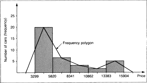
频率多边形是通过将直方图的类别标记与位于水平轴上的两个端点连接而获得的图形。它给出了分布形状的概念。可以通过在直方图的类标记上放置点来叠加在直方图上,如下图所示。
[ ](https://res.cloudinary.com/practicaldev/image/fetch/s--I4-VHw4A--/c_limit%2Cf_auto%2Cfl_progressive%2Cq_66%2Cw_880/https://dev- to-uploads.s3.amazonaws.com/uploads/articles/oay87fh12b0nq8ddtu52.gif)
你可能已经在大学里学会了如何做到这一点。但是,如果我们可以拥有一些可以为我们做的事情,尤其是当我们有大数据时,那不是很好吗???谁不想要那个😆🤪🤪???。好的继续阅读。
绘制频率多边形的步骤。
1.使用hist()函数获取数据并绘制直方图并提供必要的参数。
- 得到所有条的中点向量。
3.获取数据所有断点的向量
-
使用lines() 函数绘制一条线,使第2 个向量在y 轴上,第3 个向量在x 轴上。
-
如有必要,进行任何调整。
使用R构建直方图
这里我们将使用下面的例子,所以我们需要先绘制直方图。
示例1
使用以下数据显示 50 名学生的分数来构建频率多边形。
22 17 26 27 14 15 21 18 8 19 26 14 20 12 11 17 20 16
26 12 21 15 18 21 10 16 20 18 21 22 21 15 19 10 25 15
16 31 24 21 14 24 23 20 14 15 16 29 20 21。
解决方案
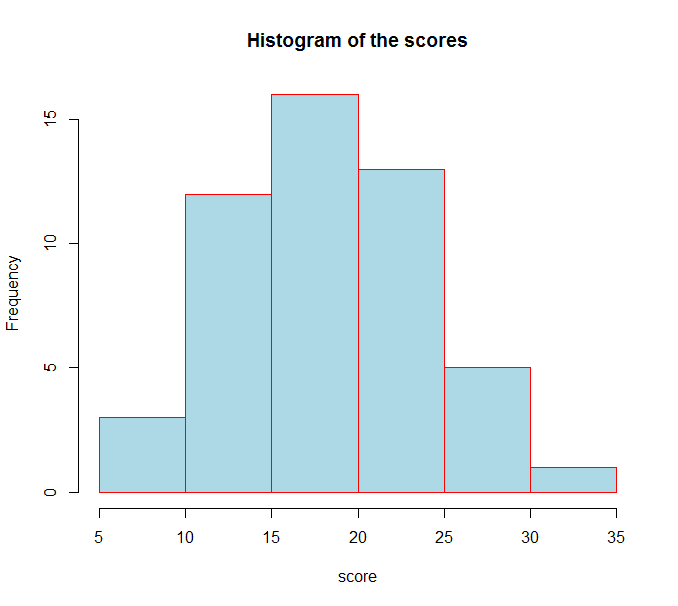
step1:输入所有数据并绘制直方图。
代码>>
score=c(22, 17, 26, 27, 14, 15 ,21, 18 , 8,
        19, 26, 14, 20, 12, 11 ,17, 20, 16,26, 12,
        21 ,15, 18, 21, 10, 16 ,20, 18 ,21, 22, 21,
        15, 19, 10, 25 ,15,16, 31, 24, 21, 14, 24,
        23, 20 ,14, 15 ,16, 29, 20, 21)

hist.score=hist(score,main='Histogram of the scores',
       breaks =8,col = 'lightblue',border = 'red')
进入全屏模式 退出全屏模式
结果>>
[ ](https://res.cloudinary.com/practicaldev/image/fetch/s--5SYDGNDM--/c_limit%2Cf_auto%2Cfl_progressive%2Cq_auto%2Cw_880/https://dev-to- uploads.s3.amazonaws.com/uploads/articles/2mnbch09tifmluonmy9x.png)
现在让我们看看关于直方图的一些信息,注意直方图被分配给了一个特定的变量。
代码>>
score=c(22, 17, 26, 27, 14, 15 ,21, 18 , 8,
        19, 26, 14, 20, 12, 11 ,17, 20, 16,26, 12,
        21 ,15, 18, 21, 10, 16 ,20, 18 ,21, 22, 21,
        15, 19, 10, 25 ,15,16, 31, 24, 21, 14, 24,
        23, 20 ,14, 15 ,16, 29, 20, 21)

hist.score=hist(score,main='Histogram of the scores',
       breaks =8,col = 'lightblue',border = 'red')
hist.score
进入全屏模式 退出全屏模式
结果>>
$breaks
[1]  5 10 15 20 25 30 35

$counts
[1]  3 12 16 13  5  1

$density
[1] 0.012 0.048 0.064 0.052 0.020 0.004

$mids
[1]  7.5 12.5 17.5 22.5 27.5 32.5

$xname
[1] "score"

$equidist
[1] TRUE

attr(,"class")
[1] "histogram"
进入全屏模式 退出全屏模式
正如您在上面看到的那样,断点准确地告诉了我们条形图的所有断点。 mids 告诉我们所有的中点,而 counts 告诉我们每个条的频率。现在我们可以使用这些信息通过列出 x 轴和 y 轴的向量来绘制频率多边形线。请参阅以下代码;
代码>>
score=c(22, 17, 26, 27, 14, 15 ,21, 18 , 8,
        19, 26, 14, 20, 12, 11 ,17, 20, 16,26, 12,
        21 ,15, 18, 21, 10, 16 ,20, 18 ,21, 22, 21,
        15, 19, 10, 25 ,15,16, 31, 24, 21, 14, 24,
        23, 20 ,14, 15 ,16, 29, 20, 21)

hist.score=hist(score,main='Histogram of the scores',
       breaks =8,col = 'lightblue',border = 'red')
xaxis=c(min(hist.score$breaks),hist.score$mids,max(hist.score$breaks))
y.axis=c(0,g$counts,0)
lines(x.axis,y.axis,type='l')
进入全屏模式 退出全屏模式
结果>>
[ ](https://res.cloudinary.com/practicaldev/image/fetch/s--UkVpBlgr--/c_limit%2Cf_auto%2Cfl_progressive%2Cq_auto%2Cw_880/https://dev-to- uploads.s3.amazonaws.com/uploads/articles/oqlt83ubqx7v5vrh7b97.png)
现在我们已经构造了多边形对吗?好吧,你可能不喜欢这个,为什么?你可能是像我这样想要没有直方图的多边形的人。所以要做到这一点,您所要做的就是将直方图的颜色和边框更改为透明,如下所示;
代码>>
score=c(22, 17, 26, 27, 14, 15 ,21, 18 , 8,
        19, 26, 14, 20, 12, 11 ,17, 20, 16,26, 12,
        21 ,15, 18, 21, 10, 16 ,20, 18 ,21, 22, 21,
        15, 19, 10, 25 ,15,16, 31, 24, 21, 14, 24,
        23, 20 ,14, 15 ,16, 29, 20, 21)

hist.score=hist(score,main='Histogram of the scores',
       breaks =8,col = 'transparent',border = 'transparent')
xaxis=c(min(hist.score$breaks),hist.score$mids,max(hist.score$breaks))
y.axis=c(0,g$counts,0)
lines(x.axis,y.axis,type='l')
进入全屏模式 退出全屏模式
[ ](https://res.cloudinary.com/practicaldev/image/fetch/s--oNvNhLfv--/c_limit%2Cf_auto%2Cfl_progressive%2Cq_auto%2Cw_880/https://dev-to- uploads.s3.amazonaws.com/uploads/articles/2su0d31n1b9rqwu7obhj.png)
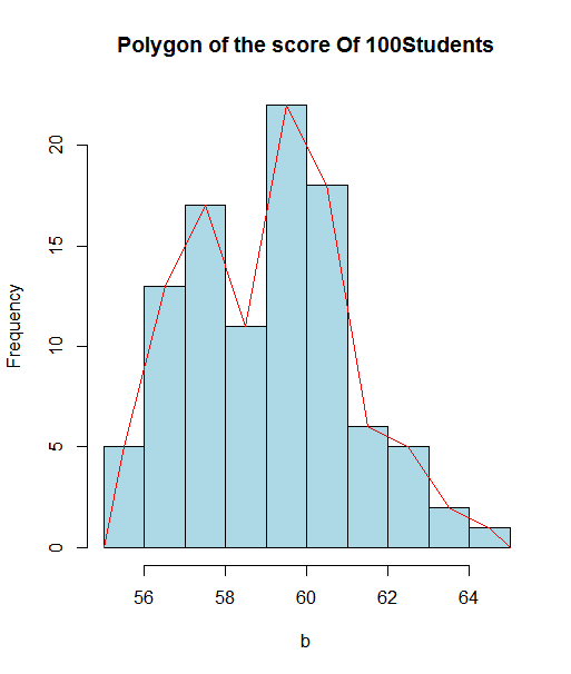
示例 2
使用以下数据显示 100 名学生在统计考试中的分数来构建频率多边形。
代码>>
examScores=scan()
63 60 57 55 60 56 58 61 62 60 60 60 58 60 59 60 60 60 58 62 58 63 60 62 61
61 58 59 61 61 61 61 59 61 61 57 58 57 62 59 60 59 59 57 58 58 62 59 58 60
64 59 60 57 60 61 62 61 61 61 60 57 57 58 60 56 58 65 63 63 58 61 60 59 60
60 61 61 59 57 58 57 58 56 60 58 60 58 58 56 64 57 61 57 57 59 57 63 60 61

hist.Score=hist(examScores,main='Histogram of the scores',
       breaks =8,col = 'lightblue',border = 'red')
x.axis=c(min(hist.Score$breaks),hist.Score$mids,max(hist.Score$breaks))
y.axis=c(0,hist.Score$counts,0)
lines(x.axis,y.axis,type='l')
进入全屏模式 退出全屏模式
结果>>
[ ](https://res.cloudinary.com/practicaldev/image/fetch/s--hmHrXKNN--/c_limit%2Cf_auto%2Cfl_progressive%2Cq_auto%2Cw_880/https://dev-to- uploads.s3.amazonaws.com/uploads/articles/3bjto2dotavk8hrobbdg.png)
您可以使用以下相同的方法删除直方图部分;
代码
examScores=scan()
63 60 57 55 60 56 58 61 62 60 60 60 58 60 59 60 60 60 58 62 58 63 60 62 61
61 58 59 61 61 61 61 59 61 61 57 58 57 62 59 60 59 59 57 58 58 62 59 58 60
64 59 60 57 60 61 62 61 61 61 60 57 57 58 60 56 58 65 63 63 58 61 60 59 60
60 61 61 59 57 58 57 58 56 60 58 60 58 58 56 64 57 61 57 57 59 57 63 60 61

hist.Score=hist(examScores,main='Histogram of the scores',
       breaks =8,col = 'transparent',border = 'transparent')
x.axis=c(min(hist.Score$breaks),hist.Score$mids,max(hist.Score$breaks))
y.axis=c(0,hist.Score$counts,0)
lines(x.axis,y.axis,type='l')
进入全屏模式 退出全屏模式
结果>>
[ ](https://res.cloudinary.com/practicaldev/image/fetch/s--ryOUC0DQ--/c_limit%2Cf_auto%2Cfl_progressive%2Cq_auto%2Cw_880/https://dev-to- uploads.s3.amazonaws.com/uploads/articles/kgbcut8tyz54h5grmgm9.png)
我希望你觉得这篇文章有帮助??考虑分享给其他可能感兴趣的地方。请支持并喜欢激励我写更多。有问题可以私聊我。

华为、百度、京东云现已入驻,来创建你的专属开发者社区吧!
更多推荐
 0
0 0
0- 0


 已为社区贡献20427条内容

所有评论(0)