

Using Python and Meteoblue weather newsletter
Meteogram is a graphical presentation of meteorological variables (observed or forecasted) through time, for a specific location. The meteogram below was created by combining several forecasts from Meteoblue’s newsletter.
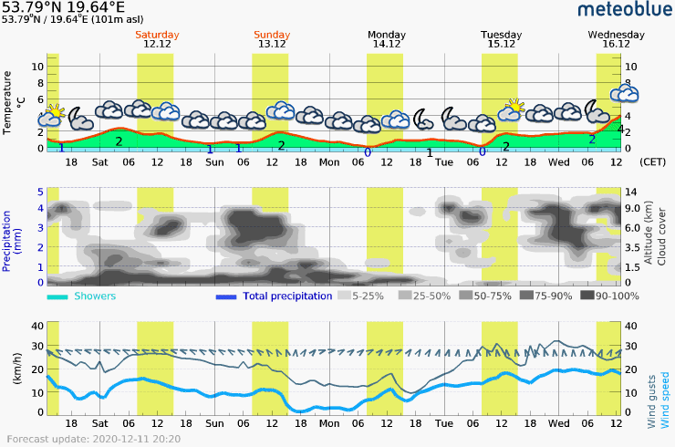
Each “frame” contains 5-day meteogram with 3 simple graphs for a specific location:
-
Temperature chart with weather pictograms. The time from sunrise to sunset is indicated in light yellow.
-
Clouds in different altitudes: from a few clouds (light grey) to overcast (dark grey). Dark blue bars show hourly precipitation and light blue showers. An asterisk indicates snowfall.
-
Forecasts of wind speeds are blue and gusts are green. The arrowheads point in the same direction as the wind.
In this article, you will find instructions on how to create similar animation for your neighbourhood.
Read More:
https://blog.devgenius.io/how-to-create-animated-meteogram-5a446f103073


 已为社区贡献2917条内容

所有评论(0)