

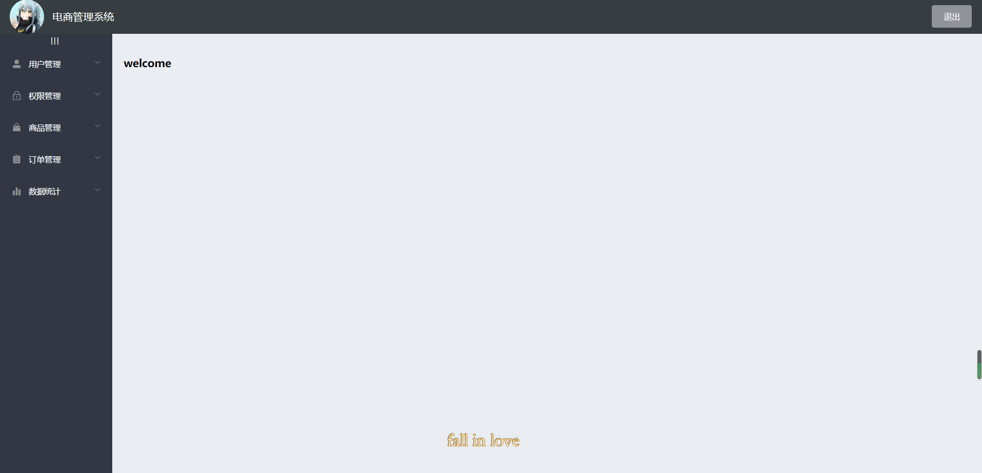
Realization effect
Design ideas
It is mainly divided into three parts
- Head area
- Sidebar area
- Right body area
Use the Container layout Container to build the basic structure of the page container
 <el-container>: Outer container. When a child element contains <el-header> or <el-footer>When, all child elements will be arranged vertically up and down, otherwise they will be arranged horizontally left and right.
 <el-header>: Top bar container.
 <el-aside>: Sidebar container.
  <el-main>: Main area containers.
  <el-footer>: Bottom bar container.
Concrete implementation
Build basic structure
Select the fourth one and stick it to home Vue
<el-container>
  <!-- Head area -->
  <el-header>
  	Header
  	<el-button type="info" @click="logout">sign out</el-button>
  </el-header>

  <!-- Content body area -->
  <el-container>
    <!-- sidebar  -->
    <el-aside width="200px">Aside</el-aside>
    <!-- Right content body area -->
    <el-main>Main</el-main>
  </el-container>
</el-container>
The name of the component provided in the element ui is the class name, which can be directly used to select and add styles
Add a style to them: background color to fill the whole screen [add a class name to the outermost El container and set height: 100%]
header area design
It is divided into icon, text and button on the right
    <!-- Head area -->
    <el-header>
      <div>
        <img src="../assets/touxiang.jpg" />
        <span>E-commerce management system</span>
      </div>
      <el-button type="info" @click="logout">sign out</el-button>
    </el-header>
flex layout
.el-header {
  background-color: #373d41;
  display: flex;
  justify-content: space-between; // Align left and right trim
  align-items: center;  // Center button
  > div {
    display: flex;
    align-items: center;  // Center text vertically
    img {
      width: 60px;
      border-radius: 50%;
    }
    span {
      color: white;
      font-size: 18px;
      margin-left: 15px;
    }
  }
}
Side bar design
The menu is divided into two levels, which can be folded and used with El menu menu
Examples of using custom colors
      <!-- sidebar  -->
      <el-aside width="200px">

      	<!-- Sidebar menu area -->
        <el-menu background-color="#333744" text-color="#fff" active-text-color="#409eff">

          <!-- First level menu -->
          <el-submenu index="1">
            <!-- First level menu template area -->
            <template slot="title">
              <!-- Icon -->
              <i :class="el-icon-location"></i>
              <!-- text -->
              <span>Navigation one</span>
            </template>

            <!-- Secondary menu -->
            <!-- router Turn on routing mode, index As jump address -->
            <el-menu-item index="1-1">
              <template slot="title">
                <!-- Icon -->
                <i class="el-icon-menu"></i>
                <!-- text -->
                <span>Navigation 1-1</span>
              </template>
            </el-menu-item>

          </el-submenu>

        </el-menu>
      </el-aside>
.el-aside {
  background-color: #333744;
  .el-menu {
    border-right: 0;   // Menu right border line

  }
}
Add token authentication through axios
Note: for API s requiring Authorization, you must provide a token token using the Authorization field in the request header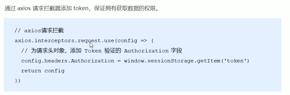
In main JS
// Add token authentication through axios interceptor
axios.interceptors.request.use(config => {
  config.headers.Authorization = window.sessionStorage.getItem('token')
  // Finally, you must add a return
  return config
})
Dynamically obtain sidebar menu data through the interface
get data
You should get the menu data as soon as the page starts loading
  data() {
    return {
      menulist: []
    };
  },

  created() {
    this.getMenuList()
  },
    getMenuList() {
      // Get all menu names
      this.$http.get('menus').then((res) => {
        console.log(res);
        if (res.data.meta.status == 200) {
          this.menulist = res.data.data
          console.log(this.menulist);
        } else {
          return this.$message.error(res.data.meta.msg)
        }
      });
    },
v-for rendering data and icons
data type
- Specify a unique index for each El submenu to control that it will not be opened when opening one. Dynamic data binding
- index should be in string format, item ID is a numeric type. To convert, splice an empty string: it is a dynamic binding
- authName is the text area of the first level menu
- id is the key in v-for
- The secondary menu loops through the children
- Secondary icons use "El icon menu"
- Level 1 Icon defines an icon object in data, with id as key and icon as value
- Active text color = "#409eff" sets the color highlighted when selected
- The unique opened setting opens only one menu bar at a time
      <!-- sidebar  -->
      <el-aside width="200px">

      	<!-- Sidebar menu area -->
        <el-menu background-color="#333744" text-color="#fff" active-text-color="#409eff" unique-opened>

          <!-- First level menu -->
          <el-submenu :index="item.id + ''" v-for="item in menulist" :key="item.id">
            <!-- First level menu template area -->
            <template slot="title">
              <!-- Icon -->
              <i :class="iconObj[item.id]"></i>
              <!-- text -->
              <span>{{item.authName}}</span>
            </template>

            <!-- Secondary menu -->
            <!-- router Turn on routing mode, index As jump address -->
            <el-menu-item :index="subItem.id + ''" v-for="subItem in item.children" :key="subItem.id">
              <template slot="title">
                <!-- Icon -->
                <i class="el-icon-menu"></i>
                <!-- text -->
                <span>{{subItem.authName}}</span>
              </template>
            </el-menu-item>

          </el-submenu>

        </el-menu>
      </el-aside>
<script>
export default {
  data() {
    return {
      menulist: [],
      iconObj: {
        "125": "el-icon-user-solid",
        "103": "el-icon-lock",
        "101": "el-icon-s-goods",
        "102": "el-icon-s-order",
        "145": "el-icon-s-data"
      }
    };
  },
Set that only one menu bar can be opened at a time

Sidebar collapse and expand
- Place sidebar objects and div labels|||
- Set style
- The collapse property controls the collapse and expansion state
- The collapse transition property controls the collapse animation to be turned off
- Define the control variable isCollapse in data
- Set click trigger method
- The sidebar width is dynamically assigned according to isCollapse
    <el-container>
      <!-- sidebar  -->
      <el-aside :width="isCollapse ? '64px' : '200px'">
        <div class="toggle-button" @click="toggleCollapse">|||</div>
        <el-menu
	        background-color="#333744"
	        text-color="#fff"
	        active-text-color="#409eff"
	        unique-opened
	        :collapse="isCollapse"
	        :collapse-transition="false">
.toggle-button {
  font-size: 10px;
  line-height: 24px;
  color: #fff;
  text-align: center;
  letter-spacing: 0.2em;  // Spacing between three vertical lines
  cursor: pointer;  // Put the mouse up into the shape of a small hand
}
  data() {
    return {
      menulist: [],
      iconObj: {
        "125": "el-icon-user-solid",
        "103": "el-icon-lock",
        "101": "el-icon-s-goods",
        "102": "el-icon-s-order",
        "145": "el-icon-s-data"
      },
      isCollapse: false
    };
  },
    toggleCollapse() {
      // Click the button to switch the collapse and expansion of the menu
      this.isCollapse = !this.isCollapse;
    }

Sidebar routing link transformation

- Turn on the routing mode and add a router attribute in the El menu
- The jump defaults to the location corresponding to the index, so change the index to the path attribute in the data
        <el-menu background-color="#333744" text-color="#fff" active-text-color="#409eff"
        unique-opened :collapse="isCollapse" :collapse-transition="false" router>
            <!-- Secondary menu -->
            <!-- router Turn on routing mode, index As jump address -->
            <el-menu-item :index="'/'+subItem.path" v-for="subItem in item.children" :key="subItem.id">
Home page routing redirection
- Define welcome components
- At home Place a route placeholder in the main section of Vue
- Set the welcome component as the sub route of Home
<template>
  <div>
      <h3>welcome</h3>
  </div>
</template>

<script>
export default {
  data() {
    return {

    }
  },
  components: {

  }
}
</script>

<style lang="less" scoped>

</style>
      <!-- Right content body area -->
      <el-main>
        <!-- Route placeholder -->
        <router-view></router-view>
      </el-main>
const router = new Router({
  routes: [
    { path: '/', redirect: '/login' },
    { path: '/login', component: Login },
    {
      path: '/home',
      component: Home,
      redirect: '/welcome',
      children: [
        { path: '/welcome', component: Welcome },


 已为社区贡献21233条内容

所有评论(0)