用vue3+elementplus做的一个滚动菜单栏的组件
在elementplus中看到了滚动条绑定了slider,但是这个感觉很不实用,在底部,而且横向滚动,最常见的应该是那种固定在左上角的带着菜单的滚动条,于是我就想要不做一个小demo,方便以后使用。
·
起因
在elementplus中看到了滚动条绑定了slider,但是这个感觉很不实用,在底部,而且横向滚动,最常见的应该是那种固定在左上角的带着菜单的滚动条,于是我就想要不做一个小demo,方便以后使用

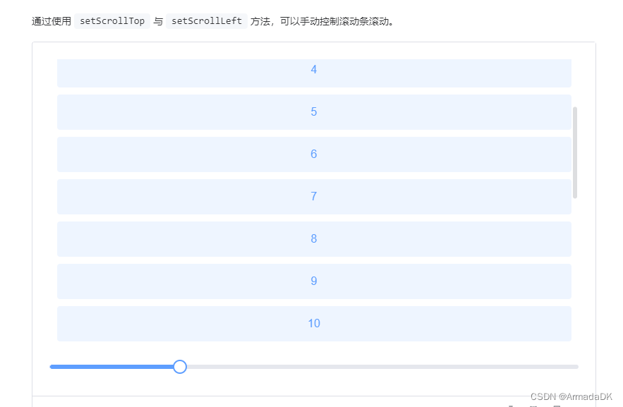
概览
样式如下:(背景是我父组件的背景色

设计及解决思路
1.滚动条竖起来
首先不能用横着的滚动条,一开始我是想用transform来旋转的,后来我发现这玩意是靠鼠标位置来决定数值大小的,所以就算transform还是得横着拖,所以采用竖着的slider;
slider是竖起来了,但是如何和滚动条绑定呢,elementplus里面使用的是el-scrollbar,但是如果这是一个信息页,你不可能把它放在一个el-scrollbar中,那么只有用当前位置/window的高度来决定slider的数值,实现方法及算法如下:
<el-slider
            v-model="heighRatio"
            :show-tooltip="false"
            vertical
            :height="scrollBarHeight"
            @input="scrollInput"
          />
const heighRatio = ref(100);
function scrollInput() {
  window.scrollTo(0, ((100 - heighRatio.value) * document.body.clientHeight) / 100);
}

function handleScroll() {
  heighRatio.value =
    100 - (document.documentElement.scrollTop / document.body.clientHeight) * 100;
}

onMounted(() => {
  // 给window绑定滚动事件
  window.addEventListener("scroll", handleScroll);
});
2.绑定菜单
假设它的信息页的内容是分title和content的,我们就可以用title形成菜单然后点击进行跳转,给每个content的title标记上id,就可以用#进行页内跳转
	<div class="contentTitle">
           <a :href="'#' + item.title" class="contentItem" v-for="item in arrayData">
              {{ item.title }}
           </a>
    </div>
    <!-- 内容部分 -->
    <div class="content" id="content">
      <div class="part" v-for="item in arrayData">
        <h2 :id="item.title">{{ item.title }}</h2>
        <p>{{ item.content }}</p>
      </div>
    </div>
3.吸附
这个菜单滚动条既然能够点击拖动,那么就必须一直在视口内,所以要通过吸附让它一直显现,而elementplus刚好具有这种组件Affix,直接采用即可。
优化
顺便加了一个回到顶部的按钮,只要添上内容这个信息页就比较完整了
组件全部代码
<template>
  <el-container>
    <!-- 自定义滚动条 -->
    <div class="scrollMenu">
      <el-affix :offset="120">
        <div style="display: flex">
          <el-slider
            v-model="heighRatio"
            :show-tooltip="false"
            vertical
            :height="scrollBarHeight"
            @input="scrollInput"
          />
          <div class="contentTitle">
            <a :href="'#' + item.title" class="contentItem" v-for="item in arrayData">{{
              item.title
            }}</a>
          </div>
        </div>
      </el-affix>
    </div>

    <!-- 内容部分 -->
    <div class="content" id="content">
      <div class="part" v-for="item in arrayData">
        <h2 :id="item.title">{{ item.title }}</h2>
        <p>{{ item.content }}</p>
      </div>
    </div>

    <!-- 返回顶部 -->
    <el-backtop :bottom="100">
      <div
        style="
          height: 100%;
          width: 100px;
          background-color: var(--el-bg-color-overlay);
          box-shadow: var(--el-box-shadow-lighter);
          border-radius: 50%;
          text-align: center;
          line-height: 40px;
          color: #1989fa;
        "
      >
        <el-icon><ArrowUp /></el-icon>
      </div>
    </el-backtop>
  </el-container>
</template>
<script setup>
import { ref, onMounted } from "vue";
import { ArrowUp } from "@element-plus/icons-vue";
const heighRatio = ref(100);
const scrollBarHeight = ref("200px");
const arrayData = ref([
  { title: "标题111", content: "111111111111111111" },
  { title: "标题2222222222222222222222222", content: "111111111111111111" },
  { title: "标题333", content: "111111111111111111" },
  { title: "标题444", content: "111111111111111111" },
  { title: "标题555", content: "111111111111111111" },
  { title: "标题666", content: "111111111111111111" },
  { title: "标题777", content: "111111111111111111" },
  { title: "标题888", content: "111111111111111111" },
]);

function scrollInput() {
  window.scrollTo(0, ((100 - heighRatio.value) * document.body.clientHeight) / 100);
}

function handleScroll() {
  heighRatio.value =
    100 - (document.documentElement.scrollTop / document.body.clientHeight) * 100;
}

onMounted(() => {
  window.addEventListener("scroll", handleScroll);
  scrollBarHeight.value = arrayData.value.length * 30 + "px";
});
</script>
<style>
.scrollMenu{
    margin-right: 50px;
}
.contentItem {
  text-align: left;
  height: 30px;
  width: 100px;
  text-decoration: none;
  display: block;
  line-height: 30px;;
  color: #409eff;
  overflow: hidden;
  white-space: nowrap;
  text-overflow: ellipsis;
  -o-text-overflow: ellipsis;
  border-top: 1px solid #409eff;
}
.contentItem:last-child{
    border-bottom: 1px solid #409eff;
}
.content {
  padding: 50px 200px 50px 20px;
  flex: 1;
}
.part {
  height: 800px;
  background: #ccc;
}
</style>

前往低代码交流专区
更多推荐

 0
0 0
0- 0


 已为社区贡献3条内容

所有评论(0)