vue confirm弹窗提示确认,修改提示的字体颜色
vue confirm弹窗提示确认,修改提示的字体颜色
·
1.日常写法
this.$confirm(
context,
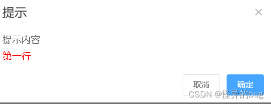
"提示",
{
confirmButtonText: "确定",
cancelButtonText: "取消",
type: "warning",
}
)
.then(function () {
return publishFaultMobleScheduling(mapObject);
})
.then(() => {
this.getList(this.scheduleType);
this.msgSuccess("发布成功");
});
2.修改提示框内容字体
2.1思路
(1)使用const h = this.$createElement写弹出确认框。
(2)$createElement参数用法
h('p', null,{class:'test'} [
        h('span', "提示内容", '内容可以是 '),
        h('p', { style: 'color: red' }, "第一行"),
        h('p', { style: 'color: red' }, null)
    ]),
第一行创建一个什么标签。案例为p标签,也可以为div标签等。可以自定义class,
第二行P标签下面放入一个列表标签。
- 第1个参数:标签,节点标签是什么。
- 第2个参数:定义style格式
- 第2个参数:文件信息,如果为null,不显示。可以根据提示类别把该该赋为null进行不显示。
2.2 案例
const h = this.$createElement;
this.$confirm('', {
    title:"提示",
    type:'warnig',
    message:h('p', null, [
        h('span', "提示内容", '内容可以是 '),
        h('p', { style: 'color: red' }, "第一行"),
        h('p', { style: 'color: red' }, null)
    ]),
    // iconClass:"el-icon-question colorYellow",
	})
    .then(function () {
        return publishFaultMobleScheduling(mapObject);
    })
    .then(() => {
        this.getList(this.scheduleType);
        this.msgSuccess("发布成功");
    });
2.3 案例页面展示

为开发者提供学习成长、分享交流、生态实践、资源工具等服务,帮助开发者快速成长。
更多推荐


 4
4 0
0- 0


 已为社区贡献2条内容

所有评论(0)