css 边框流动效果
通过伪元素及动画实现,复制即可食用。
·
通过伪元素及动画实现,复制即可食用
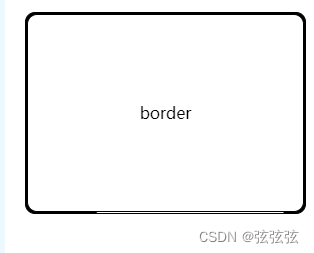
 <div class="txbox">border</div>
  .txbox {
          height: 200px;
          border: 1px solid #000;
          border-radius: 10px;
          position: relative;
          text-align: center;
          line-height: 200px;
          z-index: 1;
          overflow: hidden;
          background: #000;
        }
         .txbox::before {
          content: "";
          display: block;
          position: absolute;
          width: 60%;
          height: 60%;
          left: 50%;
          top: 50%;
          background: #fff;
          z-index: -2;
          transform-origin: 0 0;
          animation: rotate 3s infinite linear;
        }
          @keyframes rotate {
          to {
            transform: rotate(1turn);
          }
          // 0% {background: red;left: 0px;top: 0px;}
          // 25% {background: yellow;left: 200px;top: 0px; }
          // 50% {background: skyblue;left: 200px;top: 200px;}
          // 75% {background: green;left: 0px;top: 200px; }
          // 100% {background: #fff;left: 0px;top: 0px;}
        }
        .txbox::after {
          border-radius: 10px;
          content: "";
          display: block;
          position: absolute;
          border: 1px solid #000;
          width: calc( 100% - 4px);
          height: calc( 100% - 4px);
          left: 1px;
          top: 1px;
          background: #fff;
          z-index: -1;
        }

为开发者提供学习成长、分享交流、生态实践、资源工具等服务,帮助开发者快速成长。
更多推荐


 0
0 0
0- 0


 已为社区贡献1条内容

所有评论(0)