
VUE 实现拖拽效果
在我们平时做也无需求中,往往会遇到拖拽模块的需求。刚开始没有接触过拖拽的时候,会对拖拽有陌生感,会比较担心实现起来会比较的复杂,可能自己很难搞定。然后就会去网上百度一些vue拖拽相关的插件,比如vue-draggable它是基于sortable.js的二次封装,兼容了移动端,不过我们写toB项目的时候,可能只有pc端需要拖拽功能,所以这期就结合vue教大家手写实现拖拽。......
 文章共3,380字 · 阅读需要大约12分钟
写在前面
在我们平时做也无需求中,往往会遇到拖拽模块的需求。刚开始没有接触过拖拽的时候,会对拖拽有陌生感,会比较担心实现起来会比较的复杂,可能自己很难搞定。然后就会去网上百度一些 vue 拖拽相关的插件,比如 vue-draggable 它是基于 sortable.js 的二次封装,兼容了移动端,不过我们写 toB 项目的时候,可能只有 pc 端需要拖拽功能,所以这期就结合 vue 教大家手写实现拖拽。
HTML5 拖放 api
1. 设置元素为可拖放
首先,为了使元素可拖动,把 draggable 属性设置为 true :
<img draggable="true">
2. 拖放事件
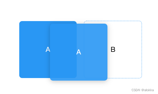
拖放涉及到两种元素,一种是被拖拽元素(源对象),一种是放置区元素(目标对象)。如下图所示,按住A元素往B元素拖拽,A元素即为源对象,B元素即为目标对象。
| 触发对象 | 事件名称 | 说明 |
|---|---|---|
| 在拖动目标上触发事件 | ondragstart | 用户开始拖动元素时触发 |
| ondrag | 元素正在拖动时触发 | |
| ondragend | 用户完成元素拖动后触发 | |
| 释放目标时触发的事件 | ondragenter | 当被鼠标拖动的对象进入其容器范围内时触发此事件 |
| ondragover | 当某被拖动的对象在另一对象容器范围内拖动时触发此事件 | |
| ondragleave | 当被鼠标拖动的对象离开其容器范围内时触发此事件 | |
| ondrop | 在一个拖动过程中,释放鼠标键时触发此事件 |
需要注意的是:dragenter和dragover事件的默认行为是拒绝接受任何被拖放的元素。因此,我们必须阻止浏览器这种默认行为。e.preventDefault();
2. vue 拖拽实现
下面我会用两种方式实现 vue 拖拽
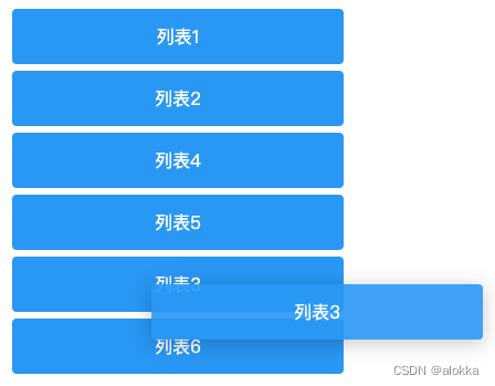
1. 拖动中触发排序
因为要在拖动中触发排序,所以使用
ondragstart、ondragenterapi 来实现
效果如下:
代码:
<template>
  <div>
    <transition-group name="drag" class="list" tag="ul">
      <li
        @dragstart="dragstart(index)"
        @dragenter="dragenter($event, index)"
        @dragover.prevent
        draggable
        v-for="(item, index) in list"
        :key="item.label"
        class="list-item"
      >
        {{ item.label }}
      </li>
    </transition-group>
  </div>
</template>
<script>
export default {
  data() {
    return {
      list: [
        { label: "列表1" },
        { label: "列表2" },
        { label: "列表3" },
        { label: "列表4" },
        { label: "列表5" },
        { label: "列表6" },
      ],
      dragIndex: "",
    };
  },
  methods: {
    dragstart(index) {
      this.dragIndex = index;
    },
    dragenter(e, index) {
      // 避免源对象触发自身的dragenter事件
      if (this.dragIndex !== index) {
        const moving = this.list[this.dragIndex];
        this.list.splice(this.dragIndex, 1);
        this.list.splice(index, 0, moving);
        // 排序变化后目标对象的索引变成源对象的索引
        this.dragIndex = index;
      }
    },
  },
};
</script>
<style lang="scss" scoped>
.list {
  list-style: none;
  .drag-move {
    transition: transform 0.3s;
  }
  .list-item {
    cursor: move;
    width: 300px;
    background: #EA6E59;
    border-radius: 4px;
    color: #FFF;
    margin-bottom: 6px;
    height: 50px;
    line-height: 50px;
    text-align: center;
  }
}
</style>
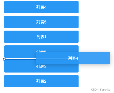
1. 辅助线拖拽后排序
辅助线拖拽后排序我们用到了
ondragstart、ondragover、ondragendapi
效果如下:
代码:
<template>
  <div>
    <transition-group name="drag" class="list" tag="ul">
      <li
        @dragstart="dragStart(item, index)"
        @dragover.prevent="dragOver(index)"
        @dragend="dragEnd()"
        draggable
        v-for="(item, index) in todolist"
        :key="item.label"
        :class="['list-item', { 'is-dragover': index === newIndex }]"
      >
        {{ item.label }}
      </li>
    </transition-group>
  </div>
</template>
<script>
export default {
  data() {
    return {
      todolist: [
        { label: "列表1" },
        { label: "列表2" },
        { label: "列表3" },
        { label: "列表4" },
        { label: "列表5" },
        { label: "列表6" },
      ],
      oldIndex: "",
      oldData: "",
      newIndex: "",
    };
  },
  methods: {
    dragStart(val, i) {
      this.oldIndex = i;
      this.oldData = val;
    },
    dragOver(i) {
      this.newIndex = i;
    },
    dragEnd() {
      let newItems = [...this.todolist];
      // 删除老的节点
      newItems.splice(this.oldIndex, 1);
      // 在列表中目标位置增加新的节点
      newItems.splice(this.newIndex, 0, this.oldData);
      this.todolist = [...newItems];
      this.newIndex = "";
    },
  },
};
</script>
<style lang="scss" scoped>
.list {
  list-style: none;
  .drag-move {
    transition: transform 0.3s;
  }
  .list-item {
    position: relative;
    cursor: move;
    width: 300px;
    background: #EA6E59;
    border-radius: 4px;
    color: #FFF;
    margin: 10px 0;
    height: 50px;
    line-height: 50px;
    text-align: center;
  }
}

.list-item.is-dragover::before {
  content: "";
  position: absolute;
  bottom: -8px;
  left: 0;
  width: 100%;
  height: 4px;
  background-color: #0c6bc9;
}
.list-item.is-dragover::after {
  content: "";
  position: absolute;
  bottom: -12px;
  left: -6px;
  border: 3px solid #0c6bc9;
  border-radius: 50%;
  width: 6px;
  height: 6px;
  background-color: #fff;
}
</style>

旨在为数千万中国开发者提供一个无缝且高效的云端环境,以支持学习、使用和贡献开源项目。
更多推荐


 24
24 0
0- 0


 已为社区贡献4条内容

所有评论(0)