
this.$message入门使用
this.$message的入门使用
·
this.$message的入门使用
知识点
type控制提示的类型,可以设置为error,warning,info,success,默认infocenter控制文本居中显示showClose控制关闭按钮显示message编写提示文本- 若
this.$createElement(标签名称,标签属性填充,标签内容填充)方式,可自定义显示文本效果 - 还可以通过设置
dangerouslyUseHTMLString为true,文本内容的html标签会被解析
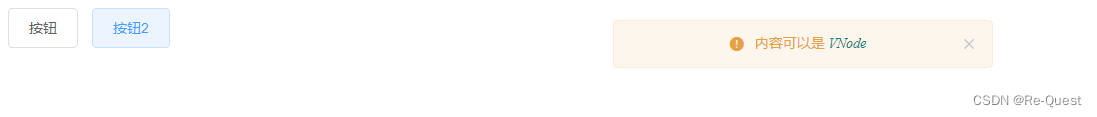
效果图


代码
<!DOCTYPE html>
<html lang="en">
<head>
    <meta charset="UTF-8">
    <meta name="viewport" content="width=device-width, initial-scale=1.0">
    <link rel="stylesheet" href="https://unpkg.com/element-ui/lib/theme-chalk/index.css">
    <script src="https://cdn.jsdelivr.net/npm/vue/dist/vue.js"></script>
    <script src="https://unpkg.com/element-ui/lib/index.js"></script>
    <title>Document</title>
</head>
<body>
    <div id='app'>
        <el-button @click='showMessage'>按钮</el-button>
        <el-button @click='showMessage1'>按钮2</el-button>
    </div>
</body>
</html>

<script>
    new Vue({
        el:"#app",
        data(){
            return{

            }
        },
        methods:{
            showMessage(){
                const h = this.$createElement;
                this.$message({
                    message:h('p',null,[
                        h('span',null,'内容可以是 '),
                        h('i',{style:'color:teal'},'VNode')
                    ]),
                    type:'warning',
                    center:true,
                    showClose:true
                })
            },
            showMessage1(){
                this.$message({
                    dangerouslyUseHTMLString:true,
                    message:'<p><span>内容可以是 <span><i style="color:teal">VNode</i></p>',
                    type:'warning',
                    center:true,
                    showClose:true
                })
            }
        }
    })
</script>
官网

基于 Vue 的企业级 UI 组件库和中后台系统解决方案,为数万开发者服务。
更多推荐
 3
3 0
0- 0


 已为社区贡献1条内容

所有评论(0)