vue.js border-image和linear-gradient()属性做一个边框渐变色
首先我们今天的需求是用border-image做一个边框渐变色!!!那我们先来介绍一下什么是border-image和linear-gradientborder-image是指定作为div元素周围边框的图像,那么它有几个参数,我们该怎么正确使用它呢?border-image有五个参数分别是:我们最常用的就是border-image-source和border-image-slice还有border
·
首先我们今天的需求是用border-image做一个边框渐变色!!!
那我们先来介绍一下什么是border-image和linear-gradient
border-image是指定作为div元素周围边框的图像,那么它有几个参数,我们该怎么正确使用它呢?
border-image有五个参数分别是:
我们最常用的就是border-image-source和border-image-slice还有border-image-repeat,
接下来就是linear-gradient() 函数用于创建一个线性渐变的 “图像”,它的语法是: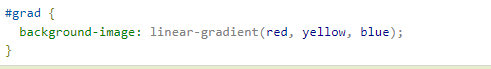它的参数有具体不懂的可以私我或者自己去查询:](https://i-blog.csdnimg.cn/blog_migrate/6afae6460959907e36b5b4f0388c5546.png)
所以我们边框有了渐变色也有了接下来只要把它们结合起来不就好了吗?
<template>
  <div class="home">
    <div class="box"></div>
  </div>
</template>

<script>
export default {};
</script>

<style lang="scss" scoped>
.home {
  height: 100%;
  width: 100%;
  display: flex;
  align-items: center;
  justify-content: center;
  h2 {
    position: sticky;
    top: 0px;
    background-color: rebeccapurple;
  }
  .box {
    margin: 0 auto;
    width: 200px;
    height: 200px;
    border: 10px solid #ddd;
    // 重点在这里哦 后面的30 30 就是border-image-slice这个参数 具体不明白的可以多查阅多方资料
    border-image: linear-gradient(rgb(0, 255, 98), yellow) 30 30;
  }
}
</style>
我们来看看效果:
完美实现哦!每天Get一个小需求,今后就不怕用户叭叭了!

前往低代码交流专区
更多推荐


 1
1 0
0- 0


 已为社区贡献4条内容

所有评论(0)