Vue + HighCharts 画不同高度的3D饼/环图
前言:由于公司可视化数字大屏项目需要用到了3D饼图和3D环图,所以在博客里记录一下!如果能帮到你,那么点个赞吧,哈哈哈。话不多说,直接先上效果图:3D饼图3D环图下面是步骤以及代码:1.npm 安装 highchartsnpm install highcharts --save2.在main.js中引用 highcharts, 注意:画3D图需要使用到 highcharts里面的 highchar
·
前言:由于公司可视化数字大屏项目需要用到了3D饼图和3D环图,所以在博客里记录一下!如果能帮到你,那么点个赞吧,哈哈哈。
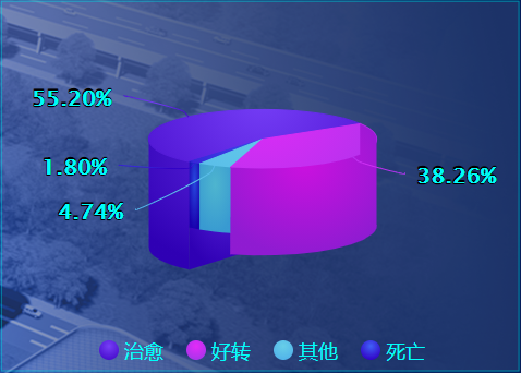
话不多说,直接先上效果图:
3D饼图

3D环图

下面是步骤以及代码:
1.npm 安装 highcharts
npm install highcharts --save
2.在main.js中引用 highcharts, 注意:画3D图需要使用到 highcharts里面的 highcharts-3d
import Highcharts from 'highcharts'

import Highcharts3d from 'highcharts/highcharts-3d'

Highcharts3d(Highcharts)
3D饼图:
HTML:
<template>
    <div class="absolute-left-right-top-bottom charts-main">
        <div class="content">
            <highcharts :options="chartOptions1" class="content-pic"></highcharts>
        </div>
    </div>
</template>
JS:
<script>
import { Chart } from 'highcharts-vue'
import Highcharts from 'highcharts'
import Highcharts3d from 'highcharts/highcharts-3d'

Highcharts3d(Highcharts)

export default {
    name: 'theHospitalStatistics',
    components: {
        'highcharts': Chart
    },
    data() {
        return {
            chartOptions1: {
                credits: {
                    enabled: false
                },
                exporting: { enabled: false },
                chart: {
                    type: 'pie',
                    plotBackgroundColor: null,
                    plotBorderWidth: null,
                    backgroundColor: null,
                    animation: false,
                    options3d: {
                        enabled: true,
                        // 延y轴向内的倾斜角度
                        alpha: 75,
                        // 外旋转角度
                        beta: 0
                    }
                },
                title: {
                    text: null
                },
                tooltip: {
                    // 数据提示框的背景颜色
                    backgroundColor: 'rgba(50,71,179,0.4)',
                    // 边框颜色
                    // borderColor:'rgba(206,94,74,.9)',
                    style: {
                        fontSize: 24,
                        color: '#16D8E9'
                    },
                    useHTML: true, // 是否使用HTML编辑提示信息
                    formatter: function() {
                        // console.log(this) // 控制台输出可以看到有很多属性
                        if (this.point.name === '治愈') {
                            return '<span style="color:#00E5E3; font-size: 20px">' + this.series.name + '</span>' + '<br>' + '<span style="color:#E9F4FF; font-size: 16px">' + this.point.name + ' : ' + '</span>' + '<span style="color:#763FF7; font-size: 24px; font-weight: bold">' + Highcharts.numberFormat(this.percentage, 2) + '%' + '</span>';
                        } else if (this.point.name === '好转') {
                            return '<span style="color:#00E5E3; font-size: 20px">' + this.series.name + '</span>' + '<br>' + '<span style="color:#E9F4FF; font-size: 16px">' + this.point.name + ' : ' + '</span>' + '<span style="color:#e42af8; font-size: 24px; font-weight: bold">' + Highcharts.numberFormat(this.percentage, 2) + '%' + '</span>';
                        } else if (this.point.name === '死亡') {
                            return '<span style="color:#00E5E3; font-size: 20px">' + this.series.name + '</span>' + '<br>' + '<span style="color:#E9F4FF; font-size: 16px">' + this.point.name + ' : ' + '</span>' + '<span style="color:#67cee8; font-size: 24px; font-weight: bold">' + Highcharts.numberFormat(this.percentage, 2) + '%' + '</span>';
                        } else if (this.point.name === '其他') {
                            return '<span style="color:#00E5E3; font-size: 20px">' + this.series.name + '</span>' + '<br>' + '<span style="color:#E9F4FF; font-size: 16px">' + this.point.name + ' : ' + '</span>' + '<span style="color:#4061f7; font-size: 24px; font-weight: bold">' + Highcharts.numberFormat(this.percentage, 2) + '%' + '</span>';
                        }
                    },
                    valueDecimals: 2 // 数据值保留小数位数
                },
                legend: {
                    itemStyle: {
                        fontSize : 18,
                        color: '#00FCF9',
                        fontFamily: 'MicrosoftYaHei',
                        fontWeight: 400
                    }
                },
                plotOptions: {
                    pie: {
                        // 每个扇块能否选中
                        allowPointSelect: false,
                        // 鼠标指针
                        cursor: 'pointer',
                        // 饼图的厚度
                        depth: 70,
                        // 空心
                        innerSize: '0%',
                        textShadow: false,
                        shadow: false,
                        // 提示信息
                        dataLabels: {
                            // 是否显示饼图的线形tip
                            enabled: true,
                            // 设置引导线的长度
                            distance: 25,
                            style: {
                                color: '#E9F4FF',
                                fontSize: 14,
                                fontWeight: 'bold'
                            },
                            formatter: function() { // 设置字体与引导线和饼图颜色一致
                                if (this.point.name === '治愈') {
                                    return '<span style="color:#00FCF9; font-size: 20px">' + Highcharts.numberFormat(this.percentage, 2) + '%' + '</span>';
                                } else if (this.point.name === '好转') {
                                    return '<span style="color:#00FCF9; font-size: 20px">' + Highcharts.numberFormat(this.percentage, 2) + '%' + '</span>';
                                } else if (this.point.name === '死亡') {
                                    return '<span style="color:#00FCF9; font-size: 20px">' + Highcharts.numberFormat(this.percentage, 2) + '%' + '</span>';
                                } else if (this.point.name === '其他') {
                                    return '<span style="color:#00FCF9; font-size: 20px">' + Highcharts.numberFormat(this.percentage, 2) + '%' + '</span>';
                                }
                            }
                        }
                    }
                },
                // colors: ['#763FF7', '#e42af8', '#67cee8', '#4061f7'],
                series: [{
                    type: 'pie',
                    name: '挂号类别分布',
                    size: '65%',
                    startAngle: 220, // 调整饼图的角度   方向:顺时针
                    showInLegend: true, // 是否打开图例
                    colorByPoint: true,
                    data: [
                        {
                            name: '治愈',
                            y: 56.21,
                            h: 50, // 高度
                            sliced: false, // 是否突出
                            selected: false // 是否一直不透明
                        },
                        {
                            name: '好转',
                            y: 38.96,
                            h: 30, // 高度
                            sliced: false, // 是否突出
                            selected: false // 是否一直不透明
                        },
                        {
                            name: '其他',
                            y: 4.83,
                            h: 10, // 高度
                            sliced: false, // 是否突出
                            selected: false // 是否一直不透明
                        },
                        {
                            name: '死亡',
                            y: 1.83,
                            h: 10, // 高度
                            sliced: false, // 是否突出
                            selected: false // 是否一直不透明
                        }
                    ]
                }]
            }
        }
    },
    created() {
        // 设置颜色渐变
        this.setcolor();
        // 设置饼图高度
        this.setOptonHeight();
    },
    mounted() {

    },
    methods: {
        setcolor() {
            // 颜色的填充
            let color1 = ['#763FF7', '#e42af8', '#67cee8', '#4061f7'] // 16D8E9
            let color2 = ['#480ecd', '#a834ea', '#51b3ea', '#3101c6']
            Highcharts.getOptions().colors = Highcharts.map(
                Highcharts.getOptions().colors,
                function(color, index) {
                    return {
                        radialGradient: { cx: 0.5, cy: 0.3, r: 0.7 },
                        stops: [
                            [0, color1[index]],
                            [1, color2[index]] // darken
                        ]
                    }
                }
            )
        },
        setOptonHeight() {
            var each = Highcharts.each,
                round = Math.round,
                cos = Math.cos,
                sin = Math.sin,
                deg2rad = Math.deg2rad;
            Highcharts.wrap(Highcharts.seriesTypes.pie.prototype, 'translate', function(proceed) {
                proceed.apply(this, [].slice.call(arguments, 1));
                // Do not do this if the chart is not 3D
                if (!this.chart.is3d()) {
                    return;
                }
                var series = this,
                    chart = series.chart,
                    options = chart.options,
                    seriesOptions = series.options,
                    depth = seriesOptions.depth || 0,
                    options3d = options.chart.options3d,
                    alpha = options3d.alpha,
                    beta = options3d.beta,
                    z = seriesOptions.stacking ? (seriesOptions.stack || 0) * depth : series._i * depth;
                z += depth / 2;
                if (seriesOptions.grouping !== false) {
                    z = 0;
                }
                each(series.data, function(point) {
                    var shapeArgs = point.shapeArgs,
                        angle;
                    point.shapeType = 'arc3d';
                    var ran = point.options.h;
                    shapeArgs.z = z;
                    shapeArgs.depth = depth * 0.75 + ran;
                    shapeArgs.alpha = alpha;
                    shapeArgs.beta = beta;
                    shapeArgs.center = series.center;
                    shapeArgs.ran = ran;
                    angle = (shapeArgs.end + shapeArgs.start) / 2;
                    point.slicedTranslation = {
                        translateX: round(cos(angle) * seriesOptions.slicedOffset * cos(alpha * deg2rad)),
                        translateY: round(sin(angle) * seriesOptions.slicedOffset * cos(alpha * deg2rad))
                    };
                });
            });
            (function(H) {
                H.wrap(Highcharts.SVGRenderer.prototype, 'arc3dPath', function(proceed) {
                    // Run original proceed method
                    var ret = proceed.apply(this, [].slice.call(arguments, 1));
                    ret.zTop = (ret.zOut + 0.5) / 100;
                    return ret;
                });
            }(Highcharts))
        }
    }
}
</script>
3D环图
环图与饼图的代码区别只有一个 innerSize 空心率的设置,我这边设置的为 50%。
// 空心
innerSize: ‘50%’,
HTML:
<template>
    <div class="absolute-left-right-top-bottom charts-main">
        <div class="content">
            <highcharts :options="chartOptions1" class="content-pic"></highcharts>
        </div>
    </div>
</template>
JS:
<script>
import { Chart } from 'highcharts-vue'
import Highcharts from 'highcharts'
import Highcharts3d from 'highcharts/highcharts-3d'

Highcharts3d(Highcharts)

export default {
    name: 'deliveryWay',
    components: {
        'highcharts': Chart
    },
    data() {
        return {
            chartOptions1: {
                credits: {
                    enabled: false
                },
                exporting: { enabled: false },
                chart: {
                    type: 'pie',
                    plotBackgroundColor: null,
                    plotBorderWidth: null,
                    backgroundColor: null,

                    options3d: {
                        enabled: true,
                        // 延y轴向内的倾斜角度
                        alpha: 75,
                        // 外旋转角度
                        beta: 0
                    }
                },
                title: {
                    text: null
                },
                tooltip: {
                    // 数据提示框的背景颜色
                    backgroundColor: 'rgba(50,71,179,0.4)',
                    // 边框颜色
                    // borderColor:'rgba(206,94,74,.9)',
                    style: {
                        fontSize: 24,
                        color: '#16D8E9'
                    },
                    useHTML: true, // 是否使用HTML编辑提示信息
                    formatter: function() {
                        // console.log(this) // 控制台输出可以看到有很多属性
                        if (this.point.name === '顺产率') {
                            return '<span style="color:#00E5E3; font-size: 20px">' + this.series.name + '</span>' + '<br>' + '<span style="color:#E9F4FF; font-size: 16px">' + this.point.name + ' : ' + '</span>' + '<span style="color:#26C4FF; font-size: 24px; font-weight: bold">' + Highcharts.numberFormat(this.percentage, 2) + '%' + '</span>';
                        } else if (this.point.name === '剖宫产率') {
                            return '<span style="color:#00E5E3; font-size: 20px">' + this.series.name + '</span>' + '<br>' + '<span style="color:#E9F4FF; font-size: 16px">' + this.point.name + ' : ' + '</span>' + '<span style="color:#CA78F9; font-size: 24px; font-weight: bold">' + Highcharts.numberFormat(this.percentage, 2) + '%' + '</span>';
                        }
                    },
                    valueDecimals: 2 // 数据值保留小数位数
                },
                legend: {
                    itemStyle: {
                        fontSize : 18,
                        color: '#00FCF9',
                        fontFamily: 'MicrosoftYaHei',
                        fontWeight: 400
                    }
                },
                plotOptions: {
                    pie: {
                        // 每个扇块能否选中
                        allowPointSelect: false,
                        // 鼠标指针
                        cursor: 'pointer',
                        // 饼图的厚度
                        depth: 70,
                        // 空心
                        innerSize: '50%',
                        textShadow: false,
                        shadow: false,
                        // 提示信息
                        dataLabels: {
                            // 是否显示饼图的线形tip
                            enabled: true,
                            // 设置引导线的长度
                            distance: 25,
                            style: {
                                color: '#E9F4FF',
                                fontSize: 14,
                                fontWeight: 'bold'
                            },
                            formatter: function() { // 设置字体与引导线和饼图颜色一致
                                if (this.point.name === '顺产率') {
                                    return '<span style="color:#00FCF9; font-size: 20px">' + Highcharts.numberFormat(this.percentage, 2) + '%' + '</span>';
                                    // return '<span style="color:#26C4FF; font-size: 24px">' + Highcharts.numberFormat(this.percentage, 2) + '%' + '</span>' + '<br>' + '<span style="color:#E9F4FF; font-size: 16px">' + this.point.name + '</span>';
                                } else if (this.point.name === '剖宫产率') {
                                    return '<span style="color:#00FCF9; font-size: 20px">' + Highcharts.numberFormat(this.percentage, 2) + '%' + '</span>';
                                }
                            }
                        },
                        states: {
                            inactive: {
                                opacity: 0.7,
                                size: '120%'
                            },
                            hover: {
                                halo: {
                                    size: '120%',
                                    attributes: {
                                        fill: Highcharts.getOptions().colors[2],
                                        'stroke-width': 2,
                                        stroke: Highcharts.getOptions().colors[1]
                                    }
                                }
                            }
                        }
                    }
                },
                series: [{
                    type: 'pie',
                    name: '挂号类别分布',
                    size: '65%',
                    startAngle: 220, // 调整饼图的角度   方向:顺时针
                    showInLegend: true, // 是否打开图例
                    colorByPoint: true,
                    data: [
                        {
                            name: '顺产率',
                            y: 60.48,
                            h: 50, // 高度
                            sliced: false, // 是否突出
                            selected: false // 是否一直不透明
                        },
                        {
                            name: '剖宫产率',
                            y: 39.52,
                            h: 10, // 高度
                            sliced: false, // 是否突出
                            selected: false // 是否一直不透明
                        }
                    ]
                }]
            }
        }
    },
    created() {
        // 设置颜色渐变
        this.setcolor()
        // 设置饼图高度
        this.setOptonHeight()
    },
    mounted() {

    },
    methods: {
        setcolor() {
            // 颜色的填充
            let color1 = ['rgba(0, 66, 178, 0.4)', 'rgba(203, 50, 245, 0.6)'] // 16D8E9 rgba(203, 50, 245, 0.4)
            let color2 = ['#00b3ff', '#c633f4']
            Highcharts.getOptions().colors = Highcharts.map(
                Highcharts.getOptions().colors,
                function(color, index) {
                    return {
                        radialGradient: { cx: 0.5, cy: 0.3, r: 0.7 },
                        // radialGradient: { cx: 1, cy: 1, r: 1 },
                        stops: [
                            [0, color1[index]],
                            [1, color2[index]] // darken
                        ]
                    }
                }
            )
        },
        setOptonHeight() {
            var each = Highcharts.each,
                round = Math.round,
                cos = Math.cos,
                sin = Math.sin,
                deg2rad = Math.deg2rad
            Highcharts.wrap(
                Highcharts.seriesTypes.pie.prototype,
                'translate',
                function(proceed) {
                    proceed.apply(this, [].slice.call(arguments, 1))
                    // Do not do this if the chart is not 3D
                    if (!this.chart.is3d()) {
                        return
                    }
                    var series = this,
                        chart = series.chart,
                        options = chart.options,
                        seriesOptions = series.options,
                        depth = seriesOptions.depth || 0,
                        options3d = options.chart.options3d,
                        alpha = options3d.alpha,
                        beta = options3d.beta,
                        z = seriesOptions.stacking
                            ? (seriesOptions.stack || 0) * depth
                            : series._i * depth
                    z += depth / 2
                    if (seriesOptions.grouping !== false) {
                        z = 0
                    }
                    each(series.data, function(point) {
                        var shapeArgs = point.shapeArgs,
                            angle
                        point.shapeType = 'arc3d'
                        var ran = point.options.h
                        shapeArgs.z = z
                        shapeArgs.depth = depth * 0.75 + ran
                        shapeArgs.alpha = alpha
                        shapeArgs.beta = beta
                        shapeArgs.center = series.center
                        shapeArgs.ran = ran
                        angle = (shapeArgs.end + shapeArgs.start) / 2
                        point.slicedTranslation = {
                            translateX: round(
                                cos(angle) * seriesOptions.slicedOffset * cos(alpha * deg2rad)
                            ),
                            translateY: round(
                                sin(angle) * seriesOptions.slicedOffset * cos(alpha * deg2rad)
                            )
                        }
                    })
                }
            )
            ;(function(H) {
                H.wrap(Highcharts.SVGRenderer.prototype, 'arc3dPath', function(
                    proceed
                ) {
                    // Run original proceed method
                    var ret = proceed.apply(this, [].slice.call(arguments, 1))
                    ret.zTop = (ret.zOut + 0.5) / 100
                    return ret
                })
            })(Highcharts)
        }
    }
}
</script>
分割线
当将alpha: 245时,但是将3D饼/环图倒过来时会出现颜色穿透,我个人也在网上找了很久没有找到解决办法,所以就没有倒过来。
options3d: {
                        enabled: true,
                        // 延y轴向内的倾斜角度
                        alpha: 245,
                        // 外旋转角度
                        beta: 0
                    }
颜色穿透:


前往低代码交流专区
更多推荐
 3
3 0
0- 0


 已为社区贡献1条内容

所有评论(0)